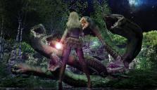
First Render in Awhile...critiques/suggestions?
 agate888
Posts: 29
in Art Studio
I haven't done much with Daz3D lately, and just wanted to make something. I feel it doesn't quite hit the mark I wanted, but in a few areas close. Open to suggestions...


KahliTAugust2021.jpg
3832 x 2200 - 8M


Comments
It looks pretty good already! Love the colours and the overall vibe.
I'd add bloom, DOF, and some haze. Now everything is a little too crisp, making it all look like a video game. Don't overdo it on the DOF, you probably want to keep both the character and the hydra in focus.
Her pose is a little too relaxed given the situation. Try tweaking her pose just a little to make it a little more tense and dynamic. And maybe some wind in her hair.
It looks like the magic effect in her left hand was entirely added in post. The effect looks great and fits the image. If you add a small point light to her left hand the effect will integrate even better with the rest of the image.
Hope some of that was helpful!
A different background that would help the snakes stand out more, could help. (Diffent color and/or less cluttered and busy, even just the stars and sky would work better than the mossy rocks and birch trees)
The hero's pose could be more active.
My initial thoughts have already been stated, I'd use DOF (depth of field) for sure. I disagree about the pose, I think it shows a cocky confidence, she's got a "Seriously?" attitude of "Do your thing, go ahead and threaten, I'll wait until you're done."
Lighting- the galaxy/ sky lighting suggests to me the lighting is over to our right as we look at it, but the serpent to the far right doesn't have much rim lighting on it along the top. Getting nit picky, it's head has a lot of light, yet HER right hand, which comes before that head, doesn't have any. If the light is from the orb in her left hand, that light would have to go past the right hand to get to the right-hand side serpent. (So would the arm. Even at her side, the arm is extended out so would be getting some light.) The vegetation at the bottom has light so the hand/arm would too (I think.)
My main suggestion other than DOF would be to get more foreground. I felt she was getting ready to wobble on those high heels and step back out of the scene.
I really like the angle of the camera, tilted up from a lower position, I love the crispness of the scene and the posing of the serpent. It's a very dynamic scene and obviously well thought out. Doing a forest render is always tricky and you do have to take some liberties with lighting to show expressions, so take what I've said with a grain of salt. :)
Thanks for all the comments. I was trying something different and never quite did a composition like that, and got to a point where I lost perspective or a feel for the scene. So the comments are very much appreciated and all make sense.