Carrara specular settings vs Studio specular settings (mini tut?)
 Jonstark
Posts: 2,738
Here's a mini tut on some cool stuff I found by comparing/contrasting how the 2 biased render engines handle specularity effects differently.
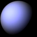
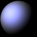
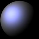
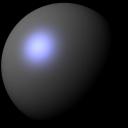
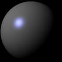
Let's start with Glossiness/Shininess. This is the function that controls the size of the specular highlight, which in turn tells our human brains how 'shiny' or 'glossy' the object is. I deliberately put a sphere of the same dark color in both the Carrara and Studio engines, and also set the highlight color to blue, so we can see the effect. First, here's how Studio handles Glossiness, starting at 0% Glossiness and moving up in 10% increments all the way up to 100% glossiness:


StudioGlossiness0.jpg
400 x 400 - 40K


StudioGlossiness20.jpg
400 x 400 - 38K

StudioGlossiness30.jpg
400 x 400 - 37K

StudioGlossiness40.jpg
400 x 400 - 35K

StudioGlossiness50.jpg
400 x 400 - 34K


StudioGlossiness60.jpg
400 x 400 - 32K

StudioGlossiness70.jpg
400 x 400 - 31K

StudioGlossiness80.jpg
400 x 400 - 30K


StudioGlossiness90.jpg
400 x 400 - 29K

CarraraShininess100.jpg
400 x 400 - 19K
Post edited by Jonstark on


Comments
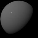
Now here's what Carrara looks like, again starting with Shininess of 0% and working our way up to 100% in 10% increments:
Pretty big difference in the spread, am I right? Studio spreads way wider than Carrara at the bottom end, and Carrara really contracts fast. Eyeballing it, I would say Carrara at 0% shininess is equivalent to Studio at about 55% glossiness!
Next let's move on to Highlight/SpecularStrength. First, here's Studio with specular strength starting at 100% and going down to 50% and then 20% (we don't really need to show the whole spread to give the idea of what happens):
In contrast, here's how Carrara handles Highlight/SpecularStrength, again showing at 100%, 50% and then 20%. Again, quite a bit different!
Studio gives more of the blue color bleed (even though both shaders have the same color highlight as each other) and also is a good deal dimmer than Carrara. Eyeballing it I'd say that a Studio specular strength of 100% is equivalent to a Carrara highlight of about 65% - 70% Studio also seems to have a brighter 'center', meaning its fall off of the brightness is sharper than Carrara, which is a little more gradual.
Let's move on to bump, where it gets a bit trickier. Studio has not just a bump strength channel, but also has a Negative Bump and Postive Bump channel which can drastically effect the amount of bump overall. By default it loads with a Negative Bump of -.01 and a Positive Bump of .01, so that's what I'm going with in my comparison.
Here's a Studio bump with a texture map set at first 100% bump and next at 200% bump (since Studio let's you go up to 200% by default).
You'll probably have to zoom in on the bigger picture to even see the bump. It's very faint, even at 100%.
By contrast, here's the same texture map in Carrara with bump at 100%, then the 2nd pic has it all the way down to 10%, and the 3rd pic has it all the way down to 5%:
Carrara's bump is obviously much more sensitive than Studio. Eyeballing it, I'd say Studio bump at 100% is equivalent to Carrara bump at about 5% I included the Studio 200% and the Carrara 10% pics so those could be compared to each other too, and based on those 2 comparisons, I think I'm pretty close.
Lastly let's compare displacement. This is very hard to make an equivalent. Studio has not just the Displacement strength channel, but also a channel for minimum displacement and one for positive displacement. These negative/positive channels can *drastically* impact the main Displacement channel (think of them like multipliers). By default Studio seems to load a negative channel of -.1 and a positive channel of .1, so that's what I'm going with for my comparison.
Here's Studio displacement of 100%:
Carrara displacement is a pretty finicky animal, and slows render speed too much to be useful imo. However Philemo's awesome Phong Tesselator plugin makes Carrara displacement feasable to use. So using the Phong Tesselator modifier enabled, after some tests I conclude that an equivalent to Studio displacement strength of 100% would be about .002 ft amplitude in Carrara.
Yes, you read that right. 0.002 The actual displacement setting doesn't show more than 2 decibel places, so if you input .002 it will actually display as .00 However Carrara still reads and uses the .002 you input. Heck, I can see that Carrara can go much smaller than that, right down to .0001, and it will still read and do displacement.
So, wrapping up... if we can get a fix on the differences in the way Studio renders vs the ways the same functions are controlled in Carrara, than we can get pretty close equivalents. And textures that were designed to be used in Studio can also be used more effectively in Carrara.
Some might say: who cares? What does it matter? Or in the immortal words of Cartman "Whatever, I do what I want!"
Hey, I'm all for breaking rules lol. I just believe we should actually learn the rules before breaking them. Not that these are rules... I guess the analogy doesn't really apply. :)
Hopefully this will be useful info for someone; it definitely helped me get on track in finally tuning skin shaders at least :)
wow! This will be super help ful, thank you.!!
very cool @jonstark
with the bump maps did you use a simple bump map or a normal map?
I find that Carrara's normal map has to be 100+ to see it working.
It was a bump map I took from one of Matcreators products, organic number 4 from something or other. :) But it wasn't a normal map. For some reason I didn't even think about normal maps. I guess Studio can now use them too, so I ought to see what the comparison on normal maps would be too...
That greatly depends upon the Normal map being used. Some of the Normal maps I've tried are way too strong at 100%.
I think that this is due to the fact that some normal maps are baked from geometry in software like Blender, Zbrush, 3DCoat, etc., while others are 'estimated' normal maps, made via image processing, which can make a world of difference.
I used Materialize to create normal maps from Reby Sky's bump maps, and learned that I'd first need to smooth the edges of the boundaries of the map (where the image stops and white background surrounds) in order for this to work properly, otherwise she gets segmented between material zone! LOL
But the concept worked. The Normal map detail is quite good, and Materialize has plenty of tweak parameters to fuss with to get variable results.
Interesting! Dart I'm curious, was it worth it to convert a bump map into a normal then? I would have guessed offhand (being ignorant as I am about how such things are done in real life) that for an optimum normal map you would need to start with the diffuse map and convert it instead, since I had thought maybe the bump map was converted from the original diffuse too, and might have lost some important information by the time it goes through a second conversion.
Damn, Materialize looks great. I had seen youtube videos of it before, but I hadn't realized it was free til I followed your link. Going to have to download and play with it asap :)
I haven't really checked to see if there's a difference in making a normal map if there's also a diffuse map loaded, but I don't think that there is.
Yeah, I selected those videos because their so quick. There are more thorough one at the materialize site, but Royal Skies gets right to the thick of it.
I haven't played with materialize a whole lot yet. I never really planned on using it for my characters, but I'm going to do more with that.
Like I said, however, the outer edges of each map island should be expanded before Materializing them into Normal maps. It took me a while to figure out why there were those annoying seem lines where the leg zone meets with the torso zone, where it was immediately visible.
At first I thought it was similar to the mipmap issue we have in Carrara (I was working in Octane at the time) so I used a 2D Transform node to expand the map a teeny bit larger, which helped solve the problem for the render I was working on until I had an epiphany - oh yeah... I bet those normal maps I made created a seem line. I was correct.
I just had a few minutes to spare to play, so I downloaded Materialize, and while it isn't super intuitive, thanks to those videos and the fact that there aren't all that many buttons to push in the first place, I think I've roughly got the hang of it (I'm probably dead wrong lol, but looks like I'm getting results, so...)
To answer my own question, looks like it doesn't have to be one or the other. If we put the bump map in the height map region (which is analagous, I found out after a bit of research and watching yet another video, bump/height apparently is just different names by different render engines for the same thing) and also put the diffuse map in the diffuse section, then the 3rd section along will allow us to 'create' a normal map using info from the first 2 maps together.
So we don't have to if we don't want to; we can create a normal map from either the bump or the diffuse by itself, but since I figure more info is better I popped the the bump texture I was testing with for the above sphere renders into the bump section, then added the diffuse map that goes with it into the diffuse section, created a normal map, saved it (I didn't fiddle with the presets too much). And here's some renders with Carrara, with the nomral map set in the bump channel, and the overall bump set to 100%, then 10%, then 5%:
Next I went over to Studio, again using the same normal map. There is no setting for intensity or any other modifier in Studio. It doesn't give you any freedom to tweak the normal map at all, it just uses the map as is. (Point of advantage noted for Carrara! :) So let's just call this Studio normal set to 100% :
Just eyeballing it, I'd say Carrara is less sensitive to normal maps than it is to bump maps, and compared to Studio... well it's so dang close it's hard to say. At least it looks like Carrara normal at bump 100% is equivalent to Studio normal.
Next question to research... can we use both a normal map and a bump map for the same object? Let me run off and play... :)
Answer... yes, with limitations. :)
The problem is we only have one master Bump amplitude for the whole shader. So we can certainly use an operator and add a bump texture to a normal texture. But we are forced to give the same overall amplitude to both channels.
However there is a solution, as each of the channels, bump and normal, that are being added by the operator can individually be tweaked in brightness, both up and down between 0% - 100%
So it does really work. :)
Here's Carrara with the sphere set to 100% overall bump and the 2 textures, normal and bump, added together:
How about a multi channel mixer and mix between them? Not sure if that has any benefit...
Hmmm... odd. Just to see, I made some normal maps for Reby and loaded them up to test render, but I'm not seeing the seams even though I didn't adjust the edges at all... maybe my eyes are playing tricks? How obvious should the seams be?
I use mixers all the time, and it would work, sorta, in this case too. The drawback is that instead of adding the 2 together, we would be at best using a 0 - 100% slider, and set at 50%, meaning that each of the 2 would contribute half the effect. It would work fine, we'd just have to increase the overall master bump amplitude to 200% to get the same effect. On the other hand, we don't have to set that slider at 50%, and in fact if Carrara is reading the bump channel way too strong and the normal channel too lightly, we could just set the slider so that 75% of the effect comes from the normal side, thus enhancing the normal effect and diminishing the bump effect to make them 'play nice' with each other. Yeah, this could definitely be another way to go. Good suggestion! :)
Oh and credit where credit is due; I mentioned a video tutorial I watched earlier but didn't think to link it. Interesting stuff.
I was really only searching for a definitive difference between what bump and normal maps do. I did already know that normal maps allow for more axis and are more complex/better. But my question is 'do we still need bump maps, or should we ditch them as unecessary old tech?'. The answer for me in watching the video is no, bump do something so different that the optimum would be to add them together and use both.
I sometimes use the mixer in the bump channel
source 1 - normal map
source 2 - texture map
Blender - colour ( white or black or anywhere in between )
Right on Stezza, that would work just as well, and probably better for those gifted with artistic eyes. For me it's easier to see the percentages though and know exactly how much oomph I'm pouring into each side :)
Since Dart mentioned Reby, I loaded her up on an Aiko5 and gave her the old heave-ho workover. After a bit of fiddling, I landed on setting the overall bump amplitude at 20%, while the normal map is at 100% brightness and added to the bump map which is only at 10% brightness (Carrara is really really sensitive to bump maps I think). After trying both the bump map and the normal map separately on a grayed out Genesis, it was clear to me that even the normal map I made with Materialize is very good at giving the eyebrows definition, while the professional bump map that came from DAZ kinda fails miserably. Still the bump map is good at giving skin surface imperfections. Of course bump eats up specularity (so does SSS, but that's a different story). So I had to fiddle with the highlight levels a little bit to match, not sure I quite got there. Honestly it's a cool experiment, but I'm not sure it's worth the trouble lol.
Also I'm still not seeing the seams, so I'm worried my perception is failing me or that I did something different when using Materialize and didn't realize it. :(
1 - I have a feeling that the seems I'm seeing from the normal map are due to her shape being vastly different from Genesis 1 - and I didn't always see them. I noticed them during animation renders. It might even just be an Octane issue, since I haven't tested the normal maps in Carrara yet.
2 - Bump + Normal
To combine the two, I'd suggest a multi-layer in the bump channel, so you can set the blending mode (Multiply, Add, etc.,) and opacity of each map individually.
When I add viens using a bump map, I'll often just use the Add operator.
Just take note that, when using multiple maps in bump, we often need to work more with the intensity slider of the bump channel to get the desired effect.
Aiko looks good wearing Reby's skin! :)