Help and Opinions Sought
 ShawnBooth
Posts: 465
I need help in determining which version of the image to go with. Which is more appealing to you? Striking?
Help would be great in figuring out how to get the dino's scales to pop. I have tried a few things and will post my surface settings later today.
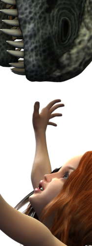

Vertical_Portrai_CharlotteDino_ALL_LIGHTS.png
750 x 2000 - 1M
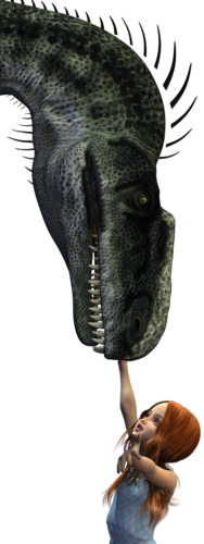

homeV2.png
750 x 2000 - 1M
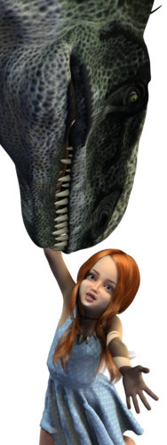

home.png
750 x 2000 - 2M
Post edited by ShawnBooth on


Comments
I prefer the first image, it leaves some work to the viewers imagination.
Thanks for taking the time. Really appreciate it.
Still tweaking and getting everything dialed in.
So here's my settings for the dino's skin. ANY input, suggestions, ANYTHING will help...
I want the skin and details to appear textured and "bumped".
I tend to go with the displacement and bump strengths at 100% and then increase the positive and negative aspects of each one of those. You've left the settings for positive and negative relatively tame. Try putting the displacement and bump strengths at 100% and change the settings for positive and negative more dramatically.
I also like the first render the best.
I agree when I set up bump and displacement settings I always leave the strength at 100% and adjust the the positive and negative settings
I with also do a quick test render with out the texture on so I can see how just the bump and displacement are working (using the undo button after the render puts the texture back)
looking at your image I would try setting your displacement at -0.5 and 0.5 but you may want to go up to -1.0 and 1.0 you with need to play and see what looks better.
Novica and NeilV 1, thank you so very much!! I'm playing with those values now. Will post results when I can.
Getting there...
Thank you again for the help NeilV 1 and Novica!!
Kudos- much better.
And you're very welcome- glad it worked out.
Looks much better glad you have it working and looking better
Thoughts on the "final" anyone?
I liked the previous one better, frankly. The teeth went a tad too dark for my preferences, and the girl's face seems washed out. I could see the details of the bumps much better in the previous one, and you had more contrast in the lighting with some areas lit and others a bit darker.
Something more along the lines of this?
BINGO! :)
That's my opinion, others may like the darker one better. Very nice render and I love the girl's expression.
Thank you!
I'm doing a series on Charlotte and Dino. Inspired by my 4 mth old and her orange triceratops.
Made a few adjustments and am pretty happy with this one. I am completely open to any and all suggestions as I'm sure I'll keep tweaking :)
Thank you again for your help!
I have been working on Charlotte...
And more...
Charlotte 23FEB2015
I like this -