equinoxx5's Renders and Stuff (formerly: (Re-)Constructing the Old West)
 equinoxx5
Posts: 126
After watching Silverado for about the billionth and third time (I love that movie!), not to mention the trailer for Django Unchained, I got a bug in my bonnet to do a western-y themed render or two. So, I set about putting together a western street set, using Daz's Old West sets, re-textured a few signs for a little variety, but still decided I wanted some more. I discovered some nice, free (always a plus) buildings by a user named Tippy on ShareCG. Good stuff. Problem was, they weren't built to Poser scale, but to the scale of the more cartoonish characters that Tippy creates.
Using Tippy's structures as inspiration, I've been re-modeling a couple of them in Hexagon, to match scale with the Daz sets (modeled by the inestimable Jack Tomalin). My primary method of matching scale has been actually using doors and windows from the Daz sets, and reconstructing Tippy's buildings around them. It's worked out pretty well so far. Of course it makes the models undistributable, so I can't share the meshes themselves, although in the future, I may just model my own doors and windows, using the components Jack modeled as a scaling guide.
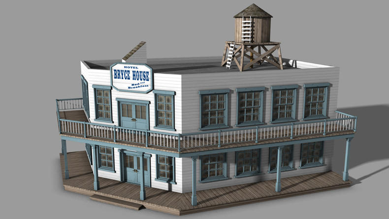
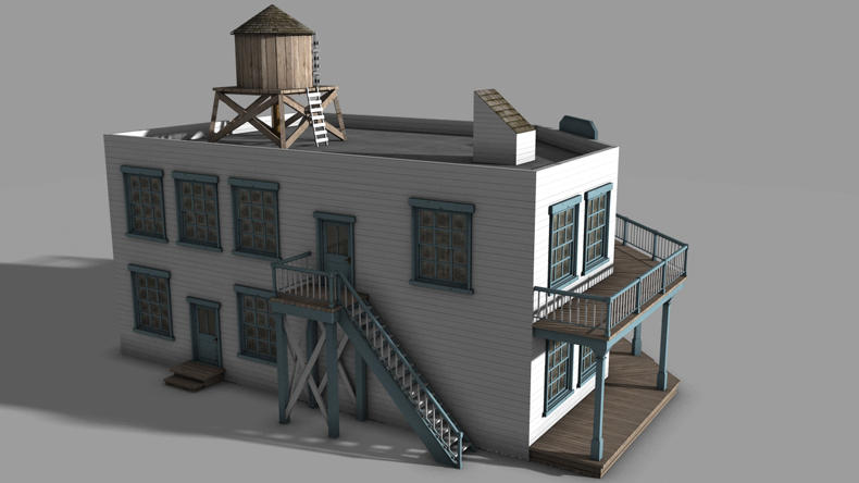
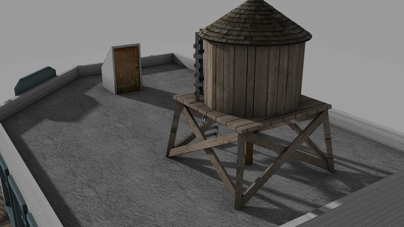
Anyway, I just finished up (I think) my "re-interpretation" of a nice little hotel that Tippy modeled. It's actually the second building I've re-done, but it's the first one of which I have a few renders (done in DS 4.5 RC3) to show off.
The major change I made from Tippy's version -- aside from the color scheme (I mentioned that he tends to a more stylized, cartoony kind of aesthetic, right?) -- was replacing the veranda in his model with a balcony. You know, a place for the villain's cronies to perch and try to get the drop on the hero during the big showdown. Also, like Tippy's, this is pretty much a shell -- pretty (I hope) on the outside, but no significant interior details. That said, I did include a ceiling and floor between the first and second stories (Tippy's is literally an empty box on the inside). It weighs in at a bit over 25,000 polys all told, but that's actually still a little more than 8,000 less than the original.
Next up, I'm thinking a bank building, but I haven't decided yet whether to do a remix of Tippy's, or build one from scratch. Any tips or constructive feedback is appreciated. (And in case I wasn't clear, hats off to Tippy and Jack T. for the inspiration.)
ETA: Oh, by the way... the name on the hotel is after my nephew, not the software. ;)




Comments
This is really cool. I like it a lot.
Me too..................I could see me using something like that. Excellent my friend. :coolsmile:
Very cool....
Thanks for the tip on Tippy's stuff-the proportions don't seem too cartoony to me so if I can get them to load in DS I should be able to rescale them to something I can use.
Your reinterpretation looks cool too.
The windows still seem a little out of scale (a bit large per scale.) The texturing and overall model looks very nice.
Yeah, I lifted the windows and doors directly from the Daz Old West Saloon, and it wasn't until I finished setting up the surfaces in DS that I placed a figure in the scene and realized just how huge those windows are. Although, I think for a hotel, they kinda work. I'll definitely be looking a little closer at the size of the windows in future models, though.
Thanks for the feedback!
My first shot at a Tippy remix was his Old West Store. For my version, I added stairs to the second floor and threw in a dividing wall to create a back room/workshop area on the first floor.
After some of the feedback on my hotel, I went back and re-worked the windows on the store -- this one also uses windows from the Daz Saloon, but I scaled them down a bit in the Y axis so they weren't quite so huge -- which also necessitated re-working the walls to accommodate the newly-sized windows. The signs on the front of the building are borrowed from Tippy's model, and the front porch/walk (which I also re-used for the back porch) is also from the Daz Saloon.
That looks very nice now :)
Scale is great, textures are great, and plenty of room to put furniture.
Here we have my Tippy-inspired constructs (kitbashes, really) alongside a couple of texture-tweaked Daz/Jack Tomalin buildings. Again, my overall goal was to be able to mix and match these buildings without the result being too stylistically discordant, and I think so far, it seems to be working out fairly well.
Left to right: Daz's Old West Undertakers converted to a doctor's office; my remake of Tippy's Old West Store; a newspaper office based on Daz's Old West Bath House; a livery stable (background) portrayed by the Rustic Barn (sadly, no longer available) from Daz's old freebies section; and my reinterpretation of Tippy's Old West Hotel.
very nice :)
Very Nice
:)
Before I started re-modeling buildings to flesh out my little frontier fever-dream, I hallucinated a couple of protagonists -- my "white hats," if you will -- by the names of Durango Jones and Jake Starnes. A bit later on, more townsfolk began popping into my head, like Annie Bryce, who runs the Bryce House, and is sort of sweet on Jake (and vice versa).
In Ride the Heroes (links to full-size/full-resolution version at my dA account,)
Coming or going, Durango and Jake always tipped their hats to a lady. Of course, when the lady was as pretty as Annie, it was more reflex than conscious action...
That is some fantastic stuff.
Thanks!
Here are a few more characters to flesh out my little make-believe Western town...
Keeping the Peace (links to full size/full resolution version at my dA account)
While no one would ever claim Granite Creek was the most lawless town in the New Mexico Territory, it saw its share of rowdiness. The job of keeping the peace fell to Sheriff Hawley Glenn and his deputies, Enrique ("Rick") Aguilár and Travis Blake. They wore tin stars... and they backed them with iron wills and nerves of steel.
I decided not to go with Tippy's bank design, though I may re-purpose it for something else down the line. I've got a rough idea of the way I want to go; I'm still doing research and working on the basic layout. Then we'll see if I'm actually up to executing it.
In the meantime, I've started working on a sort of companion piece to the hotel (companion as in abutting, and in the backstory I'm working out for my little town, owned by the same folks). Here's where it stands at the moment...
Well, my Western project is on hold for a variety of reasons, which can be pretty well summed up under the blanket category of "real life." In the meantime, powerage has released a Wild West Town construction kit over at Rendo that looks to have some pretty cool features.
As for me, I'm not completely idle, and my latest piece has kind of a frontier spirit, of sorts, to it...
"A Stop Along the Way"
Awesome as the road trip was turning out to be, Pete and Tracey were glad to get off the highway for a bit. The Sunrise Inn showed its age, but the owners took pride in the place, and it was clean, comfortable and, in its own way, kind of charming. But seriously... what was the deal with the guy in Room 7?
"Just ASK Her Already!"
"C'mon, Ethan, she's just a girl--"
"She is NOT just a girl, Josh, she's Amanda freakin' SPENCER!"
"Whatever, dude. Bottom line here: you want her to go to the dance with you, you gotta ask her. That's how it works."
"I know, I know. I just need a minute to work up my-- hey! Did you see that? She smiled! She-- aw, man... I think she's smiling at YOU. Bro, that is so not chill."
"Oh, for crying out loud..."
Super expression you have got on her face.
Thanks to the awesomeness of Joequick, rduda, Redfern, BlueBeetle3 and Stonemason, here's a little love for a couple of my all-time favorites...
"Those Two Guys..."
Blue and Gold. Beetle and Booster. Ted and Mike. Best friends, partners, brothers. To much of the world, even to some of their own teammates, they were considered the jokes of the Justice League. But those who bothered to look past their fun-loving -- often, admittedly buffoonish -- exteriors knew the truth: when it came down to it, they were heroes to the core.
Blue and Gold return! That brings back some memories! Always good to see them again.
Some very cool work on those Western scenes. Like the more modern ones a lot too, the expressions on the teen faces are fantastic. I hope real life does eventually let you get back to the frontier town though, it's an impressive project.
Work in progress, based on architectural drawings from 1949 found in North Carolina State University's Rare and Unique Digital Collections.
Still need to do the restroom windows, the overhead doors for the service bays, a lift for the lube/tune-up bay...
I go back and forth on how detailed I want to get. On one hand, I'm not sure I want to model the tracks for the bay doors. Then again, I actually modeled a key slot into the lockset on the front door. I'm wacky like that.
Service bay doors [strike](no tracks)[/strike].
Another view inside the service bays... from shortly before I decided to start over.
Really? Start over. That looked great to me. I'm not even a car dude but I Loved that so far.
Yeah, I got a little better read on some of the details in the source drawings. And I'm no Stonemason or Tomalin by any stretch, but I thought I could re-do the mesh a bit cleaner. Thirdly, it's far from my strong point, but I'm mapping as I go along (not texturing, just laying out the UVs), rather than saving it all for the end; hopefully it'll be somewhat less daunting this way.
Well haven't seen the mesh, but from these images it's looking very nice :)
Thanks.
"Cleaner" is mainly in reminding myself to delete unnecessary hidden faces (from abutting cube prims and the like). The big thing is laying out the UVs as I go. "Developing a workflow" I suppose you might call it.
Anyway... latest WIPs, to show where I've gotten back to (and one with a figure thrown in for a sense of scale). Still need to re-do the non-plate glass windows... and the other thing that leaps out at me now that I see it, is that those interior doors could use some mouldings to trim them out...
What are you using on the upper windows btw?
The architectural drawings I'm working from specify fixed panes of Velvex (textured glass) for those lites. I haven't found a really accurate Velvex texture that I like -- at least, not a "clean" one -- but as a placeholder, I grabbed another textured glass pattern from CG Textures, and plugged it into the displacement and refraction color channels.
Of course, I am straying from the drawings here and there, as well -- artistic license. For example, they call for glass doors on the restrooms, which doesn't make a whole lot of sense to me. Then again, I'm not an architect, so what do I know?