Compositing examples
 reddotmedia_8092aed472
Posts: 35
https://www.facebook.com/video.php?v=10153067822321422&set=vb.210744261421&type=3&theater;
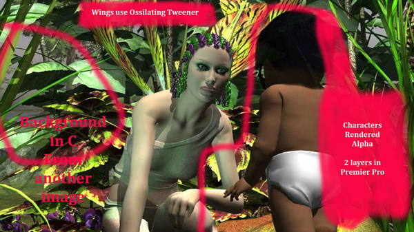
Here's an example of compositing that I did in an afternoon using C 8.5 and Premier Pro (but could be done in most video editors probably...).
Lot's of prep work, but going for fast production, the new pipeline is here, let's see how fast we can go !!!
What you see is a 2 layer "background" with characters, animated in "foreground".
check out the FB page on sig (prodution blog) for complete rundown/details. It's open, anyone can view anon..)
Internet collab not working for you but want to be involved in something; check out my IndieGoGo/Patreon link s
Thanks


DailyUpdateC.jpg
960 x 539 - 149K
Post edited by reddotmedia_8092aed472 on


Comments
Thanks for posting and for your explanation. I wonder if this could be merged with the compositing thread?
Please no... That thread got a bit derailed (and I will very gladly accept some of the blame).
If the OP doesn't mind a general discussion about compositing, tips, methods, best practice and examples in this thread, that would be awesome!
It is very nice work by the way.
Back from skiing...
Please don't merge this thread... it's actually a response to the other one...
I am keen on technical discussions, tips and tricks, etc. and don't like the drama. There's a reason my handle is now AnAlias, btw...
Thanks for your kind comments. If you have any other questions I will answer them to the best of my ability.
Here's today's update, using Gausian blur on background at a bit over 1 to bring out the foreground.
Notice the wrinkly shoulder :(
I think this has been fixed in Genesis but this is Victoria4
Moving along on the storyline/dialogue, fun, fun...
Just to say that this was done in premier pro, 2 layers; very basic.
see someone asking about Fusion and where to start...this is something that interests me but I have not had a chance to work out since this is exisiting pipeline.
But from what a very good friend told me, it's the real deal and this is coming from a shop that uses it alot in advertising and film.
After looking at the demos I see this is MUCH deeper that 2 layers. You an import models and light them in real 3d space. This would be pretty handy for those shot when you have to see them walking; a little harder to do in 2 layers only.....
The titling and particle stuff is FAR superior to "other" software. But it is kind of made for large teams and is pretty vast and cryptic. Would take a weekend or 2 and some coffee to work it out/demo.
But still seems like step 2; like to stick with what I've got (Creative Cloud); expensive, sure but quick and working well so why change on that? May need to give others access to files so they can edit/update/create sequences and it's set up for that.
Anyway, that's my Fusion rant...don't know if that helped.
The wrinkly or collapsed shoulder is from turning off limits when a pose is applied. That's why, when I load a pre-made pose and Carrara warns me it is outside of the figure's limits (which seems like 100% of the time), and wants to know if I want to leave the limits on, or turn them off, I always choose to leave them on. The initial pose may look fine, but if you change it, then it is very likely to collapse the shoulder.
"collapsed shoulder"
cool, good to know about that, I will check it out..looks freaky...
here's the final product on Youtube and a quick screen cap:
https://youtu.be/rIE5ypQ6KJg
Some Blur on background images, that's about it... When rendering a long sequence like this I find it helpful to keep one background image constant, (like the rock), gives a sense of perspective.
Cheers