Colored Cast Shadows In Carrara?...YES!
 DesertDude
Posts: 1,238
Super apologies if this has been presented and/or demonstrated in the past.
One can create colored Cast Shadows in Carrara using lights, despite the lack of a Shadow Color chip.
This expands on a concept put forth by forum member Evil Producer where he cleverly placed 3 duplicated lights, one pure Red, Green and Blue, occupying the same space to create nice rainbow splays using Caustics with glass shaders.
https://www.daz3d.com/forums/discussion/comment/884391/#Comment_884391
Using his same set up, we can control Cast Shadow colors.
But first, a brief intro and some pictures. 
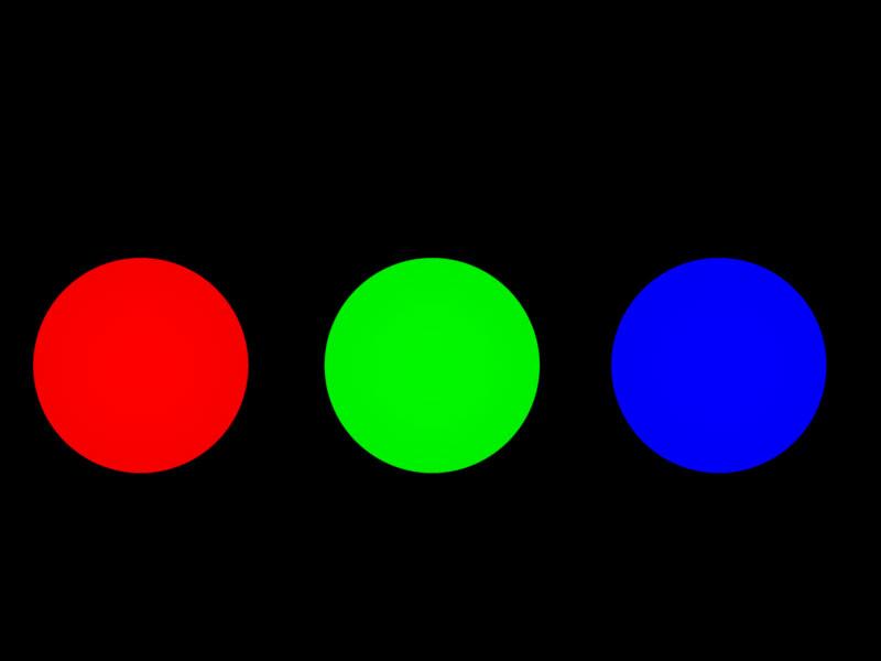
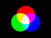
Here are three spots, one each set to pure Red (255,0,0) Green (0,255,0) and Blue (0,0,255). The Radius has been dialed back and they are aimed directly at a white plane - no other lights are in the scene. You can see in this first image the Spot Lights are separated.
In this second image, the Spot Lights have been moved closer together and in the overlapping areas, we see Carrara mimics real life light.
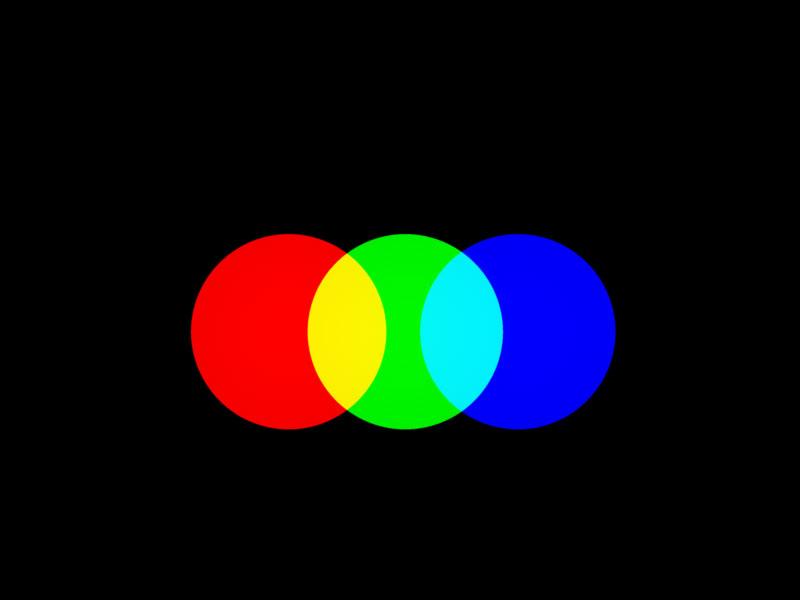
In this third image all three lights are overlapping to produce the three secondary colors Cyan, Magenta and Yellow, and ultimately, pure white where all three overlap.

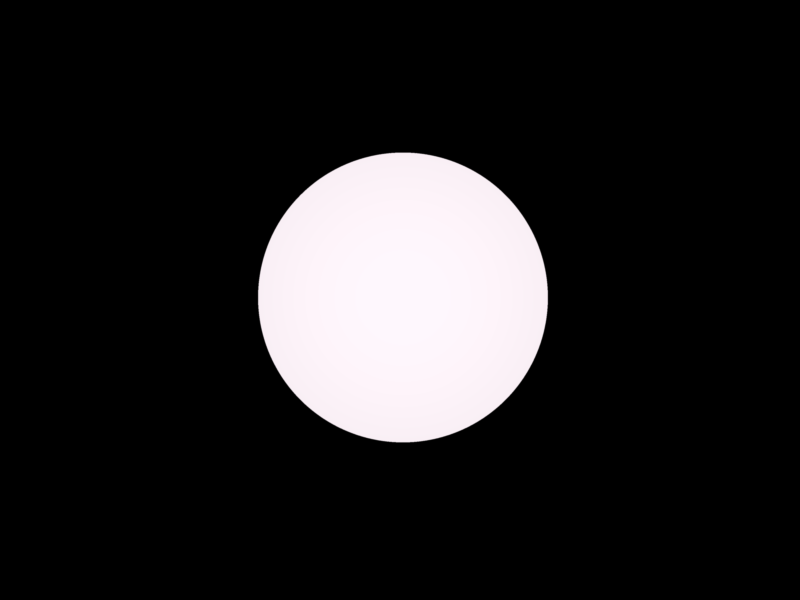
This last image shows all three Spot Lights occupying the same space. They produce pure white…well,almost. It does looks a bit "pink". A quick Eyedropper reveals RGB values are: 254,247,253. Putting that discrepancy aside, it is theoretically correct. 




Comments
For convenience I grouped the Spot Lights together and named the Group RGB_Light_GROUP.
In the following examples I opened each Spot Light to their maximum of 90 degrees, and all three occupy the same space.
In the first render the shadow is as you would expect - the stick casts a black shadow. But if we start to separate the lights, the shadow starts to split into color components, and if we move them even further apart, we see those components completely separated.
So it seems Carrara can cast colored shadows, but how can we access them?
Using the same RGB_Spot_GROUP, with all 3 lights occupying the same space, you can use the Shadow Intensity slider of each light to dial in color to your Cast Shadows.
Here are examples with screen grabs showing various extreme colors and their settings. It can be a bit counter intuitive, but think about like this: When all three lights have their Shadow Density set to 100%, they are blocking the light 100% from reaching the shadow. In the example showing a pure red shadow, the Shadow Density for the Red Spot is set to 0% - we are un-blocking the red light and allowing it to flood the shadow.
Not sure if that’s really what’s happening, but it seems to work. To keep the shadows more neutral in color, keep the values for each light’s Cast Shadows slider similar. The following examples are extremes, and of course look unnatural in the gray environment, so just for demonstration.
You can get some nice subtle “zing” on the shadow edges if you offset the lights from each other by just a small amount.
Here is a sphere and for the RGB_Light_GROUP I nudged the Red light and the Blue light similar to the first configuration in the previous picture. With a little bit of Soft Shadows enabled it gives a nice glowing effect., even if not physically real.
Beware, however, that with the lights offset one side of your object(s) will be cast in a slightly biased color than the other. In the picture above the sphere is bathed in a warm light. The following picture is taken from the other side, and is bathed in a cooler light.
I tested this on three different light types: Spots, Bulbs and Distant Lights.
Be aware however if using Distant Lights. Offsetting them won’t work for that color fringing trick, you have to change their angles, and by very tiny amounts.
In my test I have 3 Distant Lights, slightly offset for visual clarification. I then Grouped them.. If I want that color fringe I change the angle of the Z axis for Red to 1 and for Blue to -1. I can reverse the color fringe by reversing the angles.
And here is a test render of something besides a sphere.
While I like the cast shadow color, I wanted the cast shadows of the cream casting on the cake parts to be a bit warmer. So I modified the scene so only the Cast Shadows falling on the cake would show up in the Shadow Pass using Multipass Rendering. I then used that as a matte in post to warm up those shadows only.
Don't delete your attachments, the inline image is a link to them and won't work without (unless there is already a cached copy, as there is for you).
Ok, thanks for the heads up, but...are the images not showing up? I didn't delete any attachments.
Your second and third posts have no images or attachments. The others all have images and attachments..
Ok, that was weird, my thumbnails vanished in the second post. Corrected it now, hopefully others don't randomly vanish.
Argh, how weird, thanks UnifiedBrain. What is this, whack-a-mole?
Fixed
Successive posts can be an issue, try rfreshing after each (if you still see the attachment under the text box after making your post that is a bad sign) - sorry, I forgot this little wrinkle
OK, good to know and thanks again for the heads up. Yeah, this was the first time I started a thread then immediately temporarily reserved the next five slots and then edited those with the content.
Cheers
I think I'm seeing most of the images ... in any case, many thanks for the ideas. All this time I've been pleased with myself for using shadow catchers in animations with just dark shadows, saving precious render time in a two day animation constest. Colored shadows will be a nice element in some animation ...
ah yes, this is something I always found annoying about DAZ studio, because being a Carrara user I expect coloured shadows, iray has improvec things a lot but getting a spotlight to work in that properly is difficult.
Carrara on the otherhand sometimes the shadows are Too Coloured in my experience
Hi Wendy,
I'm simply pointing out you can, that's all.
I don't know anything about DAZ or iray or anytihng, simply trying to showcase Carrara's abilities 'out of the box'.
Often based on watching videos on different topics of different software, and I'm like..."huh...can we do that in Carrara?"
Thanks for the detailed step by step. Great to know, especially about the tiny adjustments to distant lights.
I think I completely misread and misunderstood your previous post, I'm sorry if my response sounded like a total jack a....
Cheers
Thanks Diomede.
There's actually more, lol, part 2 coming soon...
Cool, I hope it sparks clever ideas.
nice work @DesertDude , thanks for the detailed blow by blow - always terrific to have ideas explained in a logical way :)
it's OK, I was just showing my usual smugness DAZ studio still cannot do stuff as well as Carrara even if it is improving
my opinion only
This was inspired by reading about RGB MultiMattes for Cast Shadows in Jeremy Birn’s book Digital Lighting & Rendering: Chapter 11, “Rendering Passes and Compositing” (mine is 2nd edition, it may have changed since then).
In this simple scene there are three basic shapes, a sphere, a cone and a cube. They cast shadows both on the floor and the sphere casts a shadow on the cone, and the cone casts a shadow on the cube. If you wanted to isolate those shadows, even with a Shadow Pass, it would be tedious to make proper selections.
You can create a 3 in 1 matte which renders pure Red, Green and Blue values for easy manipulation in post. Carrara’s Shadow Pass will render colors.
However, using a dedicated RGB Light Group, as previously explained, and light linked to each object met with failure because each successive light group worked to add lights upon lights and resulted in a blown out Shadow Pass, never mind the Beauty Pass, which we discard for these purposes anyways.
The following images demonstrate the successive blown out image. The first shows the sphere only - it has a light group set to cast a red shadow for the sphere, the floor plane and the cone. If we then dedicate a light group to shine on the cone to cast a green shadow, you already see the Shadow Pass looking unhelpful. Adding the last light group dedicated to the cube totally blows out the image.
This is because in order to get the sphere to cast a shadow on the cone, we have to link the cone to that light group. And same for the cone to cast a shadow on the cube, we have to include the cube in the light group aimed at the cone. The resulting Shadow Pass is a hot mess.
Even if we separate the floor shadows from the cast shadows on other objects we still get a washed out Shadow Pass.
Mr Birn writes: “You may need a workaround such as giving the light a negative intensity and a negative shadow color. Regardless of how you set it up, packing three shadows into each shadow pass is more efficient than rendering shadow passes with only one shadow, or a shadow pass in which the shadows cannot be separated.”
Carrara does offer an option to use a negative light, and with some experimentation I was able to get it to work…for the most part.
For this to work we need to make some adjustments to each of the RGB Light Group’s parameters:
For the Red Shadow, click the ‘Negative’ box of the Red Light only and set all Shadow Density sliders to 100%
For the Green Shadow, click the ‘Negative’ box only and set all Shadow Density sliders to 100%.
For the Blue Shadow, click the ’Negative’ box only and set all Shadow Density sliders to 100%.
Then light link each light in each group to a specific object - the sphere has the lights in the Red Light GROUP, the cone the Green Light GROUP and the cube the Blue Light Group.
Upon rendering, the Beauty Pass looks like a train wreck (discard it), but the Shadow Pass will now have pure Red, Green and Blue Cast Shadows of each dedicated object, which can then be easily isolated into individual discrete mattes in post.
Unfortunately, the same problem arises if we try a separate pass for the objects that cast shadows upon each other. To cast the sphere shadow on the cone, we have to include the cone in the light linking of the Red Shadow. And to cast the cone shadow on the cube, we have to include the cube with the light linking of the Green Shadow. Even excluding the floor plane from the mix, by unchecking the ‘Receive Shadow’ box, the pure colors get wrecked, making easy selection of the masks a mess.
So, depending on the usage, one may have to create 2 more separate mattes, or, create mattes where the lights don’t cross each other, if that makes any sense.
I need to dig up my old posts on RGB mattes which I never really solved, but now have a better understanding of what is happening, to further demonstrate. More to follow.
Wow, great stuff.
And thanks for the chart.
this is an example of where I think the shadows are too coloured
the green ones cast by the leaves obvious 2:50 on the bowl and ladle
sorry about the Flowframes interpolation, without it the video is very fast, my original was actually 10fps
click video
Cool, thanks. Carrara is forever clever and I love cheats.
Hi Wendy,
Cool video. That interpolation stuff is wild.
I do see the green shadows you are talking about. Without knowing the Shaders of the plants, I suspect that there is an intense color in the the Translucency Channel for the leaves.
In this example I plopped a gerenic Plant into an empty scene, converted to a Vertex Model and isolated a single leaf. I then made a new Shader and copied the Color of the generic plant leaf, then copied that into the Translucency Channel. The RGB values are R 14 G 180 B 0. I then made several renderings stepping down the values in the Green Channel. You can see the shadow is nearly black when set to zero, but a tiny bit warm due to the Red Channel value of 14. Using a straight Value slider will yield simple shades of gray.
all in all an interesting subject ~