New Carrara Freebie - Carrara Kanji Kit 1
 Dartanbeck
Posts: 21,563
I am endeavoring to assemble a new cyberpunk city in Carrara using PhilW's Day and Night City and Central Business District - there are so many options - it's so customizable and easy to work with.
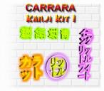
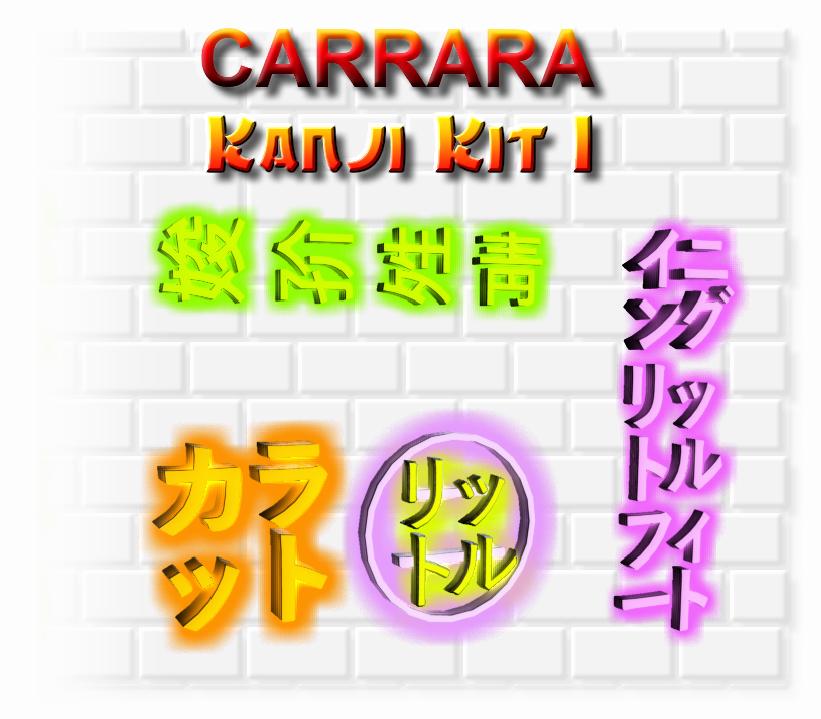
I wanted to have some Kanji-like neon signs that I could place around here and there. There's a really nice Kanji Kit in the store, but I don't have any funds right now. So I started making my own. They turned out to be pretty fun to work with, easy and fast to render, and since I have no clue what they mean (or if they're even Kanji) I can flip around and change their shaders to make these six props work for so much more.
I was just about to take a break and watch some Blade Runner: Black Lotus, then come back and start building the first part of my city.
Then it occurred to me: I should share these with the rest of the family! So here I am... sharing! LOL
Enjoy... if you want ;)













Comments
Kanji Kit 1 includes:
Kanji 01
Kanji 02
Kanji 03
Kanji 04
Kanji 05
Kanji 06
I would want at least a hint what they meant
I mean it could be Sushi bar but it also could be something risque
As I know not everybody likes using the Aura effect, I didn't apply it to the props in the pack.
Easy enough to do if you want to.
Aura can be added globally to the whole scene, which can be useful but may also cause unexpected results, and it can also be applied to individual objects, which is how I use it most often, because this gives us control over each Aura for each glowing object.
With the object selected, go to the Effects tab in the Instances tray. Enable Aura, then open the Aura settings. Turn on Distance Attenuation and I always reduce the distance setting.
In the promo I'm using ranges between 4 and 6.
Me too... but I don't. I really want to get my hands on KANJI - Japanese Ideograms for Daz Studio
I know I can make these work in Carrara... I just know it!!! Plus, perhaps learn a little Kanji along the way!
The most important one for me!
My Beautiful, Wonderful ROSE!!!
They should be harmless - I got the ideograms from Windows Character Map.
Here's my initial start with CyberCity.
Not sure how many of you have PhilW's City kits, but I have to say that this is such a great city construction kit to work with. I've purchased a Lot of things from Daz 3d. I'm still perplexed at how some artists arrange their products in the library, and that Daz lets them. For example, I started collecting an urban neighborhood series. I start building the block (buy all of them to complete a block of quiet neighborhood) and I didn't seem to have everything. So I check my account. Sure enough... I have all of the pieces. Hmmm... This is where DIM really comes in handy. Where is This?
The 'collection' meant to all fit together in the end aren't even in the same general vicinity within the DS library! WTF?!!! I mean... this is from a respectable artist, been at Daz 3d as long as I have, and longer. I just don't understand that!
Phil's aren't just close to each other, he put them in the same fricken folder, divided into subfolders to make it easier - there's a Lot to these kits.
Thanks PhilW!!!
So anyway, there's blocks of buildings that we can replicate if we need Huge. Each block is full. We can rearrange the pieces all we want, but when we load in a block... it's complete - even the trees.
If we want, he gives us low poly people, cars, signs... it's a really nice kit!
It's also meant for long shots. When I started this city, it's meant for fly overs signaling where we're going in the film. This shot gets pretty close. Not the optimal angle, but I wanted to show how nice this low-poly environment looks fairly close up. I was going to remove that tree - that is... until I saw how nice it looks. Look at that thing! Nice fricken tree!
I have it dolled up with some dystopian goodness. Once Lorenzo gets to that food stand I can finally buy a stir fry from him as I continue building. I better add him next!
Okay, a little more explanation now that I see it's a little confusing to see what's going on. You can kinda see better if you click the image.
So we're looking all the way through four large city blocks, and the sky scrapers are waaaay back there. Once there are people, vehicles, smoke elements, etc., in there, we'll see more clearly what we're looking at.
So far it's built out to a full square and we're not quite all the way back. I was sitting in a park area looking down the street when I took this picture.
One could say that I should back off on the volumetric clouds and atmosphere. But that's only because we don't have life in it yet except for the magnificent trees. Damn those are some nice trees Phil!
Tons of buildings, skyscrapers and other things to build a city with. I'm having So Much Fun being back in Carrara!
And this is - "pretty interesting" - Thanx +
Besides PhilW's Night and Day City and Central Business District kits, I'm using future elements made by Coflek-Gnorg: Techno Town and Sci Fi City. Mostly just a few signs, the info stations (one by the tree) the food cart and those support structures we see all over. Since Coflek-Gnorg's kits had those cool futuristic street curb lights, I also used his streets combined with Phils. Phil's blend into the other, giving it that wet look. I love happy accidents, and that's one of them!
Once we get a few blocks laid down and move them into position, we start thinking about what the characters are doing and where they need to go. We want that journey to be really cool, no matter what else is going on. I used to try and fully dress out Everything. But that was just me not having a story, not knowing what's going on, and just wanting it to be a situation where no matter where we take a picture, it looks like it should.
With this, I'm dressing out other areas because we Will see parts of it in passing. But I'm mostly focussed on a specific set of motions through this place.
So after the blocks are intitially laid out, we start to notice the signs on the tops of the buildings and other elements included in each block, and move them around how they work best for us.
I'm blown away again at how easy this is to do in Carrara! Zooming the camera in and out? Wow! Why can't we do that in Studio?!!!
Grab as many things as we want and move them all together, even if their not in the same group! Ouch! That's So Good!!!
Carrara truly is King! I love this software! I really like Studio now too. But Carrara makes all of this just So Fun!
Thank YOU!
Here's a screen shot of the scene so far. Some of the skyscrapers aren't showing up.
Look at the lower center of the work area. Where the transform tool is indicated - that's the camera I shot from. So you see it's quite a distance to the other side. Just that there's a lot of fog and aura-effected lights. That will calm down as the space gets occupied.
Below we see the nighttime Skyscraper collection from Central Business District. To the left of that we see that well-laid-out browser folder PhilW left us with. I love that!!!
Oh... and if you look at the skyscrapers toward the top of the image, you might be asking: "Why do they go so far below ground?"
Answer: Each of the various 'steps' of elevation of each skyscraper is adjustable! Need the fattest part to be higher? No problem! Maybe that fattest part is all you want? We can do that too!
This system, like everything Phil does, is Very Well Thought Out. What a genius city system! And who gets it? Carrara Users!!! Yeah!
I love that Carrara 8.5 Pro and Bryce 7 Pro are in the Historical Top Sellers category!
Hmmm... I'd bet that, if a new update was released for them, they'd sell!
Carrara Z for Two-Thousand, Twenty-Three!
Thank you. Very generous of you. Looking forward to seeing your animations with these resources. I am adding them to my toolkit. Much appreciated.
My pleasure!!!
~ you're more than welcome ~
that's a wow image and thanks for those Kanji.
I once had a patient who'd been part of the occupying forces in Japan directly after the war.
His juristiction was quite large.
He used to go and visit the villages in his area to see how things were going/
He got a local man to write, what he thought was' Commander Smith from Australia' in Japanese on the side of his jeep so the locals would know who he was.
But when he drove into the villages people would take one look at his jeep and all run off with panicked expressions on their faces.
One day he asked one of the villagers why they were running away.
Turns oy the inscription on his Jeep read "torturer and murderer of children"
I look forward to using your Kanji for good and not evil purposes ;)
Wow!
Trying to keep myself from getting side-tracked, I'm in DS tonight rendering a bad guy with a minigun chewing his cigar walking up to lay waste to things. I sure hope he gets his in the end! He's Bad!!!
It's all tied to this place, however. So I also have to keep pushing on my CyberCity. It's going to look much different the next time you see it!
LOL! During one of those last big sale events I spent my Daz + coupon and bought the Smoking Paraphernalia Bundle. Having this guy chewing on his lit cigar while he walks with that big ol' gun makes that whole purchase worth it already! I love using FACS. I don't have it on this fellow yet because he's Genesis 1. But just from using it as often as I have lately I use a lot more of the subtle little facial morphs than I ever did before. I'll be making FACS for Genesis and Genesis 2 sometime. I'll announce it when I do and make it a freebie.
Anyway, the bad guy's render is nearing completion and, his chewing and walking is So awesome! I still think he's a big jerk though!