Carrara renders in book trailer
 guido_2244424
Posts: 16
Hi there,
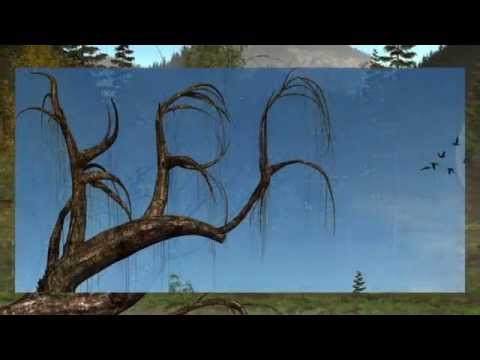
Some new material, ambiance imagery for the first chapter of the novel KRA by Aguidon, is watchable now at  .
.
The sound, especially in the beginning, has been pumped up a bit too much by Youtube by the way. So, be warned.
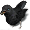
All still images have been rendered in Carrara.The rook at the end (the 1 second animation : ) has been done in Studio.
Cheers

Post edited by guido_2244424 on


Comments
beautiful work guido
you obviously have talent plus
Great imagery. I was intrigued, so I looked the book up your site and the book.
http://www.amazon.co.uk/Kra-Aguidon/dp/9082357801
www.Aguidon.com
Thank you!
Tnx,
The book's front cover is, of course, also a Carrara render.
I initially intended to make a complete animated film. Carrara really does provide nice features for automated animation of water, clouds, trees and leaves in the wind. However, realistically animating characters, animals and humans is rather difficult and time-intensive. Besides that, it would take a huge amount of rendering power for every second of film.
So for now, there is a book, the novel KRA, and just a number of still images here and there on the web, like on my Facebook and Twitter page.
And as of yet, also another one down here : )
Don't get me wrong, I completely agree that Carrara has plenty possibilities for animating characters! There is also face-recognition and all kinds of motion tracking software.
Making several high resolution characters realistically expressing themselves and moving around in this fairly complex environment is not only a big load on the system and very time-consuming but also a form of art which I do not master sufficiently (yet : )
And yet another one.
This might as well be around the 5th. page of chapter 1 of the novel KRA by Aguidon : ).
Gorgeous. That would make a much better cover (the left side) than the one you currently have. It has the rook, as the central character, nicely framed. It says to me, "this is a book about a rook."
Unfortunately the current cover, and also the blurb says very little about the story. (Come to this with the eyes of a potential reader: You're trying to sell us the book, but you tell us things we don't want to know and don't care about. The quote right at the end -- which I have to click buttons to see -- is a great hook. It tells me everything. Move that to the beginning, don't say "from the back cover" - you're just wasting space, and lose the word "Just", it's negative.
Sorry to sound mercenary, but if you want the book to sell, you have to sell the book. You only have 6 lines to make your sales pitch (before the More button) and grab the attention of the potential reader. Use it wisely.
"A tale about a young rook
that is found by a boy
who encounters a girl and a dog.
[...] and a shiny black marble."
That's your hook. That's what'll get them wanting to know more.
Thank you for this comment!
I had no intention to post a link for the book product page but it happened anyhow. Your comment made me look at the product page once more and you are absolutely right. The order of the text has been changed now but it will need some time to spread over all Amazon stores. Thanks again, I really appreciate it! Sometimes, one needs another pair of eyes to see things clearly.
The current front cover image seems like some "ordinary" postcard or something, showing a nice landscape and not much more. This image contains many elements of the story however. There is the cottage, the crooked willow tree near the stream, the castle and if you would have a magnifier, even a fly, dragonflies etc. The rook plays a central part in the tale but it is not the main character. I could think of many alternatives for the front cover but it is also a matter of taste and making choices at a certain time but I always welcome opinions as one wants to keep developing.
In an effort to prevent this from becoming rather off-topic, another render.
It is the same scene as the book's front image but here, the camera points to the East in stead of the West. The renders are all about the first few pages of the book. Later, a boy is introduced in the tale and the story gradually focuses more on people and plot...
Sure. I've gone through many iterations of cover design and blurb on my own books, so hopefully I'm saving you a bit of pain down the road. The cover image has only one purpose: to persuade someone to buy the book. I appreciate that it showcases the world you have created, and that you want to show it off to the world, but that really only interests people who are already fans (or who just like it as artwork).
I picked up on the rook as the main character, since you said this is "a tale about a young rook".
Anyhow, it's stuff to think about. I'll shut up now.
I think Tim,as a veteran author and artist, is right. And it's not off-topic to present your work. We all use 3D for different reasons and it is great to find fellow book or media cover illustrators. I also produce book covers but do not have any control over the titling or blurbs... sigh, as I have not written my own...yet.
I like your new render as well. It's true, you want your book cover and blurb to hook the potential reader/buyer from the very start. I have glossed over books that just don't tell me enough, even if they show up in specific searches. Or others that have such a long blurb that my eyes glaze over. Don't forget to use relevant tags when selling on Amazon, eg. So many books never come to readers' attention because of a lack of relevant keywords!
Nice dragonflies... I was looking for some for ages for an illustration I did a while back. Took a long time to find any.
Attached is a WIP for a book that has a very long title, and is part of a series (hence the huge sky), then the author's info will go at the bottom. It's not what I'd really want, but the author wanted the "mists of time", snowly mountains, Northern Lights, and semi-transparent people on horseback with weapons that had to be visible against a night sky. Hmmmmm.
Keep on creating and publishing, Guido! SileneUK
Thank you for your input Silene!
To avoid any confusion, I show the full cover of KRA.
I reduced its original size with 50% and it is now 3534 pixels wide.
(shown with 800 pixels width down here)
Can I just ask what resolution you rendered the original artwork at, and how long did it take?
@Silene: Veteran. Ha!
I think you need to adjust the lighting on those mountains to better match the sky. Have you thought of trying to do a NPR render on the figures? Something that has a strong outline might work well? Just a thought.
The original front cover of the book, the right side of the total cover, was first rendered at a poster resolution of 5120-7680 and took over 30 hours on 6 machines, each having 4Ghz 8core cpu’s, if I remember correctly.
But for the book, a resolution of 300 dpi is sufficient and thus the front has been rendered with a width and height of 2660 pixels to allow some overlaying on the spine and the back cover. This took less than a day on those 6 machines I think.
The whole cover, the photo of the rook and the texts have been done with image editing software. On the back, you see a photo I took of a young rook in my garden, a little over 10 years ago.
Very cool! Proud of you, mate!
Tnx,
Here is a 1:1 piece of the poster render mentioned above to get an idea of the size.
I found the map for this moonsphere somewhere at the NASA by the way. So it should be fairly accurate : )
That's awesome.
Yes it is!! TA, I sent you a PM... thanks for your advice. I may be revisiting this scene as I have time before it's needed. SileneUK
Perhaps this is the path near the stream and the old willow tree where the novel KRA begins...
Lovely! Are there also illustrations inside the printed book? Or are all of these for the trailers/animated versions, etc. So much hard work to create/produce the images/animation... AND to write as well. Sigh...... Thanks for sharing. SileneUK
I did consider creating a book with an image for every chapter.
But photographic pictures like these need different, real white, and a bit glossy paper, which is less “comfortable” for reading hundreds of pages containing only text. And it would become rather expensive as well so I deliberately chose to make the book a conventional text only reading book.
These kind of scenery images try to represent what I have in mind and are a kind of mood setters in order to taste the ambiance of the novel’s first pages. All renders here are the remains of my initial intention to create a film, the cover of the book as well. But the book's inside contains no further images besides a rook in grayscale on page 3.
All images shown above are prepared in the same scene. The camera positions are different of course. If you see the sun, the camera looks to the East and if you see the moon, it heads to the West.
Perhaps one day, I’’ll make some animation for the first few pages, just until the boy comes into play, wakes up from the screams of the rooks and opens his eyes. But even that would take a fair amount of time animating a fly, dragonflies, rooks, various birds and an owl, and of course the camera, the leaves and such, plus crispy sounds and music.
For now a render from another file. You may recognize elements of Howie (my product list contains lots of nature scenery stuff : ) but I probably did some extra shading, additions or alterations. Lights, clouds and fogs always lure me to keep on making tiny changes…
Have a good weekend!