Suggestion Needed
in New Users
I've been dabbling with Daz for a while now and below are some renders I created recently.
Though, in some ways, they look nice, I still feel there is still something missing.
In your eyes, how and what should I improve? Visual effects, lighting?
Any suggestions are welcomed.


Sunset.png
1920 x 1080 - 3M
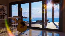

Jill's Villa Livingroom View.png
1920 x 1080 - 3M
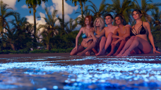

Sunset 2.png
1920 x 1080 - 3M


Girls by campfire 4.png
1920 x 1080 - 3M


Comments
They look pretty nice. Well, different ppl may have different thinking about composition, lighting pattern and the ways of post-work, etc. IMHO, you may consider -
#1, Make their buttocks sink in the sand a bit, and add more DOF to the foreground, as well as more rim light to the figures.
#2, Add a bit DOF, foreground or background, well the mood could be different. You even can darken the foreground to some extent (left, right, or both sides), tilt the guitar a bit and move the camera more closer. The 'feeling' might be different.
#4, Sparkles seem a bit away from the fire ? And may rotate the camera to have some subtle change ...for instance, let's see thru the ppl on the right from the fire a bit, with some DOF on the left ? Now it looks 'too balanced' in terms of composition.
Just for your ref.
Thank you, crosswind! It seems that I should pay extra attention to camera placement.
By adding more DOF to the foreground, do you mean to have a stronger blur to the figures in order to enhance the background(the sea and the sky)?
+1 to using push modifiers and other techniques to have the buttocks sink in the sand and seats/tree a bit. People are squishy and when sitting tend to sink into things. Since the tree doesn't move, the skin/body will since that's what happens when you sit on something hard. For the sand it will work both ways. You can also add lots of footprints in the sand around the fire.
Yea, a bit blurry on the backs of those figures, as the most beautiful focus is the sunset over the sea horizon, right ?