Need advice: how to improve the composition and post work of this render?
Hello everyone,
I am in great need of advice on how to improve the quality of my scenes. Maybe, for a beginner who started with Daz3D three months ago, I am aiming a bit too high, but when I see the incredible renders posted in the gallery... I really want to try and, most importantly, understand how to achieve such results.
I have already created 200 scenes in Visual Novel mode, where quantity takes precedence over quality for an obvious reason: progressing the story. But I wanted to take a little break and dedicate myself to a single, special image, an image that has a real purpose in its composition.
Idea: an end-of-day medieval scene where a girl is holding the main character by the arm. The girl's expression, a bit teasing and daring, perhaps suggests an invitation to spend the evening with her, with dinner and maybe more if there's chemistry. So, in this scene, I wanted to capture: the girl and her expression, beautiful sunset colors, and the invitation/activity for the evening.
Here is the first image I created:
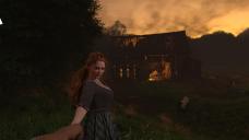
There are some things I like, but others not at all.
What I like:
- The character's expression
- The three-point lighting technique around her and the resulting Rembrandt triangle
- Successfully defining the background of the scene using trees + UltraScatterPro
- The color of the sky
- The quality of the assets
What I don't like:
- The uneven terrain and the fences that go into it
- A sense of imbalance in the scene, where everything is in the center?
- The scene still feels a bit empty, even after adding the sheep to fill the space
- I didn't manage to capture the invitation/activity for the evening. The barn is too far away to add details that could tell a story
- The lighting of the barn
With the viewpoint of this first image, I couldn't see how to encapsulate the evening activity I wanted to convey in the scene. And for the understanding of the picture, I imagine it's more important than a beautiful sky. So I made a concession: removing the view of the sky and getting closer to the building to have more details on it or what I could place around it. I also made the decision to build my own ground (which required a very laborious use of planes + dForce + simulation so that the planes conform to the slopes, allowing me to cover these same planes with foliage using UltraScatterPro).
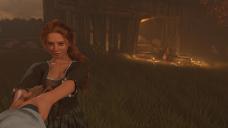
Here is the second image I created, focusing on the activity (a meal in this case):

I had a lot of trouble highlighting the meal. Initially, I wanted the barn light to illuminate the scene with a cone of light, but it lacked impact. Then I had the idea to place plenty of candles, which maybe adds a more romantic touch to the scene while enhancing the brightness where I wanted it. Despite this, I am not convinced by the result. The meal in question is not presented in the best way... and I don’t know how to improve this aspect; I am out of ideas. I kept the sheep to make the scene less empty. I maintained the three-point lighting technique with warm light; 5000K for each square-shaped point light (40x40). Lower than that made the girl’s skin too orange. Perhaps there’s something to improve there as well...?
I also tried something more atmospheric by adding a kind of fog using the "Iray Light Volume Kit." I'm not sure if it's a good idea in the end, but here is how it looks:
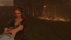
And then I became interested in post-process work. I just bought Affinity Photo 2. Even though I watch tutorials, I see how to do certain things technically, but I don't know why I should do this or that. Actually, I'm at a point where I don't even know what I should be looking for, apart from "getting an even better image" if possible. The only thing I managed to do was add a bit of contrast via an S-curve:
I would also like to hear your opinions on the matter—what is your process when you reach this stage, what you think might be wrong with this image, what could be improved, and what post-processing steps might still be needed?
Thank you for reading, and thanks in advance for your comments.




Comments
If you visits the New Users Forum they have contest every month that teaches you how to use Daz Studio. Its basically a beginners course. If you look through previous contests there are a lot of helpful links with tutorials on all different subjects.
The biggest challenge is the time of day. These twilight shots are the toughest to render because there is generally less light. There is a rule of thirds guide built into Daz Studio, put it to use and reframe her slightly.
I'd give her a lantern in her free hand guiding the way, and that can provide much need lighting for the female to help her be the focus in the scene.
Also suggest a more open pose of the male hand with the fingers clearly defined, there is an awkward claw thing going on.
Otherwise I think these are both classic medieval romance setups with good storytelling potential.
I. Basic composition.
Here is a 3x3 grid (rule of thirds) over the image. It is not a strict rule but a very useful one.
II. And here I made a first attempt to use it on your original image. I also changed the lighting because IMHo it is too dark, I will address this in the "Story" chapter.
But you can see that the tonal range of both parts, the girl and the background are different. It looks foggy and this makes the composition artificial.

III. Some adjustments.

I am adjusting the composition and equalizing the tonal range of both images. I have the feeling you are limiting yourself to "real-life filming limitations on location". Yes, you put the characters on the terrain. I am assuming their feet are touching the ground... But we are not seeing them, so we can put them either below or over the ground. Notice how both the girl and the barn door now have a better placement in the frame. Aditionally, you wanted some sky... here we go!
IV. The other framing has the same problem.
V. And here is an updated composition, and relighting. The colors are really off, because when adjusting the brightness of the image the saturation is also increased, so the image became really orangy. That needs to be fixed on the original lighting.
VI. The story.
1. First, get rid of all the animals. I have seen a lot of horror movies. A beautiful girl dragging you to a barn with candles already lit? And a goat there? Have you seen the movie The Witch with Anya Taylor Joy?
As you see on the re-composition you do not need to add stuff to have a balanced frame. You need what you need for your story in the frame.
2. Ok. Let us think it is not a horror movie. If it is going to be a romantic scene probably the time of day is not the best. If you are going to have a nice dinner, and later whatever, do not start with the whatever.
3. This introduces me to the light. You do not use a 3-point light on a natural scene, because it breaks the uniformity of the light across the scene. Again. In an ideal filming world, you put a humungous light also in the barn. As we are not seeing the sun in your HDRI, simply put a sun. After noon sun, low on the horizon, orange tint, makes it even a bit diffuse so it does not have strong shadows. The light does not need to be accurate. It needs to make the scene look the best it can.
You can not have a dramatic light emanatinf from a barn in "medieval" times. Make it more natural. The light is not that important on this scene.
4. Additional tips. Differentiate the colors of the dress of the girl. Probably some red (will look nice on a red-haired girl), probably some yellow or blue. Not green and brown because you do not have a separation between the grass and wood.
Do the same with the dinner table. If you put a red dress, try a red tablecloth.
5. An additional note. The pose of the girl is great. Congrats on that. Just re pose the fingers of the guy for each frame. The fingers look weird in the second scene.
VII. References.
Yes, you could use a backlight golden hour sun (examples) That is a 2 light setup. A the sun, B a softlight on the face (and barn).
But that will sacrifice the light on the dinner, because the barn will block all the backlight. So use more natural light.
VIII. Is your monitor brightness correct?
When people renders a scene really dark, I wonder if their monitor is too bright. Let me spam you a basic tutorial to have a decently calibrated monitor. https://otake.com.mx/ColorCalibration/
Hello,
Thank you all for your responses!
@frank0314: Ok, I really took longer than I should have to realize that there are actually two subforums for beginners. I had never seen the one you mentioned! And I see there is a new contest that has just started (and the theme is open, phew!), so I think I'll participate. :) (However, having looked at the last three contests, while I see that general advice and links are given, I don't get the impression that specific comments are really made [as I'm asking for here] on the scenes created).
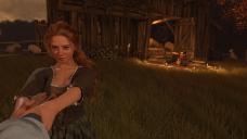
@FirstBastion: The rule of thirds! Thanks for mentioning it, I really need to keep it in mind! So, I redid the scene, which allowed me to fix the hands, and I find it looks much better indeed (I also play a bit with Affinity, which ended up by giving more luminosity / saturation to the lights. Not sure if it was the move to do, but here we are):
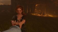
Small note: I am well aware that twilight and night scenes are difficult because of the lighting, but what really killed me, and what I spent hours on, was precisely the positioning of the hands of the characters in opposition. Moving the girl's hand a little means moving the forearm and then the arm... And the same goes for her other hand (and forearm and arm) since her hands are on top of each other... And the same for the man! It was a nightmare. =D
@Rafael: A lot of things, thank you for all the details and the screenshots!
Firstly, addressing your last point: my screen is probably not the best calibrated in terms of brightness, because I can always see the number 1 on the test you asked me to do. And this even with my screen brightness set to 0 (which is really unpleasant, unfortunately, I can't see myself doing that :/). Maybe it's because it's a TN panel...?
Next, the rule of thirds: I had already read FirstBastion's comment, so I had already tackled it, and I see that we went about it differently. Instead of cropping the image, I moved the girl to the left vertical line (which required me to reposition the hands again, by the way...)
And while you mentioned increasing brightness, I think I actually enhanced the contrast using Affinity Photo, and darkened the image even more... (while also increasing the saturation and the orange tint on the right side of the image, indeed). But on the other hand, I don't know, it makes the candles stand out even more, and the more I look at it, the more I think I like this somewhat foggy and ethereal ambiance...?
Otherwise, you are right, my characters' feet are indeed always on the ground. I guess I need to learn to break away from the rules of physics, especially when it's not visible on screen.
Story part: Haha, I see exactly what you mean (never seen the movie though, if it's a horror film, there's little chance I'll watch it, I hate being scared =D) It’s true that it can give off a very satanic vibe, now that you mention it.
Ok, I should avoid the three-point lighting technique in an outdoor scene. Just to clarify, I don't use HDRI, just sun-sky only, and I remove the default HDRI so that I can switch back to "Dome and Scene" to use spotlights while still being able to control the time of day.
But a question about the sun: I should place one, but in which direction? In the upper left, in the sky seen in my scene? Or behind the camera, pointing at the scene and the barn?
Last point: clothing colors. I am absolutely terrible at color matching, knowing which color goes best with which. But I completely understand the idea of changing the outfit's hue. Thank you for pointing that out, I hadn't even thought about it since I'm so used to these assets! Especially since, yeah, everything does look a bit monochromatic in the end. So adding a color that stands out and "pops" a bit, both on the main character and on the meal, could work very well! Thank you!
I would put the sun in the same place you have the main light to keep the main character look the same as possible. Then lets see what happens to the barn.
To avoid harsh sunlight, even if it is low on the horizon, you can change the diameter of the sun. Try 2x or something, so it still looks natural but softer.
But you can still have additional lights, Actually, I made a super basic tutorial about that. https://www.daz3d.com/forums/discussion/623521/some-basic-tutorials-i-am-making
On this case, to keep the "colonial" look, think of the aditional lights as a "bounced" light. Imagine there is a white something that we can not see in frame, but adds fill light.
The sun can also be behind, as one of the links I posted about portrait+golden hour. You can add an arbitrary paralell light so it fills the shadows on the portrait and on the barn, who knows, maybe it is a humungus cloud. You do not need to justify it, just think on what needs to have more light.
I do not remember now if the paralell lights can be soft. If they can, use that. You still can use a 3 point light setup, but for the entire scene.
I don't think you using DoF: it could help create a better differentiation between the various layers of your pictures, making the characters stand out more against the environnement around them and the building against the background and the sky.
I tried to mimick the effect in Affinity Photo to give you a basic and heavy handed idea on how it could look (it should look better if done by Daz itseft):
If you never used this camera setting:
I would say you can't go wrong with red: if it's a love scene, red is the color of love, if it's a prelude to a murder or an horror scene, blood (either his or her) may be less visible on a red dress I suppose.
There are 4 options to change the colors of the asset.
A. Change the bitmap of the texture
- Duplicate and backup your original
- Open the copy on a program like Gimp. You can use several methods inside Gimp, one could be Colors > Hue and saturation.
- Now on the material shader, select the new bitmap. (a)
B. Tweek the shader inside Daz
- On the Surface tab, Editor sub-tab try adding a color on the Base Color bar. The base color is normally pure white. (b)
C. Add an overlay color inside Daz
- You can also turn on the overlay diffuse color straight, and then add a color on the new Difusse overlay color. (c)
The result might not be perfect, but you have the option there.
D. Buy another texture pack and support your artist!
Some tests.
1. Original color (magenta).
2. Similar tint (red) using the B method.
3. Opposite color (green) using the B method. The colors on the texture are neutralized.
4. Using method A. It is a bit intimidating but is the best option. I left a very bright color on the example to show the texture stays really clear.
@Elor and @Rafael: About DoF, there is a little bit of it in my second scene, but the values are ridiculous (Focal distance: 155, and F/Stop: 372), so it does not matter I guess. I know DoF is a good trick (and I've used it all the time for my previous 200 Visual Novel renders). Here, I still wanted to capture the girl and the meal at the same time, hence the huge F/Stop value. But at that point, the fall off off for the blurr to happen is so smooth it does not change anything.
I've changed the color of the clothing, going for red (which turns out to be burgundy, why not), and add the same color for the tablecloth of the meal:
EDIT : I did not see that you edited your post. I changed the color using the Base Color bar (and the Glossy color, since it was a bit brighter).
It's a bit odd for me since I've been used to see the old colors for hours and hours (still part of the 200 previous renders...), but it might be a matter of habit ? The contrast is indeed better. Actually, I guess that's not that bad and I can appreciate it. Except perhaps it's even more obvious, if it was not before, that there is a light close the her right shoulder.
Speaking about the light, I've checked the position of the sun, and it's already behind the camera (and you can see my 3 lighting points):
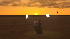
So I've switch off the 3 point lights, which made the girl way darker. I then increase the Environment Intensity (2 ->4), and the SS Sun Disk Scale (4->8):
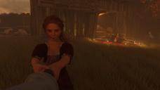
I am not sure about that... I guess the light is more natural but as you said before, I might not restrain myself to real life limitation, and still use something to light up the girl...? Maybe not a 3 light points, but at least one ?
Tho, if I do that, I am not sure I can light up the girl and the barn at the same time. To reach the barn, I'll need an high intensity, and it will probably burn the girl's skin.
ps: I've read your tutorial. The two spheres test is a good one. I'll try to remember that.
Ok Now is a horror scene. The headless man! :)
Use distant lights. Here is only 1 distant light. You can see the cube is really far away and the light lit both of them.
Or increase the intensity of your environment map.
Ahah, yeah, I needed to hide his head to place the camera.
So, here we are!
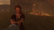
And this is the settings and location of the distant light:
I wanted the light to be on the opposite side (compared to where the main light was before) so that the distant light could also be directed toward the barn and the whole scene. I also tried to place it so that I can still have a Rembrandt triangle (somewhat). And I went for a 4000 temperature light.
So, there are hard shadows since I cannot change the dimension of the distant light as far as I know but...
When compared to that previous image I posted before :
https://www.daz3d.com/forums/uploads/FileUpload/ea/7583a2944624780ead6e39d94f56dd.jpg
I can obviously see a change. Now, the light from the previous image really looks fake ahah. Or probably way too bright, I guess. Especially when you look at the grass around her. With the new distant light, the girl might look like she is less the focus of the scene (?) but the light looks indeed more natural across the whole scene as you mentioned it. I think I actually prefer that subdued light. :)