How to make renders more real?
 dzejwid
Posts: 5
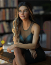
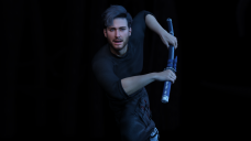
Hi every, sorry for this topic and i know that probably answer for my question is some were in this forum but i work 12 houers a day and looking for it take more time than practicing my skils. I showe you belowe two renders. Mine is with guy and the second one I found in some webside. Renders quality on the second one is low but it not about quality. I'm using assets from genesis 9.
Okey, so i try some lights and configurations of it, also increas SubD level, try to add some good background, add some of skin texture and effect of eyes etc. but reality of my render in comper to another one is like heaven and earth. I look for some videos and i even finde some but all of them tells to trow some light and shadows, increase quality of renders to full hd and increas subD and everything should work fine. So here is my question. What i should do to make this kind of renders?


Comments
Moved to Art Studio.
The answer is mostly lighting - sharper lighting if you want to bring out more detail, contrasty lighting if you want drama, etc. Look for tutorials and discussion of lighting using any software or even in photography or painting to get ideas of how to achieve the look you want. Also, don't be afraid to use Tone mapping in Daz Studio's Render Settings/the Tonemapper Setings node or in an image editor post-render to further tweak the overall look (high-contrast lighting in particular can be very slow to lose noise in the shadowed areas so it makes sense to have more light and then use tone mapping to darken the shadows down).
Thanks for reply i will try it and alredy watching some videos but i get to this guy and i don't see a lot of light and shadows or some editing in his work, but he's render on every ending of video ( even on the beginer tutorial) look a lot more real than mine after editing.
It's not necessarily a matter of a lot of lights, just of having the right lights - and a good HDRI can go along way to supplying that for many scenes.
................
Not exacly. What i'm looking for is more photorealism and less 3d image. When you look at picture of woman what i post up in first message you can clearly see that it's nearly look like photo. when you look at my it look like 3d model. Do i describe it better now?
...............
it's alredy setted on photorealism and iray, it also render in 8k and subD is setted for max lvl. When i look at your edit it's not necessarily look like you getting close to it. you make image more blur. And if we talking about colors it's probably light what make the diffrents.
I also know that i should use some photo editor but it will not make photo real because editing render what already is made can only improve it in standard what it was done.
....................
You don't waste my time, you try to help and I appreciate it. Tkank you :)
Maybe tweak the expression and posing? IMHO he could look a bit more determined, the grip of the hands a bit stronger without "melting" into the sword and some muscle flexing at the arms and face, as I personally perceive his expression as too relaxed; maybe also some motion blur at the hands / arms, as this is a very fast action?
This is not my idea, i learned from tutorials, that posing can be extremely important for being perceived as realistic. If you are ready to invest time, I would search for inspiration in movies (pause) and images, maybe even in DAZ gallery. Just my 5 cent and not meant to be perceived as critical, as your render already is better than mine are.
........................
All the same, having looked at their images, including the AI one, theyre not really helping you.
The major issue with your render was the pose and expression. At the risk of sounding like I am not giving constructive critique, the mouth-breather expression and the hand/finger position needs work. Hands are very expressive and humans seem to be able to register uncanny effects on hands, so if the hand expression is off it will be noticeable. Same obviously goes for facial expressions where detection of issues is even more pronounced. Perhaps looking at a series of reference images or assuming the pose yourself will give you a better sense of the positions of the hand,fingers,facial features.
Secondarily, you could look to use higher quality assets (skin, simulated garments, HD props, strand based hairs). By default, Daz genesis figures load at low SubD. This is not sufficient to get the full effect of HD morphs, assuming you have any dialled in. You can 'crank' up SubD and dial in HD morphs for more detail. You can also get a high level of detail on Normal maps. Genesis 9 comes with a good normal map (8k) by default. SSS effects will blunt some of the detail, so HD morphs might look excessive in viewport but often will be softened in final render if you have appropriate SSS on your skin shader.
In your example, the samurai sword and the trousers look okay (but might just be because they are hidden by shadow), but the top doesnt look very good to me. It can be hard to find conforming garments that are going to work well in all poses and body shapes due to distortion. Possibly dForce garments can look better as they will be simulated under gravity but they also have drawbacks because they often lack thickness. You could also look at other simulation options out there like Blender and Marvelous Designer.
By the way, his face is too symmetrical.
Some nice free lights you can find on polyhaven. Download a bunch of HDRIs and drag/drop them into the environment map under Render Settings. They wont be foolproof, but can give you some decent, diverse, and low effort lighting to start with if you dont feel like focusing on lighting.
It wasn't ai thank you, it I used paint.net then Used online hd enhancer and background remover, I then put it back into paint.net and kept rotating the auto- level and lighting, it makes them turn out realistic looking, I do that with all my renders, so to say someone is not helping someone when you are not aware of peoples techniques, kindly keep your mouth closed. or should i say offencive comments to yourself.
The last two you posted were AI. Accurately pointing out that something is AI shouldn't cause offense unless it is shattering some kind of delusion you had about the post processing techniques used in the last two.
the last 2 were not CREATED with AI, I put his image into a stable diffusion enhancement, it was his render, diffusioned, if you concider stable diffusion enhancement as ai created then i am corrected, but it was only stable diffusion enhanced not recreated, so be as it is, it doesn't matter you think my efforts are crap so it doesn't matter, people like you are the reason artists are quitting posting. im done disscussing this, have a good day. they simplely asked how to make them more realistic, and you piped in saying i was not helping, Art is not black and white only, it's not how you create something, it that you do!!!! you may create 1 way and somebody different but niether way is wrong. that was what i concidered offensive, not your mono-technique thinking.
- Facial expression needs a lot of work. I'm not able to tell what this character is supposed to be feeling or thinking.
- Also, too much symmetry in his expression.
- Shift his eyes a little instead of having him look dead ahead.
- Does this pose make sense? I could be wrong, but wouldn't the sheath be attached to his belt, or some kind of harness?
- Does this entire scene make sense? A softly lit white guy with boyband hair, peachy perfect skin, and cargo pants holding a katana? It all seems a little random. The less likely your scenario, the harder you'll have to work to make it look believable.
- Lighting is too even for photorealism. As someone who doesn't care too much about photorealism I actually quite like your lighting, the colours are pretty and romantic. But an action scene would be lit differently.
- His skin could probabaly use some sweat, maybe grime, and generally be less perfect. He looks too much like he's from a skincare commercial.
- Try placing fake reflections in his eyes. Try different eyes, perhaps less intensely blue and more gray-blue.
- Because there's no background it makes the image even more unreal.
- Add DOF, motion blur, and film grain. The latter two you'll have to do in post. I would also add at least a little bloom.
I hope some of that helps, good luck!
I think you need to learn how Img2Img works. Img2img is literally recreating with AI.
Even if one accepts that it was an "enhancement" and not a recreation, the fact that this "AI Enhancement" totally shifted the pose, facial features, etc lends credence to the idea that this enhancement was not really what a purist would call a render.
In my defense, I didnt technically say they were crap, I said they werent helpful because the OP wanted to know how to make renders realistic, not how to feed renders into an img2img stable diffusion workflow. Millions of people are doing img2img, so find it strange that someone using these tools would take it so personally when someone says it's not a render, which it isnt.
Slap him into a cyberpunk environment and he could easily be a Shadowrun character.
Very helpful post @Hylas, thankyou, shows how much time and thinking you have to invest into a render. To me that is the most challenging part, to develop that patience and stamina .
.
It all comes down to lighting. A good HDRI which adds subtle and realistic light sources to your scene will help bring real details to your image. Generally you don't have to post work a decent render.
And it is important to note that there are variations in characters material settings and even with the exact same lighting, there can be differences in the end result renders as this short video shows.
Exact same lighting was used, exact same character morph, different material skins swapped. Variations in rendered results in video format.
https://youtube.com/shorts/pBoypmuFps8?feature=share
@FirstBastion: exceptionally well done DOF effect! Did you add the blurring at the shoulders and outer part of arms in PW or is it possible to reach that with a camera setting? Totally agree with HDRI, still I believe posing also to be very important, as added imperfections.
...my one issue with most HDRI's is that they are usually like a 360° photo backdrop with scenery included. I had little trouble with 3DL and mastered the lighting pretty quickly (particularly with AoA's Advanced lights, and UE. With Iray the processes became far mo re complex as one now had to understand lumens, temperature, and other parameters that I didn't have to worry about in RL theatrical lighting. If I ou needed a different colour or effect, I simply had a a "gel filter" slipped in front of a light or used lights set at different angles (the latter which Dreamlight's Light Dome Pro and Studio Light Pro did).
Granted an HDRI is less resource demanding than an array of 30+ lights, however again most include scenery in the dome while the ones that are just lights are more for portraits than using in full scenes.
Your one issue with most HDRIs is the whole point of most HDRIs. The scenery being included is intentional, as the elements of the scene contribute bounce light in real life, so taken together, all aspects of the HDRI help to make interesting lighting as its emulates the environment in which the HDRI is captured.
Attached were lit with HDRIs and nothing else.
...I tend so build scenes using geometry and rarely even use photo backdrops The last time was several years ago as I needed a specific city background.(which I created a mask of to use a skydome). That was rendered in 3DL with IBL Master and UE and was about the closest to "realism" as I could get with the older render engine at the time. [attachment below]
Other than the ones I mentioned above I do have a large set of sky only HDRIs (the full IBL Skies Bundle which reminds me of the old Light Dome Pro2 as it has different altitude settings for the "sun") for outdoor scenes as the Iray Sun/Sky mode doesn't include clouds.. There are a number "cloud" products that work with the base Iray Sun/Sky setting, but the only one I found that works the best is KA's Iray Sky Pro as it light on system is resources. I tried cloudscape creator, but it has it's own HDRI and is very resource demanding crashing the programme almost every time I use it.
Another difference between Iray and 3DL is that IT has a setting to vary softens of shadows (as well as turn shadows off which I did in the scene below to create bounce lighting from underneath the ground plane) With Iray, there are no shadow adjustments.So, for outdoors scenes I'm pretty well set.
Again as to interior scenes, it comes back down to having to set up an array of multiple lights to try and create the effect that an IBL does
Sure, in cases where you need the horizon, you may not want to render an HDRI with dome visible if the HDRI contains unwanted scenery at the margins. But for many cases, lighting with an HDRI and either rendering the dome or not rendering the dome is very useful, even for exterior scenes like the city environment i attached above where the dome is not rendered. WIth indoor scenes, while you can light with an exterior HDRI to act as external light entering through windows, or light with an interior HDRI by hiding walls and the ceiling outside the frame, I suppose there is no substitute for placing lights with care and attention. I think the point still stands for the OP that it is a good starting point to get interesting lighting, particularly for their test case which was a scene without an environment. The added bonus being that vast libraries of HDRIs are typically free to obtain and low effort to use.