New graphic novel project
in Art Studio
Greetings,
Here are a few panels from my new graphic novel. I'm using photography combined with DAZ assets and 2D images to create these, much like VFX for a movie (which is my background). I'd be curious to know what you guys think, and if there are other projects out there which are similar in look to this.
These are the first images we're releasing to the public. If you would like updates, you can sign up at our web site: http://mianwings.com
Regards,
Kaveh
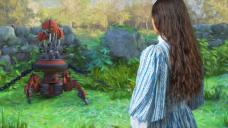

03.jpg
960 x 540 - 131K
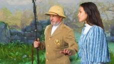

05b.jpg
960 x 540 - 121K
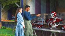

15.jpg
960 x 540 - 117K


Comments
Well, they look a bit roto'd. Which is okay, but it's a style that's become pretty common now. The image on the right looks best for various reasons; the one in the middle just like what it is: a photo (or photorealistic render) that you've Photoshopped with a couple of filters.
There are some stunning examples in this sub-form of what some artists are shooting for, where the image looks more like drawn art rather than a compouter-manipulated image. See, for example, the 'Non-photorealistic Renders (NPR)' and 'Algovincian Non-Photorealistic Rendering (NPR)'
I'm not sure I would agree that they look rotoscoped, if that is what roto'd refers to, but they do look like you used the Photoshop Oil filter. There are some really nice NPR ways of doing images, as Tobor points out. With this kind of filter, you only see the effects of the filter close up. Looking at the thumbnails, you'd think they were photos. All depends on what you want the outcome to actually be.
There are ways to make the photos and 2D look more cohesive. I'm thinking that what Tobor is seeing is the way the filter creates a bit of a disconnect between the photo elements and the backgrounds due to the treatment result on the silhouettes of the photos.
I can't use NPR since I am compositing live action photography, 3D renders, and 2D imagery. Just doing a non-photoreal render of the 3D elements won't do the trick. I need to use a 2D filter post comp to unify the looks, as well as give the project its own aesthetic. I am using Topaz Impression, which is the best painterly filter set I have come across.
Are you aware of other graphic novels or comics which are using this approach?
Rotoscoping just means painting over. In this case, it's done by machine, but it can also be done by hand. Either approach is valid (though by hand is usually better, if it's done well), unless it has the clear look of being rotoscoped. When it looks obviously processed, many readers just say, "meh." You are right that it's not so much the fact that it's been filtered, but that it has the tell-tale *looks* that it's been filtered. The human creative element, the thing we most often ascribe to good art, is missing, because it's plain a computer has faked the transformation of the image into "art."
Kaveh808, there are many graphic novels that take stills or renders and apply filters. Some are good; some just add to the noise floor. Topaz is a good set, but by now its look is pretty well known among fans of graphic novels. You may need to combine a number of different filter passes, comp them in creative ways, perhaps even create some of your own. Cris P, whom I quoted above, is an expert filter coder for FilterForge. I don't code my own, but I do sometimes use 'em -- though never singly. I always combine them, sometimes using 4-6 filters at a time, and always followed by hand work. Example hand work is with layer masks to manually control how each filter effect is used in the image.
A separate answer to this ... though Vince (as an example) is using multiple controlled render passes, the visual effects of these passes can often be replicated using different types of filters, so the net effect is much the same. For example, an AO filter could create a synthesized ambient shadow pass very similar to the one Vince gets using the separate 3DL render. Topaz is likely doing this already as part of its internal process, but it's not as controllable as creating a spearate AO layer and using that to control other filters or effects. You can always use a general purpose painterly filter/action like Topaz, but you might think about how to combine those results with other filter and layer techniques.
https://www.filterforge.com/filters/4517.html
Can you point me to a few of the good ones?
Yep, that was why I ammended what I stated earlier in my post, I realized what you meant. :)
Kaveh.
Whatever you use for filters, I would highly recommend, never just filter and you're ready to go. The key to any good work is attention to details. How well do things integrate, before and after. sometimes color correction and other things are needed to bring elements in line with each other and then you filter. After you filter, then it's going through and correcting things the filter didn't get right or changed. It's why you keep the original pieces in a non-filtered version to change or correct things where needed. Automatic ways of doing things, too often, have a way of screaming that's what was done to it. You want a way to make it look fully blended, original and unique.
There are some interesting tips here: http://harrowgatepress.com/beyond-photoshop/
Smudging is a great technique for blending areas.
Working with the history brush is also very handy. Take some time to investigate methods of working and then play with them to find what works best for what you need. :)
The Photoshop plugins that I get from Envato have a lot of options built in, by right clicking you can pull and tweak the graphs (with nodes to move along the line going horizontally and vertically) so if you are using plugins, remember to right click over in layers in the plugin to see what it lets you tweak. I also like Corel Photo Paint because the Adjustment Lab is SO much easier than Photoshop and the contrast, saturation, midtones, shadows, etc are all there together.
These images are made of multiple layers of filters, combined using layer masks to bring out detail where I want. I effectively use the brush size to control depth of field and focus attention where I want to eye to go.
I'm sure a real artist can do much better, given the time.
And what makes you think you're not a "real" artist? Art is from the heart, so I think you qualify.
Haha, thank you. I'm a photographer and I work in Photoshop. But I can't draw, and for me an artist has to be able to draw. ;)
www.kardanphotography.com
I took a very quick look at Topaz Impression and it seems very capable. I've never owned Photoshop and don't know how it's effects compare to other software - I've always assumed it has everything.
Nevertheless, if you are using Windows, you might want to take a look at the free FotoSketcher. It has some great painterly effects and is very easy to use with final images. You can use a brush to paint the chosen effect on parts of your image (it doesn't have layers).
I'm on a Mac. I use Photoshop with filters and 3D software.