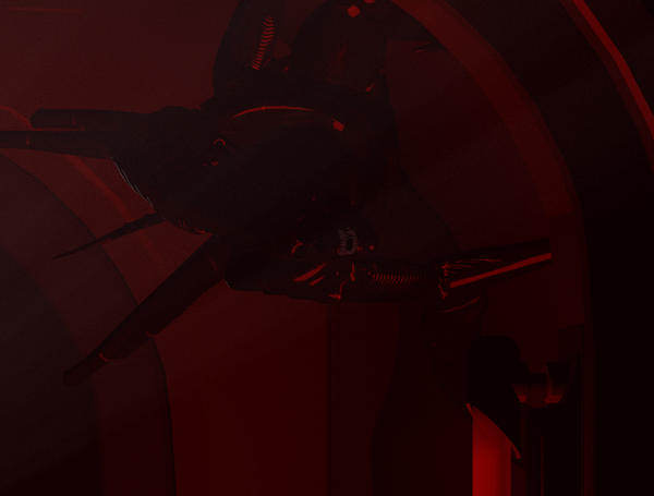
I need lighting and texture feedback/advice
 flashback
Posts: 0
Here are some crops from a rather large image.
You should be able to barely see teeth in each crop, can you? is it too dark on your monitor?
Second, I don't like the materials on the aliens when too close to the lights. Any advice on which way to go with this?
The set Stonemason's Utopia Deck C, also using a volume camera, Swidhelm's Aline drone and an Alien Queen Freebie I got somewhere.
If I can get a little feedback the final image will posted in my render thread "Random Echoes".
Thanks,
John aka flashback


utopia-no-more-crop-2.jpg
730 x 721 - 156K


utopia-no-more-crop-3.jpg
751 x 569 - 141K
Post edited by flashback on


Comments
hmm, the pics seem to be breaking the forum....
It is pretty darn dark on my monitor. I can't really see much other than the specularity and the light behind the alien(s)
Lighting is alittle to dark on my screen as well. Try adding a white backlight on the alien, from behind to give it a more crisp look. But you got the shots and smoke looking good :) Darkness just needs to be adjusted :cheese:
Ok, a consensus of 2. It's too dark.
What about the alien skin texture? Any thoughts there?
And I might as well post the whole thing, the only postwork is size reduction to fit it in the forums. (original size is 4800x3600)
The full image works very well, the crops don't give enough info to be helpful. This looks good.
If you're using DAZ Studio, try going into the surfaces tab, selecting the aliens' skins and set them to metallic, because they've probably defaulted to plastic. You could also try googling for a freebie called Vex Skin Shader-install, hold down ctrl, left mouse click, select "Ignore" when it asks what to do about the existing textures, and you should get a nice, organic looking glossiness.
In terms of lighting, again if you're in Daz Studio, try playing around with "negative lighting"-basically create a light, doublecheck on the name of the "brightness" tab, set it to "respect limits-no" and dial the brightness to a negative value. This will brighten the shadowy parts and can add a nice eerie quality to some scenes. The main thing to remember is that you have to set the light color to the opposite of what you want it to appear-for pure red, you set a blue-green, for orangey-red you set a purer green.
I really like this render! :cheese:
Potentially awesome image! It might benefit from a light source in front of the aliens (fill light) set pretty low, but high enough to let some of the details come through. You also might consider making the light color match the overall scene color, sort of a reddish.
I don't use Studio, so I can't give you program specific suggestions, but a fill light to bring out the details should do the trick.
One major problem is that the Aliens are black and thus hard to see even in full light. Trying to find the balance between dark-and-creepy and bright enough for details is frustratingly hard.
So far I have 7 linear point lights, 2 spotlights and uberenvironment. midnight preset.
Is the specularity on the aliens red or is that due to lighting? I thought it was the lighting and now I wonder.
The red is in the lighting. The 'lightbars' in the corridor have point lights in them. I've been trying different shaders but the volume sometimes has interesting effects on the appearance of various materials.
Still experimenting, but getting a little frustrated with it.
Red on black is not ever going to give you very strong detailing on your figures. I'd try putting a low level white distance light somewhere in front of them (no shadows) to help pick out some details.
I think I found a combo that works for me, now I'm just wondering if I should put a few more aliens in there. Will a larger number of drones add to the impact of the image though? Or will it just look cluttered?
I personally think what you have now is a good balance in terms of creatures...you might have space for one or two more towards the left side of the image, but you don't absolutely need to add any.
Better?
Yes indeed. I see much more detail on the nearest critter.
Much better... And Its defininately still my favorite :cheese: I also agree with Khory.
That's looking pretty good. The details are definitely showing up better now. I still consider AvP one of my favorite games. Extremely scary and intense to play as a Marine.
Yes, much.
You might also consider bringing the camera in a bit closer, fill the image with the aliens and less with the open space of the corridor. That's just a personal preference, so take it or leave.
Big improvement. Well done.