Joe's workshop
 Joe Webb
Posts: 837
I'm hoping to get some critique and advice on scenes I think have promise but have otherwise run out of steam on.
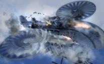
So first up is this one: Dogfight.

This is a DS 4.8 render, in 3Delight. I used Light Dome Pro - R to render it out in layers. I used Ron's Brushes, War Essentials and Smoke, in Photoshop, to add details. The props are Iron Wasp, Trey for M4 and Steam Cowboy clothing.
I'm not going for photoreal per se, but I'm trying to get away from that computer graphic render look, if you know what I mean. A straight up render makes the character, clothing and prop look like a video game screen shopt - not bad in its own right, but I'm looking for something else.
To me its gotten to the point that I've way overdone it with the Photoshoping. I was hoping the smoke and such would mask the harsh lines on the vehicle, but its just made the whole image too busy and muddled.
Would I be better off trying to update the mats on the vehicle? And how can I make the M4 character mats better - I'm not sure if a used the ambient reducer that comes with LDP-R, it looks like not. Would it help the image to have a darker background?
Anyway - any comments on what works and what doesn't would be appreciated.


Comments
All of my work is in Iray, so I don't have much useful to add on shaders and materials for 3Delight.
I do agree that it feels like too much postwork. I'd look at hiding some of the smoke layers and seeing how the image changes.
One of the first things I'll mention is composition. I'd pull the camera back just a bit, as the nose of the aircraft and the lower front are chopped off, as is the tip of the right wing rotor. It's a little disconcerting. You also might want to consider another aircraft in the distance to give some scale, or maybe use it to help tell the story
Hey, Joe, nice to see you with your own thread! I have no advice given I am still horrible at using 3Delight. I do think you should consider either pulling out so that ship isn't cut off in that particular way or consider going in full blown close up. At the moment, the framing of the ship does look kind of awkward. I kind of like the postwork you did. I think it looks good. However, you have to take everything I say with a grain of salt as I tend to think you are the better artist than I am. I love your images! The only other suggestion is the name as when I think of the term Dogfight, I usually think of two planes and seeing the term Dogfight in the title makes me think something is missing. Just a thought. Maybe you need to consider setting up a view with an opponent to balance out the image? Great to see you here in the art thread!
I didn't see it until you pointed it out but you're right - a big problem is the framing. I started over, rerendering with a different sky - sunset this time. I made a node instance and moved it to the background for a second ship. If you know LDP-R you know the secondary PS Action gives you that glow/frame effect, so I did that and changed the tint to a deep orange.
I'm going to do something I rarely do - move carefully. I'm giving the hull a treatment in Photoshop first, then moving to clouds/fire/whatever. Still not sure how to procede with the character - he looks a LOT better in this render (moved the sunlight so its coming from below left, nice face shadows) but still not where I want him.
I like the oil smears more in this one. All of this is Ron's War Essentials brushs, the smoke on the burning ship from Ron's Smoke.
Thanks! I've been lurking your thread but never have anything constructive to say. If you can get Light Dome Pro - R if you want to do 3Delight. You also need Photoshop or GIMP but I swear by it. It automatically renders your images out in different light layers - essential for making adjustments in shading/lighting. I know you can do it in iRay too, but it would take a week for my poor old computer to render out 7 layers of iRay.
Thanks for the feedback. I tried the pulled back image, rather than close up - I don't think the Iron Wasp would take a closeup too well, at least with the base mats and for what I want to do. The postwork is OK, but overdone, and way overworked. Its easy to do when those great Ron's brushes. One thing I did like was the swirl effect I got for the smoke going into the turbines - I have no idea if that is accurate but looks cool.
You make wonderful images, and you are helpful so I will take your advice seriously, so none of this salt business You inspired me to make this thread, for example. I hope I can keep it up, I don't always have time for this sort of thing, so I drop off the map for a bit.
You're right about the name - I need an enemy for there to be a dogfight, and I don't think I want one in this. I have a story, or at least a setting, that goes into this image; I was surprised to find both the airship and the 'steam cowboy' outfit already in the Daz store, since I think I came up with it a while back. Anyway, this is one scene in the story of Johnny Gallio and the Flying Aces-in-the-hole, or Johnny G and His Flying Ace-Holes, a name I cribbed from a great short story, "Tales fo Houdini". So maybe Aces High?
Thanks for the welcome :)
Hey Joe, nice to see you decided for a thread as well!
Let's see if I got something of value to say, first as I do my renders in 3delight as well I'm a strong believer that they don't need to have that computer grafic look and I alway try to get as much done in DS as possible before I try my hand at the post (comes from the fact that had the more serious touchdown with DAZ before I seriously started working with gimp). There is a lot the can be done in terms of shaders, texture light etc. For example the bulleholes and the oil smear I would try to add as a LIE (layered image editor) to the surface of your flyer(diffuse channel), especially the bullet holes in the bump or displacement map as well. from the motion blurr on the rotor I take it that you know about the motion blur, you could add that to your sky dome, by rotating that ( if you parent the smaller flyer in the back to the skydome it gets blurred on the track as well) (examples are http://www.daz3d.com/forums/discussion/comment/982041/#Comment_982041 and http://www.daz3d.com/gallery/#images/86464/).
While Tabascos idea with the composition has a good point, I wouldnt nevessarily try to avoid cutting stuff, even if you don't go to full closeup. But has to be a decided cutting, that will then add drama to your action scene. Another trick to add drama is to tilt the camera.
Comparing the first and the second version I genreally like the light in the second version better but the guy himself has a more fitting light in the first version.
End of rant here
I like the second version much better. Maybe add a little more light on the pilot's face, to Linwelly's point.
Heh, nice to part of the elite club!
I went with post work on this because I'm lazy. I've never used LIE, and altering the mats seems pretty daunting once you open the files. There is SOOOO much in there. And I actually don't know about motion blur built into the render engine. Blurred blades are an option that comes with the model I just used a blur tool to give the second ship a slight blur, so I'll go back in and try what you suggest.
Now that I've slept on it, I like the bullet holes but they certainly look flat. I'm going to have to learn LIE and/or go directly to the mats. Maybe I can knock out some alternate mats for this vehicle - I've liked it since I saw it, and it certainly doesn't get enough render time.
As to framing I guess it depends on what I'm trying to focus on - if its a portrait of the pilot I should pull in a little more, and have him dominate the image. But that confuses the parts of the ship visible - is it a cowboy flying a plane? If I'm trying to say "its a cowboy flying a air-ship" I want to show the airship as much as the cowboy, so cutting it off is a disservice to the model, if nothing else. It would work IF he was flying a bi-plane or some other easily recognizable thing. Our minds can fill in the blanks. This item is too different to get away with that.
I appreciate your rant. I agree the more I do in Daz to set up the render, the better the finished image looks even after significant post work. Its just that I'm lazy - and its a beautiful sunny day outside. I can rake some leaves for a few minutes then throw myself under a tree for a few hours of napping, music and world appreciation.
Thank you, your advice helped me focus on what I was trying to present. I'll go in and add some light, which I'll have to do anyway if I want a good bounce light from firing machine guns and/or chaf rounds exploding nearby.
Lurking? My goodness! Thank you. You could just say hello, though, if nothing constructive comes to mind. I won't mind. I do have Light Dome Pro - R. I haven't really had a chance to figure out how to use it. It is on my growing list of things I need to figure out. And I have GIMP, so I'm set there. When I'm ready to take a look at it again, I'll have to PM you and you can come into my thread and give me some pointers. I could sure use some!
So, plenty of people keep telling me. I guess I'll have to start believing all of you. I'm glad I could inspire you to make this thread. If you start to forget about it, I'll make sure to try and give you a nudge on occasion.
I, actually, love Aces High for a title and it does fit! I was thinking, if you aren't comfortable using L.I.E. for the bullet holes, how are you at using textures straight onto the plane in the Surface Tab? There are some really nice filters for bullet holes in FilterForge. I was making some test textures with them earlier today. I still have to test them out on the plane you are using, but if they look good without messing up the underlying texture that could be a possible solution for you if you aren't happy with the postworked bullet holes in your last render. Although, I have to say that I REALLY liked the last bit of postwork you did on that last render! I think you did a nice job and it looks better with the slightly more understated postwork than your first image. I, also, think it looks much better pulled out so the ship isn't cut off like in the first render, too. Very nice. I love that grease smear, by the way. Even without the flames, it looked more realistic that the first image posted. However, I do think those flames really add something to the overall look of your image! I like the changes you made to the sky background, too.
Ha, I'm totally intimidated by Surfaces Tab. I have to get over that - after all I was completely intimidated by the whole program up until about 6 months ago. Thank you about the post work - less is always better than more, usually. But its so easy to do more, especially with all those cool brushes. I was a little proud of the grease smear
Anyway, here is a slightly updated version. I rendered out two layers in 3Delight, one with point lights at the machine gun ends, one with a spot filling in the pilot's face. Then, since I had some time, rendered a 2 hour iRay with a sunset light scheme. I layered them all in, mostly Screen at various opacities, in Photoshop. I added in the gun flares, shells and a little bit of smoke (but its really subtl and I'm still not happy with it).
Not sure where else to go with it. Should I had some smoke? I have a little smoke phobia now. I think I'm going to mess with the basic mats and work with LIE - but on a different scene featuring the Iron Wasp.
I, actually, like what you've got here. If you could improve on it, I have no idea what you could do. I think it looks great!
Joe!, we're going to have to get you over this phobia you have of the Surface Tab in the near future! I promise it isn't as scary as it looks! Oh, and if you haven't checked it out, yet, you should check out DestinysGarden's Texture thread here in the Art Studio! That Surface Tab awaits you and I promise to help if you get stuck!
i just saw the thread and am excited to see whats in there! So far my attempts to do anything but apply shaders has been a dismal failure, so I'm hoping this will get me moving in the right direction. And I WILL need the help
Joe, really good progress on the image. I'd add a little smoke...
Also, the surfaces tab is an amazing place to experiment. There's so much you can do in there. Just experiment and have fun!
OK, a little smoke...
I've gone in and applied shaders in the surfaces tab. I think only one image turned out well, but its true from the images I've seen that playing with the shaders and mats is very rewarding.
That look very cool, Joe! I like how the smoke in the front seems to be sucked up into the turbine thing.
I like playing with surfaces. Any time you have a question, just pop over to my thread or PM and ask. I'll help out as much as I can and if I don't know, we'll figure it out together!
It is interesting watching this image evolve. The details on this are really good, especialy the smoke getting wafted around and into the propellers, I like the warmer color tones you chose too, suggests a late afternoon sun. And pulling back to take in more of the vehicle and sky balanced out the composition of the image as well. Definitely going to get some gallery votes.
Very nice Joe! This works really good now.
I have to agree with First Bastion its nice to see the progression from start to finish! I think it looks great now.
Thanks for all the feedback. Obviously it really helped. The encouragement helps too , it was a fun process to mold something satisfying out of that first idea.
I may have lost some of the smoke/propeller detail in the final when I tried punching up the sky/cloud detail, but I think it I'm happy with it overall.
I'm going to try to do a series of these. Or at least work on the mats for the Iron Wasp, based on WWI biplane color schemes. I've mapped out some of the mats in a grid so see where I stand, and get an idea of what goes where. Fortunately it looks like the mats a really straight forward, considering the model design is basically a few big sheets covering a modified cylinder.