Ultra Project WIPs
 mmitchell_houston
Posts: 2,484
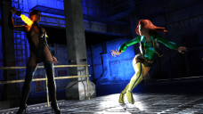
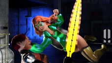
I'm starting on a new superhero project that will include work in both Daz Studio and Poser 11. So, to keep everything in one place, I'm going to post all the WIP files here. As always, comments and constructive criticism are always welcome. Here's the first two renders (in Iray) of the superheroine, Ultra.
Ultra is a hero I created back in the late 1970s / early 1980s, and I will be publishing a 20-page b&w comic that I wrote back then, and which was illustrated by two guys I knew back then (when we were all quite young). The late Steve Addlesee did the pencils, and then teenaged/now comics professional Andrew Pepoy did the inking. The original was never published back then, and the material was (of course) done by hand.
These renders are my attempt to bring the heroine into the modern age with 3D. As such, I'll be doing some concept art in Daz Studio (to capitalize on its fantastic Iray engine), and I'll also be doing b&w work in Poser 11 (to capitalize on its geometric edge and comic book preview features).
With no further ado, here's my first two Ultra renders (BTW: Does anyone know where those white dots in her hair are coming from?)



Comments
These look good, MM! I do have to say, I like the first one better than the close up image. I like the lighting and the way the shadows keep their faces sort of half hidden. As for the sparkles, I would normally say they are the usual Iray sparkles, but I'm not sure they are. If they are, then lowering the diffuse slider might help. But, it looks more like it might be a light issue. I don't know for sure. I've never had sparkles quite like those before.
KM: I agree with you, those sparkles are weird. These images are just throwaways, so I'm not going to fret about it (unless they keep showing up in other renders, of course). I'm just trying to set up the figure the way I want her to look, so there will be a lot of disposable images as I work things out. Once I nail the look, then I'll get serious and pay attention to all the little details.
BTW: I also like the first image better. The second was just another "throwaway." I really don't like her expression, or how much of the oppenent is showing/hidden. I had the costume custom created by Terry McGinnis (he does a lot of "cosplay" costumes for V4, so I need to put it through some stress testing to make sure it will work for me. That's why I'm trying some extreme poses, rather than just the stock "hero standing there looking cool" poses. So far, I'm very happy with the results.
Cool. I look forward to seeing more!
Glad I found this! Looks great, Mike! Very much looking forward to seeing this project develop.
I will be watching with great interest!
Thanks, everyone! It's been a while since I've actually worked on this directly, but I've been perfecting the techniques I will use to actually create something with this character. So even though there's nothing new to show here, I have been doing stuff behind the scenes. Hopefully I'll have something new to show before too long.
Mike