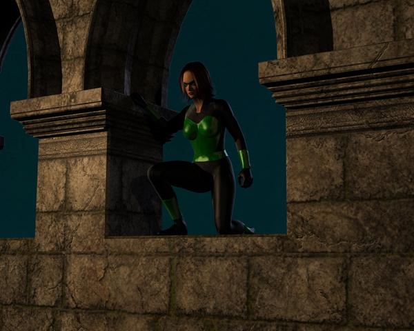
Supersuit renders by XoechZ - comments are welcome
First try with Supersuit


001.jpg
800 x 640 - 342K
Post edited by XoechZ on
You currently have no notifications.
First try with Supersuit


Licensing Agreement | Terms of Service | Privacy Policy | EULA
© 2025 Daz Productions Inc. All Rights Reserved.
Comments
another one
next one
She is dangerous...
Love me some SuperSuit, Watching thread.
Thank you. Here is another one. I like those reflections :-)
the super suit renders look great
Thank you!
I am still a noob, but with every render I learn a bit more about how all that stuff works. So, if anyone has suggestions or tips how to make the renders better, please tell me.
Tip: Google the Rule of thirds. That one thing will help move you to a new step with your renders.
Thank you Jaderail!
I have found this article: http://en.wikipedia.org/wiki/Rule_of_thirds
It´s very interesting and I will try that rule in my next render. It would be very helpful (for a beginner like me) to have this guidelines in the cameraview in DAZ. Would make things easier :-)
Ok, this one follows the rule of thirds (as close as I could in a first try). It looks good to me, but on the other side there is so much "empty space" at the right side. That would not happen if the figure was in the middle. What do you think?
The human eye will focus on of center items first. That is how the ROT came about, I think it is very good. My Eye went right to the character.
another hero
next
next one.
Very well done, I like the use of the Super boots as well. Great texturing on this one.
Redacted
Good stuff! I particularly like the guy with the interesting reflections, the one you call "another hero," and the woman at the Moon Gate. The Rule of Thirds is definitely working for you. :)
The Supersuit is a lot of fun to play with, and I enjoy seeing what others achieve with it. Keep up the good work!
Thank you all for your kind words. Yes, the Supersuit is a lot of fun and opens almost endless possibilities. I really like it and there will be more renders... :-)
Oh, and if you have any suggestions to improve my renders, please let me know.
Hm, I wish I could have done this one better. Maybe I´ll try it again when I am more advanced. Or I need some better lights...
Ok, here I have re-worked my first image from this thread. I think it looks much better now. Not yet perfect, but better.
Thank you!
I know, it´s a long and hard way to perfection. But at least I´m on the road :-)
XoechZ exactly that is a great attitude and IMHO you are on the road heading in the right direction.
Here my latest. Come and get it - if you dare...
A new one. Looks like a movie poster.
Just playing with her new power.
Another one. Some kind of modern ninja.
Today something funny:
His wife said: "You have to take my supersuit if you have to save the world today. Yours is still in the dryer."
Later this day he really had to save the world. Poor hero. But at least it was easy. All the enemy died under a heavy laughing attack! :-)
No more comments, suggestions, opinions?
Ok, never mind. Here is another one. A soldier in a mystical light scene. No postwork on this.
Well, I think you have the Comicbook thing down pat with the Supersuit. Lets see some Fights and stuff now.