Looking for Some Input

BrotherloboBrotherlobo Posts: 495
edited October 2012 in Art Studio

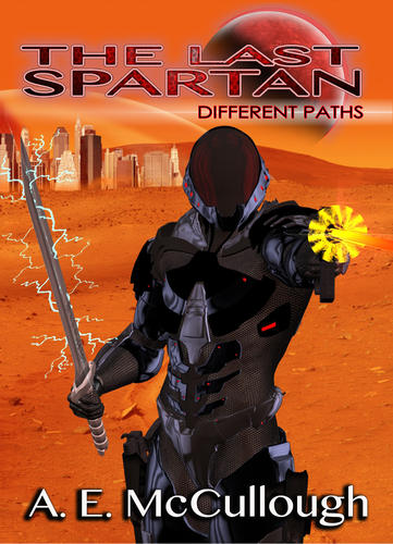
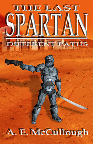
Okay, as the thread title says....I'm looking for some input on the tweaks to my current Sci Fi Novel cover. I wanted to update it but still keep the 'feel' of the original. I built the original back in March on a 'shoestring' budget before I found DAZ. I bought the armor and sword from Dreamstime and cobbled them together on Photoshop. It worked...but the armor was nothing like the one in my head (or hopefully) in the story. I have a sequel coming out next month with the new logo --- so I tried to blend the old with the new.
This is the eBook cover version. The left image is my original and the right the updated version.
Suggestions? Thanks in advance.
Last-Spartan-Different-Paths---new-eBook-cover-1.jpg
1443 x 2000 - 2M
Last-Spartan-eBook-Cover-2.jpg
651 x 1000 - 695K
Post edited by Brotherlobo on

Comments

  • OdaaOdaa Posts: 1,548
    edited December 1969

    Okay, as the thread title says....I'm looking for some input on the tweaks to my current Sci Fi Novel cover. I wanted to update it but still keep the 'feel' of the original. I built the original back in March on a 'shoestring' budget before I found DAZ. I bought the armor and sword from Dreamstime and cobbled them together on Photoshop. It worked...but the armor was nothing like the one in my head (or hopefully) in the story. I have a sequel coming out next month with the new logo --- so I tried to blend the old with the new.
    This is the eBook cover version. The left image is my original and the right the updated version.
    Suggestions? Thanks in advance.

    It is not very clear that he's firing a gun from his left hand-I would suggest using a more metallic surface setting, maybe even some metal shaders, on the gun, and rotating the camera slightly so that we're not looking at the gun/discharge headon.

    If the lightning on the sword is postwork, you could try duplicating the lightning layer, blurring it slightly, setting to screen, and adjusting layer opacity to taste. This might give you a more glowy, plasma like effect.

  • bighbigh Posts: 8,147
    edited December 1969

    background good
    yellow blaster doesn't work at all

  • Jake_35533Jake_35533 Posts: 242
    edited October 2012

    Maybe brighten the foreground, he blends in since he is all black. It's daytime, so he should be better lit.

    Post edited by Jake_35533 on
  • BrotherloboBrotherlobo Posts: 495
    edited December 1969

    bigh said:
    background good
    yellow blaster doesn't work at all
    Okay....here are a few tweaks on the blaster.
    Odaa said: It is not very clear that he’s firing a gun from his left hand-I would suggest using a more metallic surface setting, maybe even some metal shaders, on the gun, and rotating the camera slightly so that we’re not looking at the gun/discharge headon.

    How's this...
    Jake_Russel said: Maybe brighten the foreground, he blends in since he is all black. It’s daytime, so he should be better lit.
    I tweaked the lighting and the metal of the armor and the angle of Spartan.
    Last-Spartan-Different-Paths---new-eBook-cover-2.jpg
    1313 x 2000 - 1M
  • Jake_35533Jake_35533 Posts: 242
    edited October 2012

    I tweaked the lighting and the metal of the armor and the angle of Spartan.

    Wow, that's much better. Now he needs a slight orange tent over him since his surroundings are primarily orange. Maybe a lens flare off his visor too.

    Post edited by Jake_35533 on
  • BrotherloboBrotherlobo Posts: 495
    edited December 1969

    Wow, that's much better. Now he needs a slight orange tent over him since his surroundings are primarily orange. Maybe a lens flare off his visor too.

    I was thinking the same but had to set it aside for a bit. It was taking too much time from my writing.
    Already deep into working on my next novel. I will definantly have a cover contest for this story.

    I'm not sure if I need to zoom in a bit more or not. Hmmm.....

    BTW -- if anyone is interested....The Last Spartan: Different Paths is FREE to download today on Amazon.

  • BrotherloboBrotherlobo Posts: 495
    edited December 1969

    Here are the latest tweaks.
    I added a couple of blood red spotlights for a hint of 'red' tinting.
    Tweaked the camera angle and added some starships in the background.
    Input?

    Last-Spartan-Different-Paths---new-eBook-cover-3.jpg
    1313 x 2000 - 1M
  • bighbigh Posts: 8,147
    edited December 1969

    much better

  • scorpioscorpio Posts: 8,418
    edited December 1969

    Much better, but I think his pose could be improved it doesn't look natural at the moment, his legs need to be furthur apart more as if he's in a stance rather than just standing around.
    I would also bring his right forearm down.

  • BrotherloboBrotherlobo Posts: 495
    edited December 1969

    Much better, but I think his pose could be improved it doesn't look natural at the moment, his legs need to be furthur apart more as if he's in a stance rather than just standing around.
    I would also bring his right forearm down.

    Thanks...I'll try that later today after work.
  • cjreynoldscjreynolds Posts: 155
    edited December 1969

    Total newbie here, but it looks to me that the lightning is not "attached" to the sword - maybe the previous suggestion about post-processing a glow on the blade?

Sign In or Register to comment.