Adding to Cart…

Licensing Agreement | Terms of Service | Privacy Policy | EULA
© 2025 Daz Productions Inc. All Rights Reserved.You currently have no notifications.

Licensing Agreement | Terms of Service | Privacy Policy | EULA
© 2025 Daz Productions Inc. All Rights Reserved.
Comments
I did a 3D graphic novel with Markosia called Night Creatures. I belive they have several other books in that style. I believe what the original poster is getting at, is that pros have been using 3D CGI in different ways, altered, filtered, traced, etc. so that it isn't obvious. Some of my best pieces were done with DAZ and CGI. I'm open about it and the dfact that I've moved entirely CGI in my work for the most part, but because of the stigma and stereotype from people who often have no clue about art, there is a weird taboo about admitting it. I know of 2 other pros personally who use CGI for their best work, but are still "in the closet" so to speak, so I won't out them. There are a few prominent cover artists for Marvel and Dynamite using CGI in their cover art, which people who make CGI art will recognize immediately if you look for it, but I've never heard or read anything about the artist using CGI. I HATE when people assume that all good CGI art is now made by CGI. I'm like "No, you bastard, does it have 6 eyes and 3 toes? No. I MADE that, I put WORK into that!" It's the ignorant assumption of people outside CGI that somehow using computers to make art is cheating. Even traditional artists use CGI simply to get perspective and shading right or to design rough figures in a space to see light and shadow effects on a space ship for example. I've dealt with this in teaching with laymen who somehow got the idea that using any kind of reference and not drawing everything from your head is cheating. It's not. The "anti-CGI" taboo is ridiculous, perpetrated by people who don't create art every day and I cannot wait for those outside the industry to understand and catch up. BTW I just read the Wytches TPB from 2015 and it has a very interesting style of blending computer art layers with traditional art (inks by comic artist Jock) and there is a section in the back that shows how they made multiple pieces and layered them in photoshop. Not exactly full CGI, but worth a mention. Entertaining horror comic fare. Back to the original point, CGI enhancement and use for art creation is EVERYWHERE, but the powers that be are treating it like it's a dirty little secret...because...percieved anti CGI bias? Like publishers think comic famns everywhere will be in an uproar if they find out someone used a computer. If this board had an eyeroll emoji, it would be here.
They're all web comics, not retail books. And I'm not going to name drop them because I know many of the people who make them and I have no intention of embarassing them by using their work as examples of good CGI but weak comics storytelling.
You are right, though, a LOT of readers don't know that it's specifically 3D they're looking at. All they know is that there's something "off" about the comics and most of it has to do with the storytelling (i.e. the "comics") part of the product.
I feel better,
I knew it couldn't be 'books in print' cause CGI is a rare, rare find.
I say in one of my courses (Digital Art Live- Drew Spence reference) that the "Comic" part is the literal comic element.
Like a stand up COMIC. They exaggerate frequency and intensity. In a comicbook, a punch in the face makes a person spin 360 degrees and a kick makes a villain do 3 back flips.
A yell makes the mouth 2X as big. You have to push the morphs to the limit, heck, turn off LIMITS to get those kinds of looks. The extreme perspective, foreshortening..etc....
CGI has a tendency to lean towards the harder, more realistic depictions. I dare say 'adult', not rating-wise, but storytelling for mature audiences. Drama.
I have read a Sci-fi Webtoon that's been going for like 10 years and 95% of the book is people standing around talking.
But I get it.
I think a hyper-awesome realistic face is seductive. I marvel (no pun intended) at the Genesis 8 and 9 characters.
I can see why someone would build a whole book around real-looking characters saying dramatic stuff.
I just don't know if that's supposed to work against a child slaying dragons with a magic flute.
* I made that idea up and any similarity to a known property is entirely coincidental*
What I typed in my previous post was " I HATE when people assume that all good CGI art is now made by CGI." What I meant was " I HATE when people assume that all good CGI art is now made by AI." hence the reference of 6 eyes and 3 toes. My brain...gotta love it
I immediately thought of that Ironman comic when I started reading this LoL. That book was like DECADES ago, however I have a feeling it's impact might still be part of the issue. I was not really recieved very well. I kind of thought it was cool, but also though, hmm... maybe a few more years.
The other one I would bring up in a similar way, but not 3D was First Comics's "Shatter". This was the first comic produced on a computer. It had a very positive responce (at least at first). Everyone was facinated with it. Somehow it got a pretty good response with somewhat questionable art in some panels (as in NOT just due to the computer) and rather mediocre storytelling (which got worse as it went on). I re-read it recently... it does not hold up so well.
This got me poking around for other examples. I just did a pretty quick search but found nothing. However, I did find this interesting article...
A comic artist’s debut made possible with 3D software
BrashFink,
Fascinating article! It brought together a few things I've noticed in my recent research. Blender, SketchUp, Unity, Unreal ... I came across marketplace assets for these tools pitched specifically for comic creators. (Unity alone has several non-photorealistic shaders for the anime/celshaded aesthetic.)
Cheers!
Interesting. I have also been planning on playing around with Unity and Unreal eventually anyway.
As for the Korean comic maker... I have not really gotten a chance to fully read this article I sent today at work. It's been open on my browser all day.
I have another quick question for you...
I notice that Lightning Boy Shader only claims to support through Blender 3.4... specifically mentioning that it will crash immediately in 3.5. Are you using 3.4?
EDIT: Oh... also I gave up on the idea of starting over from scratch. There is something I am enjoying in inking a lot of the pages.
BrashFInk; Traditional comics fans (which make up most of the superhero market, and ChicagoCon) are not interested in CG of any kind. They are old school, don't like digital anything (art or presentation), and want paper comics they can read on the toilet. Print is also expensive, especially at lower print runs. But I still can't say whether or not it's a waste of time. If your book is out there... anything can happen. Better odds than it NOT being out there.
I put up a WebToon and had a tremendous (and unexpected) response, but didn't have the time to create a story a week. Having a website to point people to is often better odds than handing out a print book.
Manga fans are more receptive. Gantz, and other books have blazed that trail effectively. Largely because the story was intense, and engaging.
Ultimately it's story that will win out for you, so finding people who will look beyond the visuals and be engaged by your story is where you'll get the most interest.
Hope that helps!
Okay that gives me some perspective. Again, with mine being purposely designed to NOT look CG, I was just wondering. It is not my intent to 'hide' its GC origins, but to make it not noticed immediately.
Since I am more interested in traditional size and proportions of US comics (not webtoons), and with printing (non-offset) being relatively inexpensive, I think I may spend a few hundred on a "prototype" print run.
Thanks for the answers!
I think I am familiar with the 'Ironman' comic of which you speak? LOL
"I think I am familiar with the 'Ironman' comic of which you speak? LOL"
Ha ha I know the comic that YOU'RE talking about, and no bullshit brother, bought it every week and still like it today and intend to buy the trade when I get a chance.
Are we talking about the same comic? I think Space Viking may remember. I was not talking about Space Viking's Comic, but "Ironman: Crash" from 1987 by the same guy that made Shatter (Michael Saenz).
Ironman: Crash
It was sort of ill-received even though Shatter was received rather well.
Space Viking, while I know some of your other work, I have not seen or read U.S. War Machine. In fact, because of this thread, I added it to my Amazon Wishlist. I do not keep up on Marvel the way I did 15+ years ago, so it went completely under my radar.
Though I'm sure that there willbe those out there who poo-poo it, I madfe this book for Markosia using DAZ for 95% of the images. https://markosia.com/books/worlds-of-horror/night-creatures/ ;
Hi BrashFink. It was a wild experiment, using both CG (with drawovers), in a manga weekly format. The covers were full CG and War Machine/AIM models I custom built. I was pleased with the results and it sold amazingly well in a time before Robert Downey Jr. when IM was less highly regarded. I had hoped to do more, and we were supposed to continue it as a weekly comic, but they decided they wanted me to write X-Men, so I wound up doing more of that than art of any kind. And, yes, most people are referring to Iron Man: CRASH.
Ignore the 'poo-pooers'. Take pride in actually creating something.
Word. If I took the time to slap each one in the head, I'd never have time to make comics.
Never ignore a pooh-pooh!
Been a while Gents! Here is a 4 page sample of what I have been working on.
These pages do not feature lettering yet.
Great action posing!
Yes, great posing and expressions. What filter are you using. Here's a sample of what I've been noodling with lately


Those look great, what are you using for those?
Mine is a couple filters within FilterForge (one for my color layer, and one for some of the linework, also one that adds additional black areas). However, the filter has issues with lines on colors that are too close, so about 75% or more of the lines are literally inked by me with an Apple Pencil in Procreate on an iPad. I am almost completely manually re-inking the pages.
Even without the lettering, we get a good idea what is happening in the story. Very dynamic panels with good action.
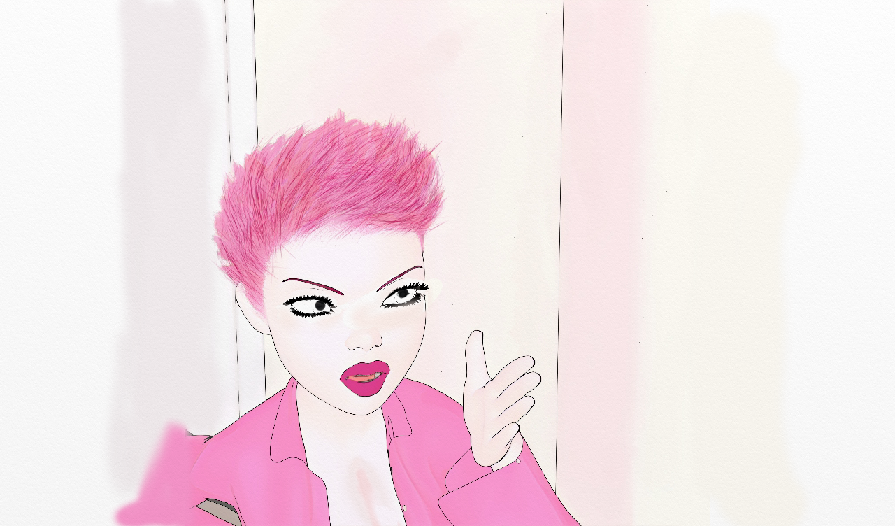
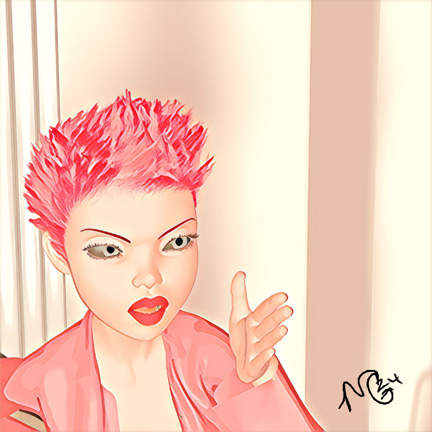
The flats and lines are made by an outline script for DAZ. Not sure if I picked it up as a free third-party add-on somewhere, or if it came with LineRender9000. Both separate options appear on my scripts list, one Linerender9000 and the other just says "outline" I've had them so long that I don't remember if they are associated with each other or not. The final painting is done on my tablet with some digital painting over top in ArtRage and Infinite Painter, then enhanced with a filter in Prisma. There are not many outline scripts that work perfectly, so I completely relate to redoing inks by hand on the tables, done it many times myself. I should post more of my digital ink work, but just too focused on current projects.
Ah yeah. I also got LineRenderer9000 a long time ago. I had no luck back in the day figuring it out. I should have a look at it again.
Here is some work I have been doing in my character design class in college...
And a later assignment of putting similar characters from different genres together (I put them together in cyberpunk)...
I've been away for a LONG time, so I haven't been keeping up with the thread much. But I wanted to say this is awesome! I really love how this turned out! Nicely done!
I'm enjoying your site and your blog. Thank you for sharing! :)
BrashFink,
The characters look striking and the even palette matches the gritty cyberpunk (or post apocalyptic) setting.
Cheers!