My muse is on vacation
 Trish
Posts: 2,625
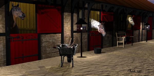
Here is one I just finished...need feedback...good,bad or ugly.....Thank you in advance Trish Oh I guess I should say the title...Hungry Babies...rendered in Bryce early morning feeding time and stall clean up


hungry_babies8.jpg
1332 x 664 - 576K


Comments
Heres another called...Miss Pris at the beach....also rendered in Bryce
and again...rendered in Bryce....called...The new visitor
and the last for right now ...rendered in Bryce ...called...Morning ride......I value your ideas on how to improve my artwork.
ok I fibbed...This is my first Daz render...funny how you have a program for a few years and it just over comes you on ...I wonder how that works...LOL...Its called making friends
This is a photo of my muse and she is not interested at the moment.........Her name is Stripes
Well everyone is really quiet...I take that as a bad sign I guess.........????
Your muse is very cute.
I like all your renders. Especially "Making Friends". Nice arch in the horse's neck.
Kismet2012:Thank you very much for your kind words....she is usually on my lap while I am at the computer but has found a chair more to her liking....LOL
Love the lighting in all of your Bryce renders. "Morning ride" seems a bit empty in terms of what is in the scene...a few distant boats or birds, or grass in the foreground, might help the overall composition. I wouldn't mind seeing some plants in "Hungry Babies" too but that's a minor complaint on a beautiful render. "The New Visitor" is a very cool scene too...great rocks and trees and framing of the horse figure.
I think you're off to a great start with DAZ Studio too. Not sure about the shadows in "Making Friends" but otherwise the lighting is very impressive...gives the image a realistic and aesthetically pleasing appearance.
Looking forward to seeing more, when your muse deigns to inspire you! :)
I'm sure she will be back. My Grandmother's cats would sleep in one spot for a month or so and then find a new "favourite" spot.
Scott; Thank you so much...me and Daz are off to a slow start on the lighting dept. that's for sure.
Here is a few more from Bryce 2013
A few more.........
you got it now - keep it up
Thank you so much bigh you are very kind......The next 3 renders I created with help from Michael Frank......and the Multi-Replicate button on Bryce that I didn't know a thing about till he started teaching us......Thanks again Michael!!
The next 3 renders are from a tutorial by TLBKlaus.....
These just came from ideas in my head......which might lead you to believe I have weird thoughts......
and this is the rest of the story of 2013 so far........
We now have a break in the action and move backwards to 2010.....My muse had the bright idea to jump from the couch onto my tower and killed it dead....and I fell and broke my hip so I was not doing too much artwork.........
I guess I should say that my women back then do not have hair because I never could get it to look right...bald is beautiful.....LOL
I love the render with the butterfly.
Kismet2012; Thank you so much !!! Here are more renders moving back to 2009
All Bryce again
looking good !
bigh;Thank you for the nice comments and for stopping by....here is more of 2009
My my, what an extraordinary productivity in all kind of styles!
I think they are generally very good pieces of work with interesting subjects. In some cases, e.g. Beat the heat 3, you could have done a little more to prevent the rather boring plain (e.g. put in some hills in the back of the scene). And I think you might want to play more with textures, because a few look to be simple textures not yet of the same quality as the remainder of the scene, e.g. in Dreary Day and Bambi Run. I think these are mostly the older ones.
I like Mountain Horse very much; the grass looks very good!
Keep up the good work!
hansmar; yes it is hard for me to stick to a certain style...Thanks for looking
For anyone using Bryce I did a comparison on the mil. horse and the new horse2 The first pictures are rendered in Daz can you tell which is which??
The second shot is rendered in Bryce and there is a lot of work to do on the horse2 if you use him in Bryce......His specularity maps are all set to 100 that's why he looks spotty........He has to be ungrouped and reset to 0......In daz he comes out just fine rendered
Here are a few more from 2009
I'm SO sending my Muse on vacation with yours from now on.
Jaderail; LOL..... thanks you are very nice to comment on my art!!! alrighty then was digging through stuff......lids off of dust covered boxes...here is a few more....