KC's Attempts...
 KC Riley-Gyer
Posts: 170
Well, looking at my profile I have just discovered I have been a member here for 10 years. However, I have (obviously) been rather quiet and haven't shared anything here. Actually, I haven't had/done anything to share here. Until now.
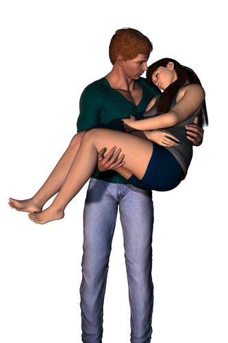
This image took me 4 days to do. Please take into account that this is the first time I have used DS and was learning everything from the get-go. From learning how to browse and add the contents to posing the figures, to setting up a camera to adding 3 lights, to finally tweaking until somewhat happy with it. Yes it is a bare-bones image but the finished product will have a photograph as a background and it is for the cover of a novel.


bk2-ee.jpg
1059 x 1588 - 156K
Post edited by KC Riley-Gyer on


Comments
Very nice first image. hard to judge shadows, etc without the whole scene.. but they look right. Nice pose too.
It is a nice image period, beginner or not :)
Tiny suggestion, I don't know how close you are to pose limits, but perhaps her head could be more into his shoulder/chest maybe? No biggie tho. Perhaps lift your hard shadow light a bit to show off her hand more, if it doesn't wreck stuff.
Thank you. There are three lights:
One spotlight in front and to the right (our right as we look at the image) and set at a distance to mimic a fluorescent bulb shining from the kitchen into another room.
Another spotlight in front and to the left but much closer to mimic a lamp not far from them.
There is also a point light to the left and behind to mimic another lamp.
And I just played with the lighting colour and intensity slider to try to get it to what I thought it should be. The only reason for those three lights was because I was following the Dreamlight tutorial in the help section here on the site. Although, I did change the distance light to a spotlight after completing the tutorial.
As for your suggestion... Her head and neck are bent as close to his shoulder as I could get them. The only other way to have her head closer now is to have her shoulder to disappear into his body. I have also played with moving her shoulder but it just doesn't seem to be enough without creating distortions.
I am open to other suggestions as the above image doesn't have to be the final render yet lol.
Nice! I love images where characters carry eachother. This image has a nice sense of emotion. Good work!
I can appreciate what you are saying in respect of the pose but remember people are soft and their surfaces compress and move when in contact with other surfaces.
When you place a DAZ model sitting on a chair/box etc (unless you have a specialist glute deformer) the buttocks need to intersect the top surface of the thing they are sitting on to represent that depression/deformation. The same could be considered with your characters and a degree of intersection would be expected as he pulls her into his chest.
Lighting is great fun in DAZ because you have to anticipate what isn't there. DAZ doesn't bounce lights so you have to make allowance for reflected lights. If your characters were in a dark corridor illuminated by one light bulb you would still need more than one light source to represent the light reflected off the walls floor and ceiling. Their relationship to the sides of the corridor, and colours and materials of the corridor, would all have an influence on the perceived lighting. This being the case (as noted above) it is difficult to comment on the lighting of your scene without seeing the background.
Photography tutorials in lighting are a great help because flash photography uses such high light outputs that ambient and general reflected lights are almost irrelevant and have to be introduced, and shadows counteracted, to make an image that looks like it is naturally lit - so just like in DAZ.
Photography tutorials are also good in respect of composition. While we can't see your final image it can make an image jar to cut off immediately above the ankles, or immediately below the knees. Better to include the feet or cut off just above the knee.
Thank you SereneNight :)
John Sims: While I could collide her shoulder into his chest a little, her head still would not touch his shoulder. As you say, a little collision is fine but the amount needed just to have her head truly touch his shoulder, hers must be completely embedded into him.I personally think that is not acceptable. Based on that, I don't know how to fix the issue.
As for the lighting, I agree with what you are saying but since the above image is going to be overlaid onto a photograph that has no *direct* bearing to the couple (as the compilation is for a novel cover) I am not that worried about it. When I do full-on scenes a little later down the road then your observations will definitely come into play. Please note I'm not dismissing your comments. They will be useful to me when the time comes, so thank you for taking the time to guide me :)
Okay, I have played around with her pose. Her shoulder and upper arm are now half way embedding into his chest so her head is on his shoulder.
Does it look like it or have I achieved the desired result?
Oh... and in the final image (as in the one submitted for the cover), he will be chopped off just below the knees. I was tired when I read that part last night my time but now I understand the comment.
I think you did very well with it. Subtle difference but important I think. You know the arm is embedded, the viewer doesnt :)
As long as a knowledgeable view doesn't know it by looking at it then I'm happy, thank you :)
Looking very good now on the pose front.
Being super critical (please don't read this when you are tired ;-) ) I find the shadow of her leg on his right thigh somewhat distracting. It seems to be a shadow from her left foot from a light source unusually low down to our left. I can appreciate you will need upward facing lights to represent ambient reflections but these are often so broad that you can get away by not using shadow with these, if you use a linear point light you can decay the light sufficiently that it shouldn't over illuminate the area between them.
Alternatively, if you start off with an Omniarea light (which most off the shelf lighting schemes available in DAZ seem to use) you can play with spot lights more easily to introduce contour details without having to worry so much about killing the intensity of the shadows with pseudo reflected lights.
Thank you John.
LOL I won't read your posts when I'm tired, promise :) . As for the shadow of her foot on his thigh... yes it is from the left spotlight which is set up to mimic a lamp light. Here is the basics of the scene from the novel...
So she left and sat in the lounge room grabbing one of the magazines to read.
By the time he had finished and joined her, she was asleep on the lounge. He gazed down at her, so peaceful.
A moment or two later he gently picked her up, holding her close to him, and headed to her room.
Aaaahhhhh........see. I said we needed to see the picture. ;-) You will also have to work the lighting colours to match. Incandescent bulbs produce a slight orange tint but it will also depend how the back ground image has been colour corrected.
To completely embed the 3D model in a background image you really need to camera solve it. This ensures all the perspectives and the focal length of the model camera matches that of the image. This can't be done in DAZ automatically and, without other software, is just down to trial and error.
No, no embedding. Background photo indicates town location. However, having said that... the night time shot of the city backdrop and the lighting of the models do go quite well together. There are a lot of orange fluoro lights in the city and suburbs, and our homes have to change over to energy saver bulbs so the orange spot on her legs suit as well. While it is true, for the sake of the story and image, I could use any lighting... staying true to the locality and it's rules work in my favour anyway :)
The embedding of the shoulder into the chest a bit works nicely because the chest muscles are soft tissue (even though you have the hard ribs underneath). One thing you can do to improve the effect is to either add a smoothing modifier to the man with collision set to the girl, or make a deformer to create a shallow indentation "squash" morph in the man's pectoral. ZeVo's Breast and Glute morphs set might also work for the same effect. (even though they were created mainly for female breasts).
Okay... Tramp, you've lost me lol.
Even though I started using poser back in 2002 and stopped in 2005, I'm a user of existing products not a creator of them. Even then, I didn't use things like modifiers and deformers that weren't a one-click created by someone else. Also, this is my first round of using DS even though I had downloaded over the years since it was created. So, please be gentle with my brain lol
Yes, I get a bit glassy-eyed when someone suggests I open the flux capacitor and amplify the dilithium crystal matrix to modify the jellydonut quarks.
LOL Yup. I just leave that to Scotty and any other who has the inclination for that sort of thing.
Okay, now that the cover has been submitted and accepted... Here is the finished product. After I have saved up some more money, I'm going to complete the scene (the room) the couple are from in the story.
Looks great. Well done.
Thank you Tramp Graphics. My partner and I worked hard on all aspects. I did the front and the couple while he took the photo of the city in the background.
Firstly, I renamed this thread so all my images would be in one thread.
Here is my new character. He is G2M/M6 with me playing with the sliders for the face and body. He is wearing the default skin and I just played with the skin colouration to suit him. He is meant to be a Native South American... Aztec. I don't know how well I have him as photos are not easy to find. I have yet to find a pair of suitable sandals known as cactli and a cape.
Any and all feedback welcome.
Nice lighting. The skin looks realistic. I can even see the reflections of the light on his skin. I don't see any problems with the setup. He does have big muscles.
Thank you starionwolf. Strangely enough, the lighting is the default when opening a new scene. As for the reflections of them on his skin... I claim no knowledge of them LOL. Honestly, I don't know how they happened, but if you look at his lower legs they don't show the shine at all. Mind you there is a seam on his visible hand near his wrist and I don't know how to get rid of it. As for him having big muscles... he works out lol
This is just a quick and dirty render I did of one of my characters from my second novel (Changes in Degrees). So, from Brisbane Queensland Australia (and me)...
This is my current wip. I did this quick render of her on Monday and have been working the scene ever since (except for yesterday, my christmas day).
The little squares are handles and I couldn't make them disappear.
Watch your transparency, the top is pushing the limits very hard. As for the handles check in the Scene Tab on different areas of the item and if there use the EYE to turn them off, if not there check in Surfaces and set each one's Opacity to 0%.
Cute couple. This scene is romantic. Hopefully you will complete the scene soon. Thanks for uploading the other renders too.
Thank you for the tip about the handles. As for the transparency, it's not as low as you think. I later discovered that the tattoo is poking through the fabric and I've just spent the past hour trying to correct it with spot renders to see how I'm succeeding... Just checked the latest spot render and I've almost got it lol
Thank you starionwolf. I just have to wait another week or so before I can get the pieces I need then I can do the scene :)
And here she is. The only post work is the red box and text. Everything else is DS.
Cool render, well done. Night lighting is so hard to get right, this is SPOT on in my eyes.