I think I'm done with this. This is the image out of Carrara with no rework except resizing and converting to .jpg
I think I'm going to call it, Deconstructing an Epoch.
Beautiful! It came together very nicely. Love the repeating landscape elements receding ino the distance. They almost look like menacing mouths full of teeth themselves. Great job evilproducer!
Hi all. Thanks for the compliments on my picture. I did not use any sort of GI for this picture. I used a light rig and lights for accent. I relied heavily on Carrara's ability to "link" lights to objects using the "Only," and "All Objects Except," options in the light's general control tab.
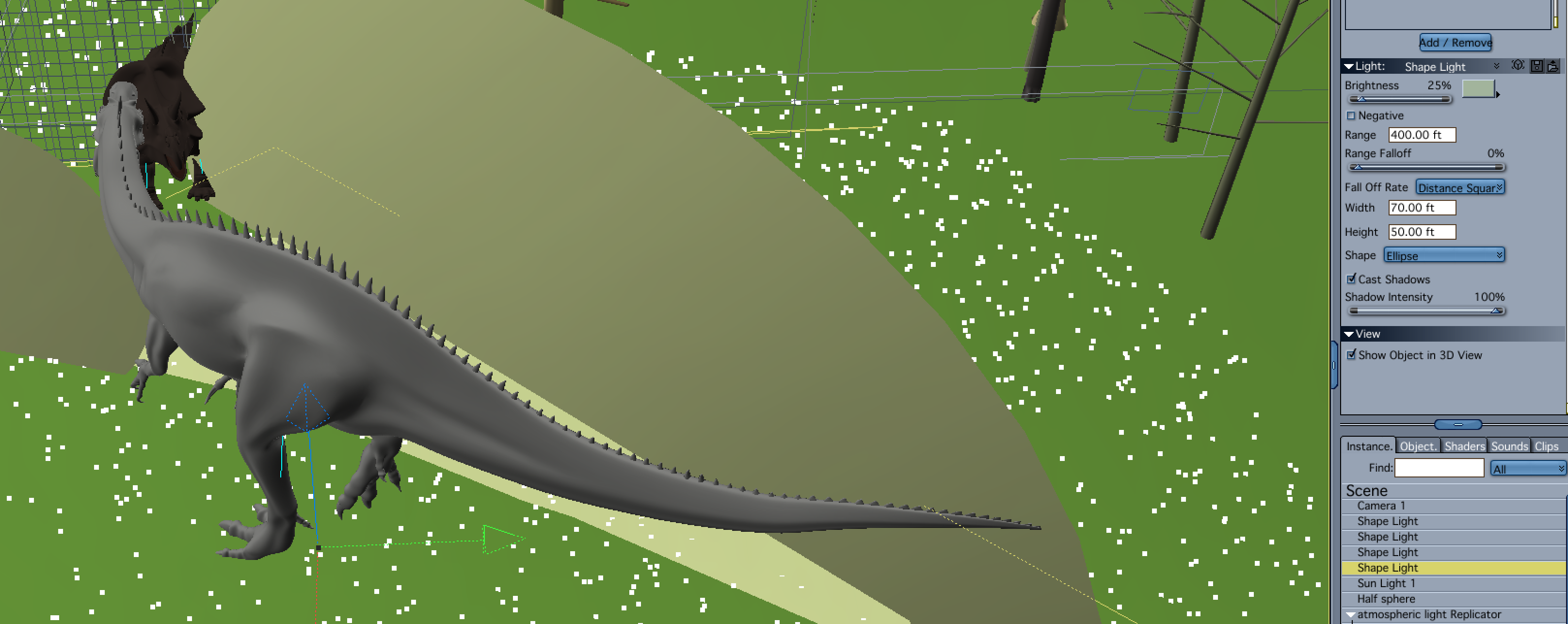
I wanted to add trees to the scene to both frame the dinosaurs and emphasize the meteors. Due to the position of the sun light, the zuniceratops was back lit, and looked like it was in silhouette. When I added the trees it became really lost. I added a shape light with a high intensity and soft shadows that was set to only light the zuniceratops. The light looks like the sunlight is lighting the animal and provides a kind of rim light effect.
The other lighting issue with the zuniceratops was the atmospheric light that I was simulating with a special light rig (more on that below). When I added the trees, they blocked the directional light from the atmosphere light rig and created a really dark animal. To compensate, I duplicated the first shape light, reduced the intensity, changed the color to a bluish gray, and moved it to the opposite side of the dinosaur.
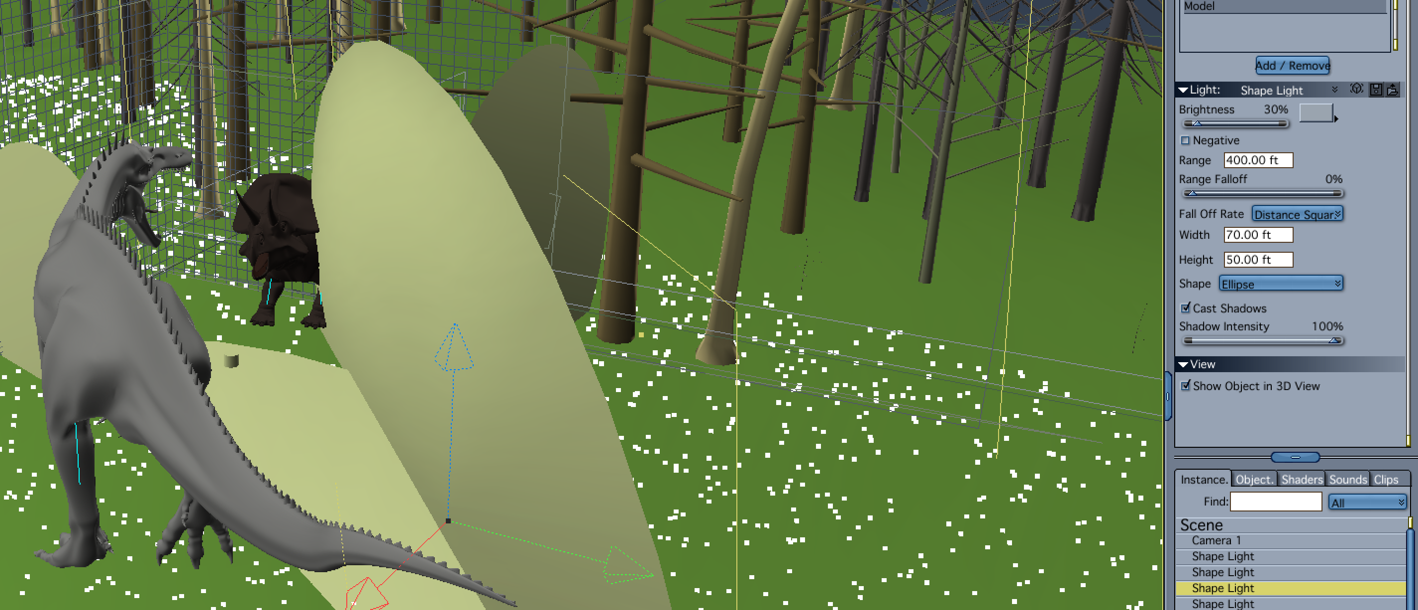
I ran into similar lighting issues with the suchomimus, in that the side away from the sun was very dark, and the so was the underbelly. I decided not to add a light to mimic the sunlight as there was a lot of contrast with the sky and sun's disk and aura. I felt that it would have been washed out.
The atmospheric lighting on the side of the dinosaur opposite the sunlight was actually not that bad, but I did want to brighten it a bit and to bring out the skin's detail. I didn't want to increase the brightness on my atmospheric light rig because it would lighten other areas of the scene that I didn't want lit up as much. My solution was to use a low intensity shape light set to a bluish color with soft shadows, to only illuminate the suchomimus' model. I also wanted to suggest reflected light from the ground on the under belly of the dino, so I added another low intensity shape light, that was set to a greenish color, and aiming up from the ground. Since it was set to only light the creature, I could postion it below the terrain and have it still light the dinosaur.
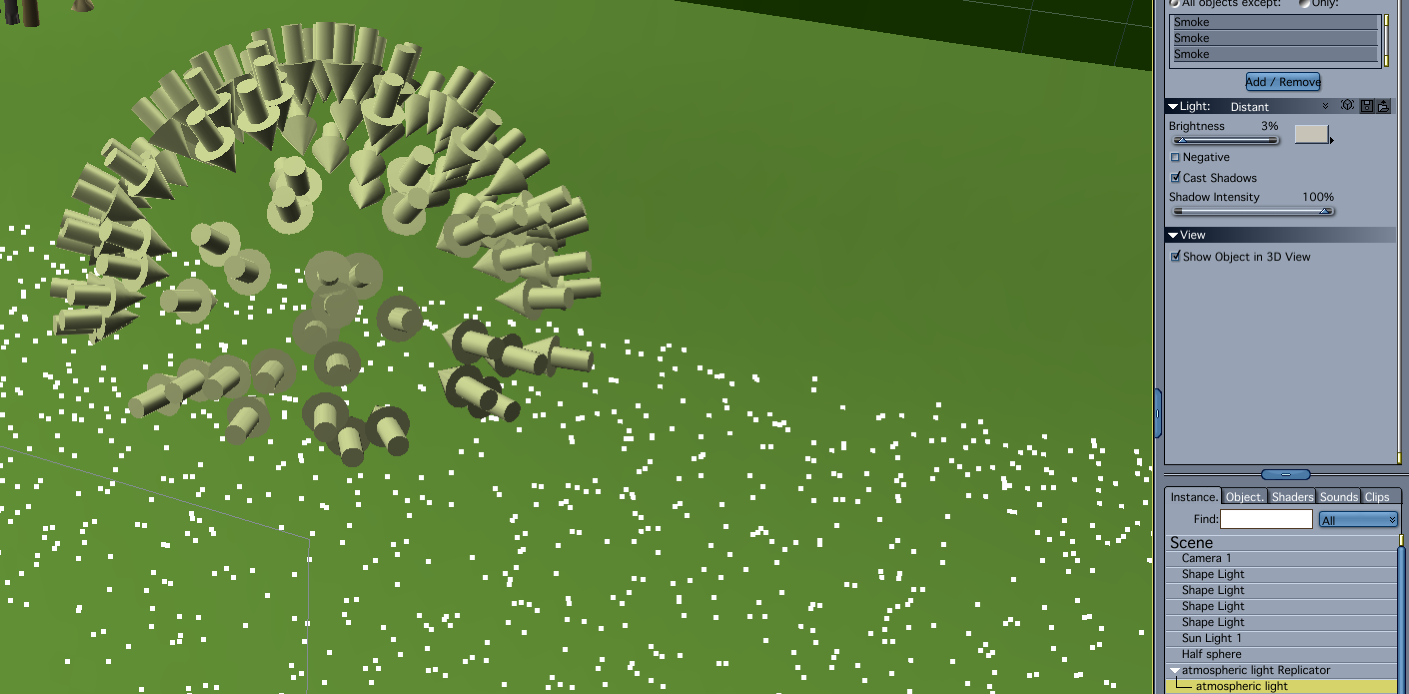
My atmospheric light rig uses the old trick of making a dome in the vertex modeler, and setting up a surface replicator to use the dome as the surface, and then replicating distance lights on it. I then hide the visibility of the dome. I think I used about 100 replications. Since the light is additive, I set the intensity to 2.5% so as not to overlight the scene. Note that while the light control panel displays the intensity as a whole number, it does honor decimal places. Try it out for yourself! The advantage of using the light rig as opposed to the Skylight, is that it renders much faster. Like the Skylight and Indirect lighting, you get nice diffuse light and shadows. Somethings don't render as fast or at least take as long to render using this method as do the GI options. Things with a lot of alpha for instance, can take a long time to render. Because of that, I excluded the smoke emitter I used on the meteors from the light. The other advantage to using the light rig is that because they are replicated lights, you only have to adjust the original light.
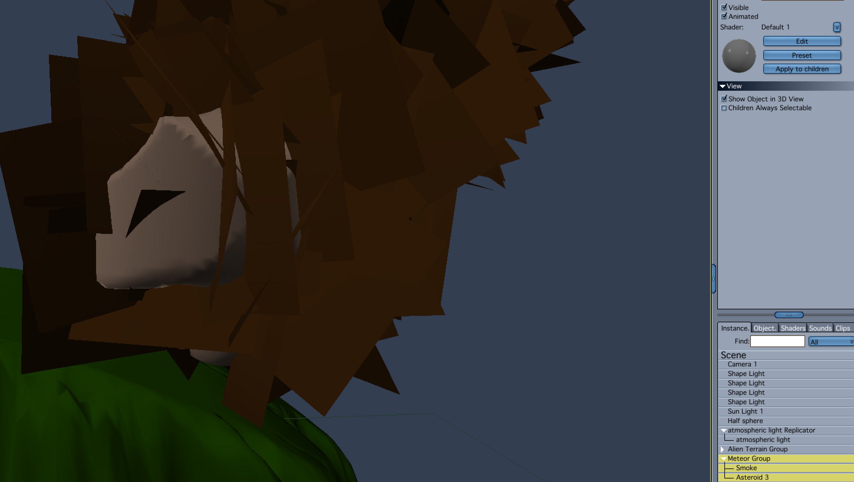
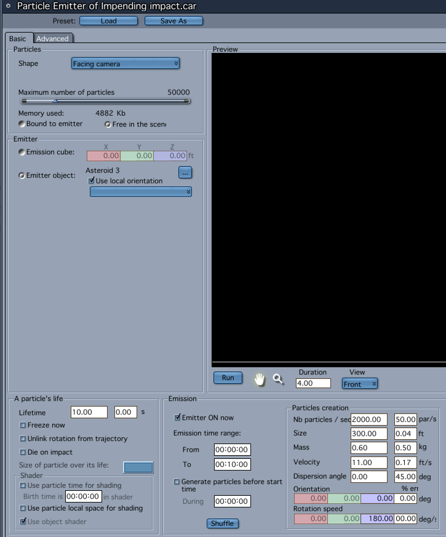
To make the meteors, I used the metaball modeler. I added the smoke emitter from the Basic Particles directory in the Object Browser. I modifed the particle size, emission speed, particle life, etc. in the emitter's editor. I also added the meteor as the emission object.
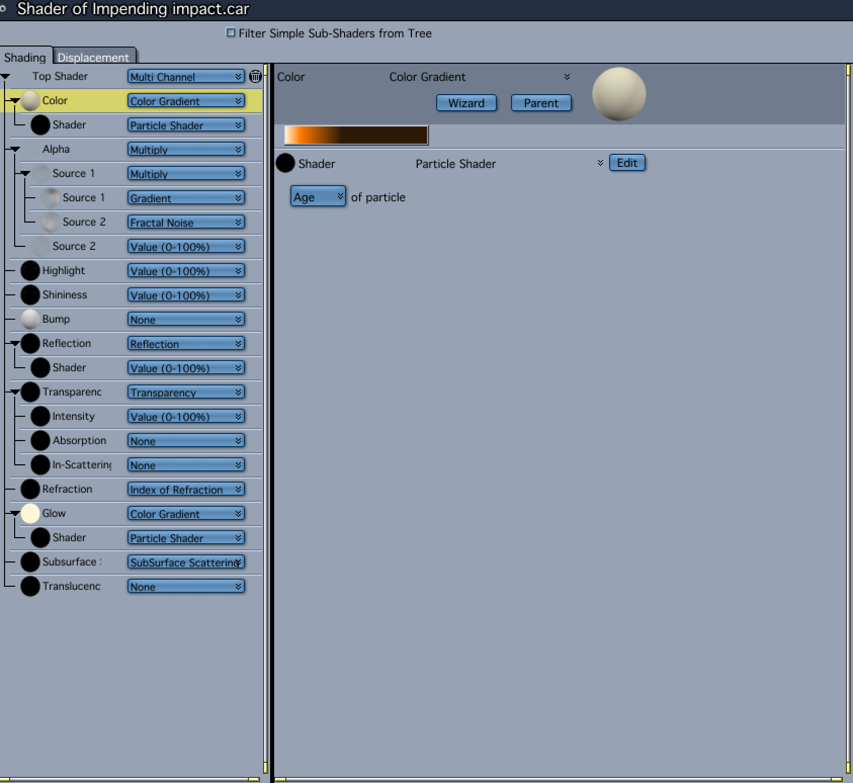
To get the particles to look like flames trailing into a smoke contrail, I selected the emitter and then entered the texture room. I added a color gradient to the Color channel, and selected the Particle Shader under the Natural Functions sub-menu to drive the gradient. I set the particle shader to "age." I then copied color gradient and pasted it into the glow channel.
To get the particles to stream behind the meteor, I set the scene length to 10 seconds, and used the translate tool to move the meteor from its initial position at frame 0, to the final position at the end of the timeline. I then found a frame I liked, and used the Render Current Frame option in the Render room.
Evilproducer - thanks for the detailed explanation of your scene, lots of info there and careful thoughts. I had no idea Carrara lights could accept decimal values - I know I have tried in the past and yeah, it just displays a whole number. Great to know, thanks!
Evilproducer, DesrtDude, and Selinita, thanks for the comments on the bees. Much to do.
Evil - I appreciate the very detailed explanations. Most helpful.
ed3D - I'd say structured, but could definitely be structured/unstructured. I like how you integrated Bryce and Blender in your workflow. Thanks for the screenshots.
I especially like the details in the sand, those "waves"...I'm sure there is a technical term I don't know for that...Even though I live in the desert I live like 8 blocks from downtown Tucson, lol.
Great to bring all those elements into Carrara. Bryce + Blender + Carrara. Yay!
The model did require a lot of work before I could use it. Half of the model have the normals flipped.
And this created some problems when I used the surface replicators and Philemos Triplanar Plugin.
So it was tour trough Hexagon to divide,weld and fix the normals..... lot of work.
Lights are two Spotlights with a gel-map and lightcone.
The concrete-rubbel are from Stonemason and the grass and tree are recycled from a previous challenge.
I love Aiko 3. Her pro pack was the first character package I ever bought. Figured it was time to let her out again, in her full anime glory.
Her outfit is a kitbash (thanks to Carrara's modeler) of DClassy and A3 Nurse (both available at Daz). Moko hair is a nice 3rd party freebie.
For the background, I used PhilW's incredible Night and Day City. It was my first time to take it for a spin, and I was impressed. To get a little more structural symmetry than usual, I rendered the city in the bottom half of the screen and saved it. In the same scene, I opened the render, and used it as a backdrop - but flipped upside down. That was also saved, and the combined result was used as a backdrop for Aiko. So, if you look at the setup pic, you will see the city is made of a single image that has been flipped. But I only wanted to suggest symmetry, so I added the blimps and some clouds to make it less obvious. Aiko masks the symmetry as well.
The blimps are Carrara objects. Other processes include Carrara cloud, light cone, a touch of GMIC, and text. No GI or HDRI, etc. Takes only a minute to render on my modest 4 core machine. My kind of render!
Kidding aside. Your amazing use of older figures really drives home the importance of the artist. Very inspiring. Keep it up. Thank you.
After Dart, I probably write the longest average post. Please insert an appropriately long post of adoration. Seriously, I wish that I could somehow combine Dave's models, with your adaptation, with Misty's workarounds, with Philemo's plugins, with.(insert everybody's particular greatness...)...
How awesome would that be? Answer? As per lego movie? Everything is awesome. In the Carrara forum, that really is true.
The model did require a lot of work before I could use it. Half of the model have the normals flipped.
And this created some problems when I used the surface replicators and Philemos Triplanar Plugin.
So it was tour trough Hexagon to divide,weld and fix the normals..... lot of work.
Lights are two Spotlights with a gel-map and lightcone.
The concrete-rubbel are from Stonemason and the grass and tree are recycled from a previous challenge.
Wow Varsel, I love this image. What I get from it, as an observer of art and my own bias is... when "humans" are gone...Mother Nature sighs relief and can rebuild...and will...hope I'm not being too dark, just Art is is subjective and in the eye of the beholder...
And thank you for the explanations of all the roadblocks you had to overcome regarding the models and jumping through software hoops to solve those problems. Cheers
I love Aiko 3. Her pro pack was the first character package I ever bought. Figured it was time to let her out again, in her full anime glory.
Her outfit is a kitbash (thanks to Carrara's modeler) of DClassy and A3 Nurse (both available at Daz). Moko hair is a nice 3rd party freebie.
For the background, I used PhilW's incredible Night and Day City. It was my first time to take it for a spin, and I was impressed. To get a little more structural symmetry than usual, I rendered the city in the bottom half of the screen and saved it. In the same scene, I opened the render, and used it as a backdrop - but flipped upside down. That was also saved, and the combined result was used as a backdrop for Aiko. So, if you look at the setup pic, you will see the city is made of a single image that has been flipped. But I only wanted to suggest symmetry, so I added the blimps and some clouds to make it less obvious. Aiko masks the symmetry as well.
The blimps are Carrara objects. Other processes include Carrara cloud, light cone, a touch of GMIC, and text. No GI or HDRI, etc. Takes only a minute to render on my modest 4 core machine. My kind of render!
No postwork.
UnifiedBarin - Looks like a scene out of a Hollywood film!
I "get" how you did the background...but barely...ha ha. Awesome! And...I see a building with a glowing "Carrara" sign. Sweet! Love those subtle details.
Just a random guy constructing or deconstructing with Lego
Stezza - another awesome image. Thank you and all others for modeling interpretions of Lego blocks, and usage in your images. Great new reource for modeling.
Love the colors of the Lego blocks...and then things get a bit sinister.
Kidding aside. Your amazing use of older figures really drives home the importance of the artist. Very inspiring. Keep it up. Thank you.
After Dart, I probably write the longest average post. Please insert an appropriately long post of adoration. Seriously, I wish that I could somehow combine Dave's models, with your adaptation, with Misty's workarounds, with Philemo's plugins, with.(insert everybody's particular greatness...)...
How awesome would that be? Answer? As per lego movie? Everything is awesome. In the Carrara forum, that really is true.
Your contributions and explanations of your workflows, like so many others here, is/are priceless. Yes, you and all here, and everything Carrara is Awesome!!
@Stezza - and our first Lego entry is official. Awesome (really). But will there be more Lego entries? I bet there will.
Meanwhile, thinking about Stonehenge led me to rethink an old idea for an ancient city. Plan to have a fancy temple, but focusing on more basic sections of city right now.
I am primarily following the workflow that PhilW describes in his advanced training tutorial, so I won't go to detail here. One thing I added was inserting a terrain that applied a zero edge filter (and other adjustments) so that it lines up with the other flat plains. I've modeled some simple buildings, low res people, lowres plants. The people are not rigged, but I made a couple of morphs so I could move their arms and legs a little. The ancient bricks are kind of dull so I tried to add some color with some awnings. As a test, I'd say the terrain fit nicely. See the empty squares.
Comments
I think I'm done with this. This is the image out of Carrara with no rework except resizing and converting to .jpg
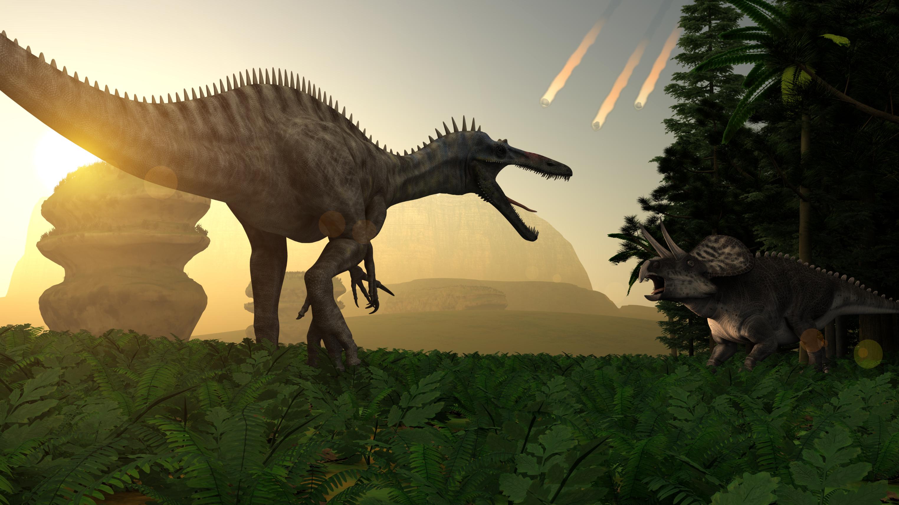
I think I'm going to call it, Deconstructing an Epoch.
Beautiful! It came together very nicely. Love the repeating landscape elements receding ino the distance. They almost look like menacing mouths full of teeth themselves. Great job evilproducer!
Thanks!
I did a little postwork with a depth pass to add a subtle DOF.
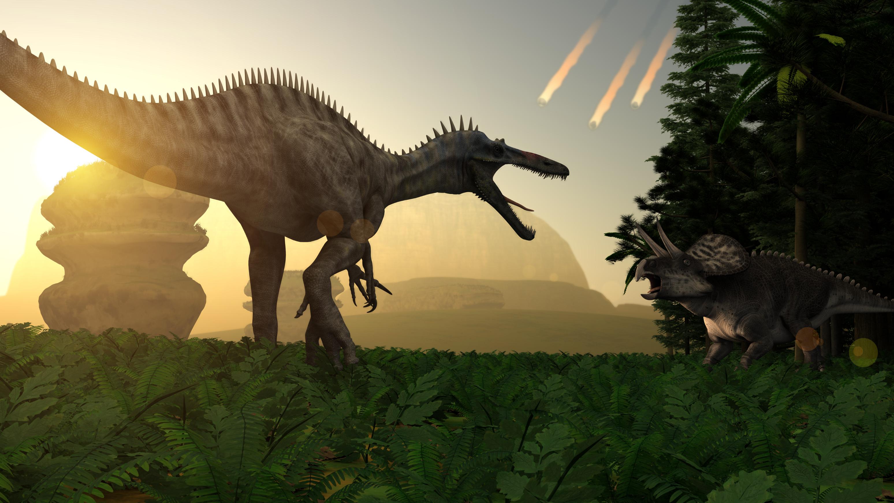
poor dinos... just didn't quite get a foothold on survival...
great work @evilproducer
- Varsel - wonderful job creating the mood. very impressive
- Evilproducer - poor dinos won't know what did them in. great DOF.
Here is the beginning of an idea. The neolithic henges are a bit of a structural mystery. Maybe giant bees helped out.
Nice use of hair on the bees, @Diomede_Carrara
Hi all. Thanks for the compliments on my picture. I did not use any sort of GI for this picture. I used a light rig and lights for accent. I relied heavily on Carrara's ability to "link" lights to objects using the "Only," and "All Objects Except," options in the light's general control tab.

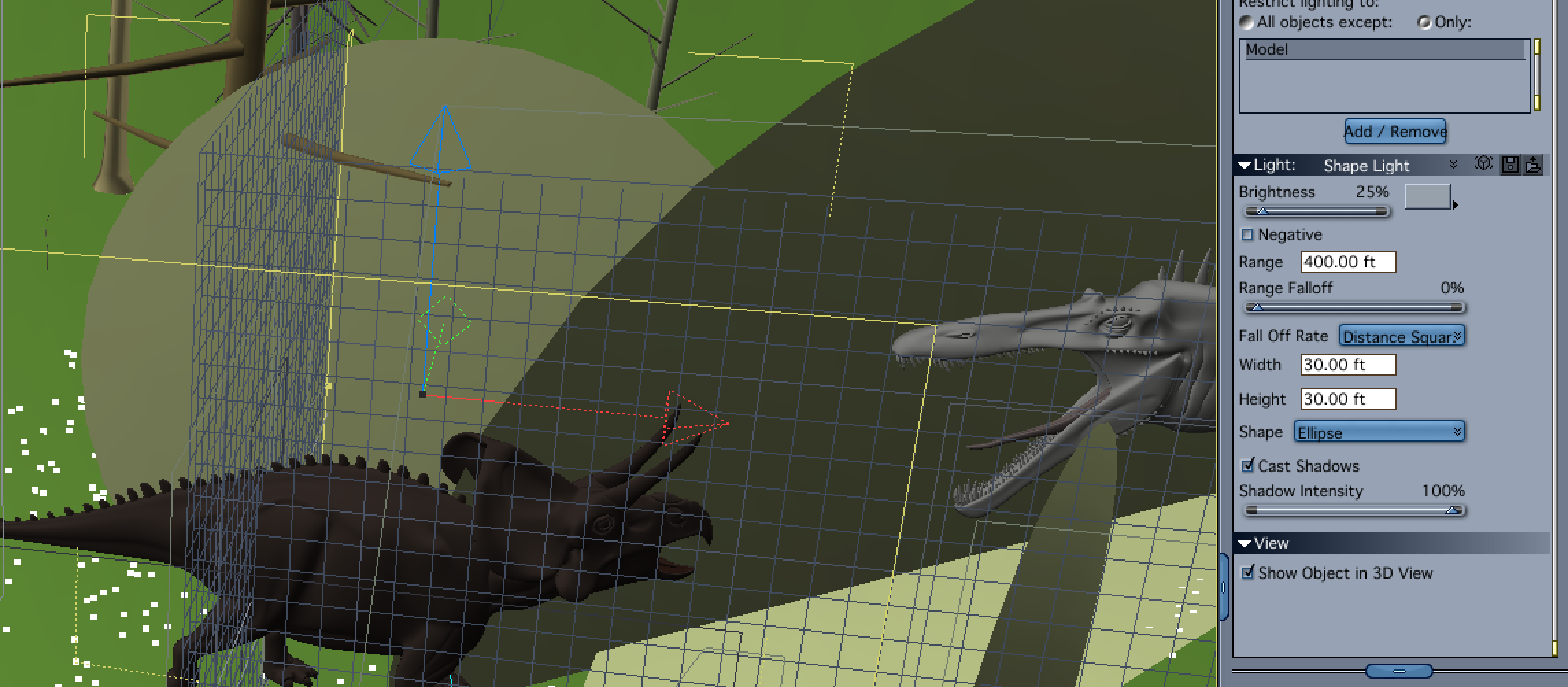
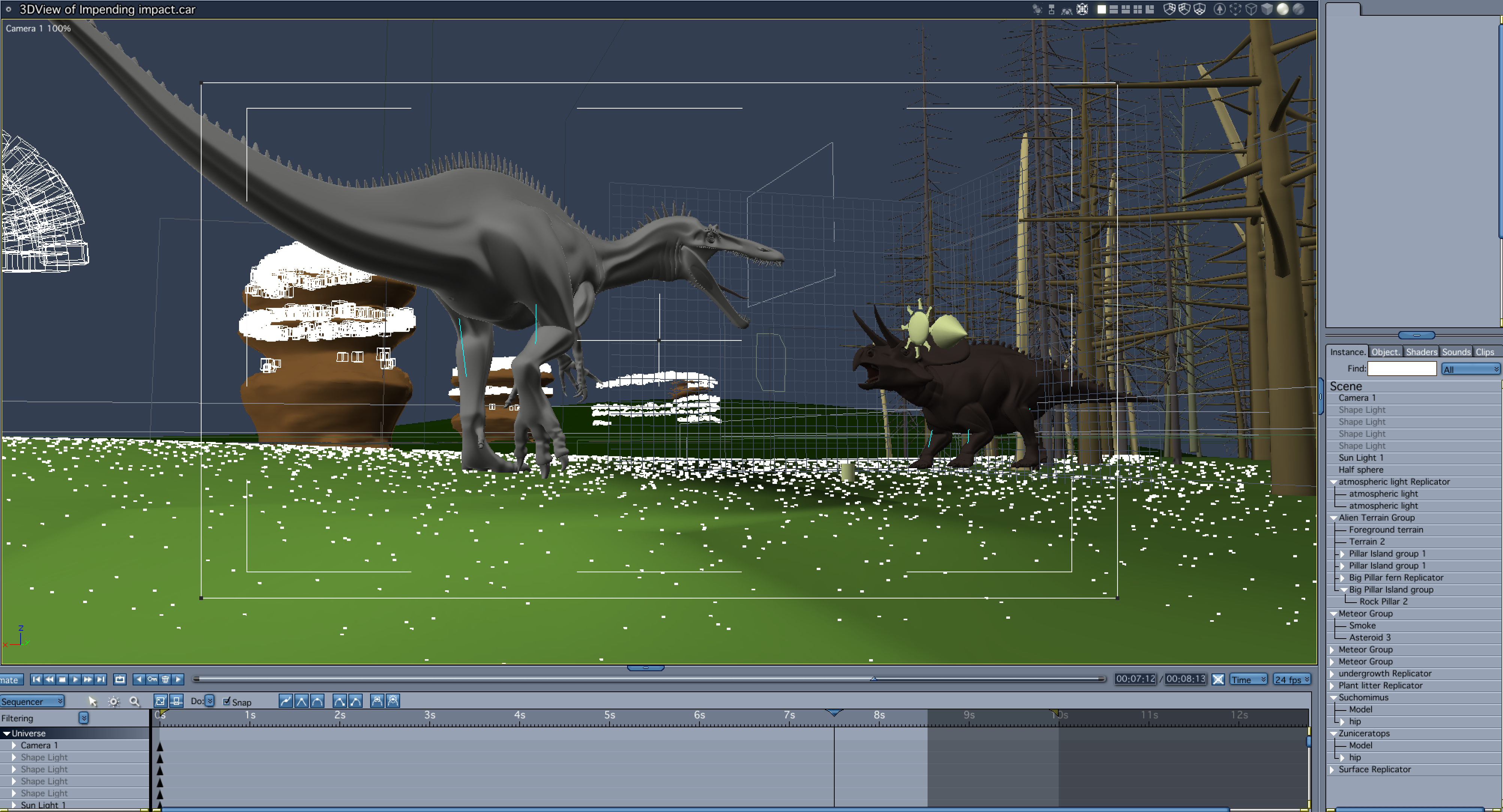

I wanted to add trees to the scene to both frame the dinosaurs and emphasize the meteors. Due to the position of the sun light, the zuniceratops was back lit, and looked like it was in silhouette. When I added the trees it became really lost. I added a shape light with a high intensity and soft shadows that was set to only light the zuniceratops. The light looks like the sunlight is lighting the animal and provides a kind of rim light effect.
The other lighting issue with the zuniceratops was the atmospheric light that I was simulating with a special light rig (more on that below). When I added the trees, they blocked the directional light from the atmosphere light rig and created a really dark animal. To compensate, I duplicated the first shape light, reduced the intensity, changed the color to a bluish gray, and moved it to the opposite side of the dinosaur.
I ran into similar lighting issues with the suchomimus, in that the side away from the sun was very dark, and the so was the underbelly. I decided not to add a light to mimic the sunlight as there was a lot of contrast with the sky and sun's disk and aura. I felt that it would have been washed out.
The atmospheric lighting on the side of the dinosaur opposite the sunlight was actually not that bad, but I did want to brighten it a bit and to bring out the skin's detail. I didn't want to increase the brightness on my atmospheric light rig because it would lighten other areas of the scene that I didn't want lit up as much. My solution was to use a low intensity shape light set to a bluish color with soft shadows, to only illuminate the suchomimus' model. I also wanted to suggest reflected light from the ground on the under belly of the dino, so I added another low intensity shape light, that was set to a greenish color, and aiming up from the ground. Since it was set to only light the creature, I could postion it below the terrain and have it still light the dinosaur.
My atmospheric light rig uses the old trick of making a dome in the vertex modeler, and setting up a surface replicator to use the dome as the surface, and then replicating distance lights on it. I then hide the visibility of the dome. I think I used about 100 replications. Since the light is additive, I set the intensity to 2.5% so as not to overlight the scene. Note that while the light control panel displays the intensity as a whole number, it does honor decimal places. Try it out for yourself! The advantage of using the light rig as opposed to the Skylight, is that it renders much faster. Like the Skylight and Indirect lighting, you get nice diffuse light and shadows. Somethings don't render as fast or at least take as long to render using this method as do the GI options. Things with a lot of alpha for instance, can take a long time to render. Because of that, I excluded the smoke emitter I used on the meteors from the light. The other advantage to using the light rig is that because they are replicated lights, you only have to adjust the original light.
To make the meteors, I used the metaball modeler. I added the smoke emitter from the Basic Particles directory in the Object Browser. I modifed the particle size, emission speed, particle life, etc. in the emitter's editor. I also added the meteor as the emission object.
To get the particles to look like flames trailing into a smoke contrail, I selected the emitter and then entered the texture room. I added a color gradient to the Color channel, and selected the Particle Shader under the Natural Functions sub-menu to drive the gradient. I set the particle shader to "age." I then copied color gradient and pasted it into the glow channel.
To get the particles to stream behind the meteor, I set the scene length to 10 seconds, and used the translate tool to move the meteor from its initial position at frame 0, to the final position at the end of the timeline. I then found a frame I liked, and used the Render Current Frame option in the Render room.
Neat idea - looks like a great start!
Evilproducer - thanks for the detailed explanation of your scene, lots of info there and careful thoughts. I had no idea Carrara lights could accept decimal values - I know I have tried in the past and yeah, it just displays a whole number. Great to know, thanks!
Love the meteors!
Hilarious! I wouldn't want to be under one of those blocks as the bees fly over
And would this Be an Structured/Unstructured ??
was on this RetroWave/SythWave kind of Theme
_Pyramids made with Blender
Or this One ??
And a WIP +screenshots_
also the Moon is Dave Savage's Moon for Bryce + link below+
https://www.daz3d.com/forums/discussion/283351/bad-moon-rising-free-bryce-moon-prop
+thanx+
And +Also Blender
Out of curiosity, why the '08 copyright notice? Shouldn't that be '19?
Evilproducer, DesrtDude, and Selinita, thanks for the comments on the bees. Much to do.
Evil - I appreciate the very detailed explanations. Most helpful.
ed3D - I'd say structured, but could definitely be structured/unstructured. I like how you integrated Bryce and Blender in your workflow. Thanks for the screenshots.
Awesome ed3D - Yes!! Looks great!
I especially like the details in the sand, those "waves"...I'm sure there is a technical term I don't know for that...Even though I live in the desert I live like 8 blocks from downtown Tucson, lol.
Great to bring all those elements into Carrara. Bryce + Blender + Carrara. Yay!
When Structures are becoming unstructured.
For the building, I used the model from http://www.3drender.com/challenges/ ; -Challenge #17: Natural History
The model did require a lot of work before I could use it. Half of the model have the normals flipped.
And this created some problems when I used the surface replicators and Philemos Triplanar Plugin.
So it was tour trough Hexagon to divide,weld and fix the normals..... lot of work.
Lights are two Spotlights with a gel-map and lightcone.
The concrete-rubbel are from Stonemason and the grass and tree are recycled from a previous challenge.
You guys are really stepping up! Great to see Varsel and EP joining in for this Challenge.
The World of Aiko 3
I love Aiko 3. Her pro pack was the first character package I ever bought. Figured it was time to let her out again, in her full anime glory.
Her outfit is a kitbash (thanks to Carrara's modeler) of DClassy and A3 Nurse (both available at Daz). Moko hair is a nice 3rd party freebie.
For the background, I used PhilW's incredible Night and Day City. It was my first time to take it for a spin, and I was impressed. To get a little more structural symmetry than usual, I rendered the city in the bottom half of the screen and saved it. In the same scene, I opened the render, and used it as a backdrop - but flipped upside down. That was also saved, and the combined result was used as a backdrop for Aiko. So, if you look at the setup pic, you will see the city is made of a single image that has been flipped. But I only wanted to suggest symmetry, so I added the blimps and some clouds to make it less obvious. Aiko masks the symmetry as well.
The blimps are Carrara objects. Other processes include Carrara cloud, light cone, a touch of GMIC, and text. No GI or HDRI, etc. Takes only a minute to render on my modest 4 core machine. My kind of render!
No postwork.
what a buzz...
great work by everyone once again..
using LoRenzo again....
Just a random guy constructing or deconstructing with Lego
Evilproducer : made in those days, then save as a file by itself _like a pre-set
_So, not to keep re-makeing Every time just to put in Signature
Diomede : alright then _Thank you kindly
DesertDude : Thank very much _ like those waves also
UnifiedBrain : The World of Aiko 3 _very well done
Stezza : +Cool+ nicely done
_ + your Guy reminds of Alice Cooper
UB -her blimps look blimptastic.
Kidding aside. Your amazing use of older figures really drives home the importance of the artist. Very inspiring. Keep it up. Thank you.
After Dart, I probably write the longest average post. Please insert an appropriately long post of adoration. Seriously, I wish that I could somehow combine Dave's models, with your adaptation, with Misty's workarounds, with Philemo's plugins, with.(insert everybody's particular greatness...)...
How awesome would that be? Answer? As per lego movie? Everything is awesome. In the Carrara forum, that really is true.
Wow Varsel, I love this image. What I get from it, as an observer of art and my own bias is... when "humans" are gone...Mother Nature sighs relief and can rebuild...and will...hope I'm not being too dark, just Art is is subjective and in the eye of the beholder...
And thank you for the explanations of all the roadblocks you had to overcome regarding the models and jumping through software hoops to solve those problems. Cheers
UnifiedBarin - Looks like a scene out of a Hollywood film!
I "get" how you did the background...but barely...ha ha. Awesome! And...I see a building with a glowing "Carrara" sign. Sweet! Love those subtle details.
Great confident gesture of the figure.
Stezza - another awesome image. Thank you and all others for modeling interpretions of Lego blocks, and usage in your images. Great new reource for modeling.
Love the colors of the Lego blocks...and then things get a bit sinister.
"D Carraring.......Sons" Nice
As usual nice soft lighting.
Your contributions and explanations of your workflows, like so many others here, is/are priceless. Yes, you and all here, and everything Carrara is Awesome!!
@DesertDude - thanks for the kind comments.
@Stezza - and our first Lego entry is official. Awesome (really). But will there be more Lego entries? I bet there will.
Meanwhile, thinking about Stonehenge led me to rethink an old idea for an ancient city. Plan to have a fancy temple, but focusing on more basic sections of city right now.
I am primarily following the workflow that PhilW describes in his advanced training tutorial, so I won't go to detail here. One thing I added was inserting a terrain that applied a zero edge filter (and other adjustments) so that it lines up with the other flat plains. I've modeled some simple buildings, low res people, lowres plants. The people are not rigged, but I made a couple of morphs so I could move their arms and legs a little. The ancient bricks are kind of dull so I tried to add some color with some awnings. As a test, I'd say the terrain fit nicely. See the empty squares.
Preliminary WIP and some of the models.