NEW! Novica & Invited Guest Contributors Tips & Product Reviews Pt 6
This discussion has been closed.
Adding to Cart…

Licensing Agreement | Terms of Service | Privacy Policy | EULA
© 2024 Daz Productions Inc. All Rights Reserved.You currently have no notifications.

Licensing Agreement | Terms of Service | Privacy Policy | EULA
© 2024 Daz Productions Inc. All Rights Reserved.
Comments
Here's M7 with the 3delight Shaders. He doesn't look too bad. IF I was using these mats I'd adjust the lights to gray to tone the brightness down a bit, but these are all white lights.
I'd say he looks really decent! Nice render!
I use a set of lights that haven't been released yet LOL. I'm not sure if they will be released as I think she was going to upgrade them a bit before she does. But then, I've been using the for half the year and they are my go-to lights that I use on EVERYTHING.
I"ve got Aiden, and he uses the G3Male base uv's so I'm going to give him a try tonight. I'm still hesitant to pick up M7 - every time I think he looks fantastic, it's an iray render - on the bright side, I THINK i'll be ordering my new computer next week *jumps up and down in excitement* so hopefully I'll be getting into iray a bit more from then.
My $1300 water heater is my Christmas present lol. (And yeah, given the choice between hot water or keystrokes, hot water wins. But lousy timing for it to go completely out!) Love to see Aiden when you get him rendered.
oh, i feel for you on the lousy timing of the hot water heater. We just got hit with a $1000 repair bill on our one and only car, so this fortnight is REALLY bad for finances...I have $1 in my bank account till next week. LOL. I just had to borrow $20 from my mother to go and get bread and milk today. (and forget about the daz sales going on right now, certainly can't afford that) The money for my computer is a small $1000 'inheritence' from when my grandfather passed away a few months ago - it's been earmarked for the new build since then and my mohter is hanging on to it for me till i have the components in place, so I can't spend it. And my husband refused to let me use it for the car repair, cos he wants me to keep it for the new computer. If we hadn't had the car problem, we would have been fine this fortnight....but yeah, bad timing on the car's part. LOL
It was fun using the Batch Render while I wasn't home- loaded up some headshots and it was cranking them out when I got home. These are from Dial-A-Girl and I'm doing the Tokyo and Budapest too. These are using Destiny's skin materials.
First is Adele, then Anja, Jessica, Lorena, Marie. Jessica and Marie are VERY close, the chins are different and the eyebrows shift slightly- but I had to go back and apply the morphs to check them against each other. The nostrils also come up on Marie (I'm sitting here clicking) I wish there had been more of a difference on those two.
Dial-A-Girl series is COOL. You can apply the heads straight, or go into any of the parts (aka nose, lips, cheeks) and select one of the figure's parts. So you can have Lorena's eyes, Marie's nose, Adele's mouth, etc. Wishlist if you don't have them, they're handy!
EDIT: I AM DOING SIDE VIEWS FOR YOU RIGHT NOW. CHECK BACK.
Dial-a-Girl: Budapest Express shown below. Can only post two characters as am doing side views. Will do more in another post.
Dora, Hannah.
More Budapest gals. Jazmin and Liliana.
Last Budapest Express gals. Reka and Tamara.
Reserved for the side shots of the Dial gals.
Novica, slow down I can hardly keep up anymore, Lol !! But do appreciate, all you've shared, your doing a fantastic job

Novica, I am wondering what sort of camera settings your using for those test portraits. They all look a bit nose..urm..heavy.
Default camera but the few I test rendered in Perspective view were quite similar. They were loaded directly onto G2F. Perspective on, Frame width 36, focal length 65, focal distance 62.33 and F/Stop 22. It's the same exact settings that I use for all the catalog head shots, and they all look like the promo thumbnails (aka, Gia looks like Gia, Callie looks like Callie, etc. See below, Cassia for Olympia.) I used the zero morphs option between each one to reset back to G2F. Any suggestions?
One thing to keep in mind- these are the straight heads, 100%- the promo images show you mixtures of each character. That nose is really large when it's not on a compilation face where the cheeks may be fuller. I'll test the nosey one on a mixed face and let's see what it does.
Edit: Image 1: Put the figure back quite a ways to eliminate the possibility of distortion from being too close to the front, same results. The noses are pronounced. I've left the space above the head so you can see how far back the camera was pulled. This was a combination figure but using Marie's pronounced nose.
EDIT: Image 2: Reloaded G2F and left her with the default skin, tested Maria (with the pronounced nose) and results are the same with various cameras/ character further back or closer to camera made no difference. Then tested a couple others with the bigger noses and still had noticeable honkers (no offense ladies.)
Glad you are doing these. I forgot I had Dial-A-Girl. WIll have to give it a try.
Please do- let me know if yours look similar to mine (put one or two in the same position?)
Thought I would share some renders of Hemlock Folly which I got during the PA sale. It comes with both 3DL and iRay materials and is loaded with all types of plants, as well as an interior for the tower. It has several areas that make for good outdoor scenes. The plants and fences can also be used as props with other sets. My only warning is that this is a resource intensive environment but I'll share a few tips I've learned to work around the issues.
These renders are all 3DL. The set does not have a background so I used FirstBastion's skydome from his 1950's Motel set. The first render uses the under the bridge camera and the default lights. If you have AOA distant light and ambient lights as I do, there's a convenient preset that will load them. I found them set a bit bright so reduced the ambient light intensity from 20 to 10%. These were used for the second render. I like the AOA lights better.
1 2
2 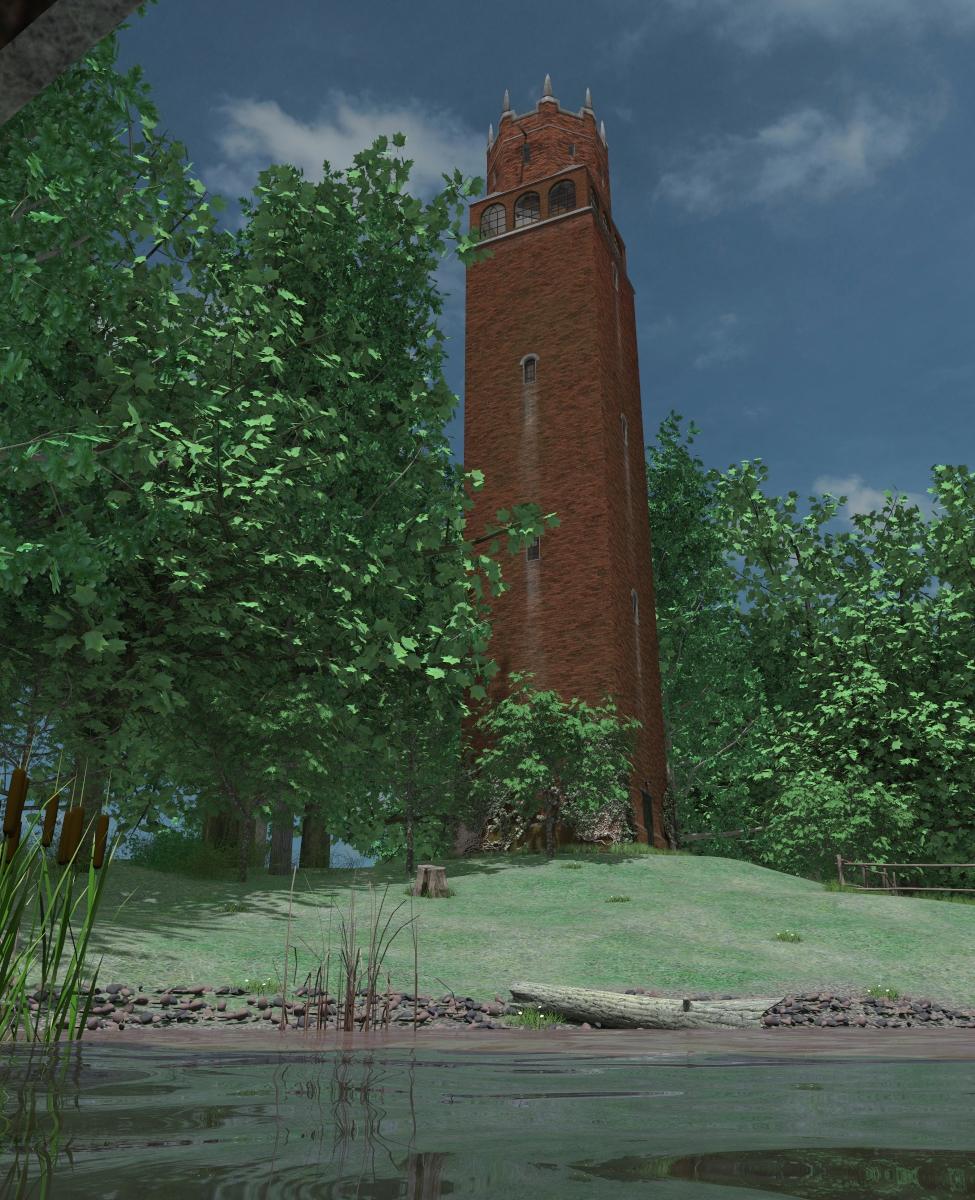
The third render shows one of the outside scenic spots, along the western track. As you can see, very lush and varied vegetation especially along the path and in the understory of the trees. The set also supports the use of AOA grass shaders for 3DL. The fourth render shows the AOA grass in use. This is the same scene as the third render, but I didn't turn on all the trees, weeds and grasses. Get a very different feel between the two.
3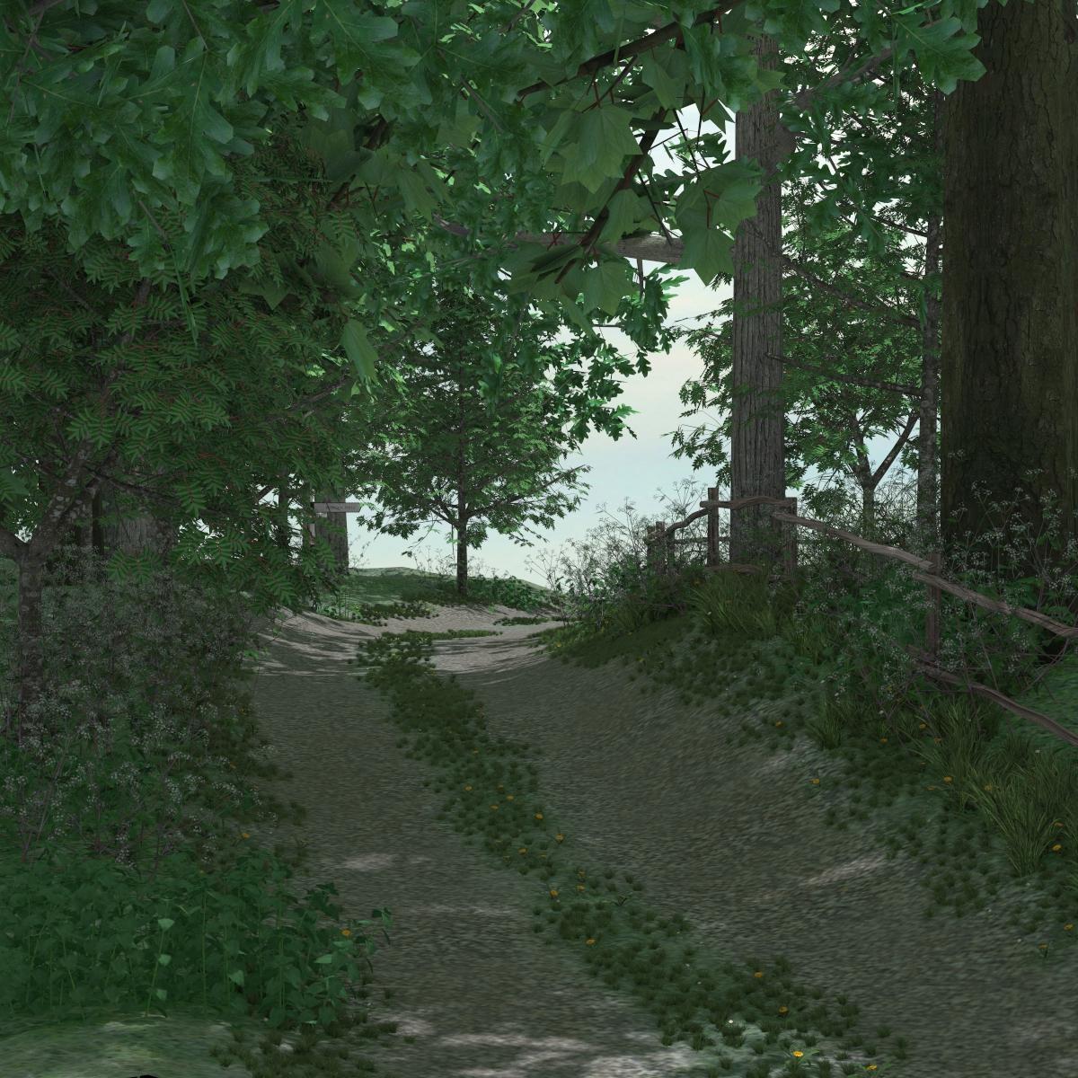
4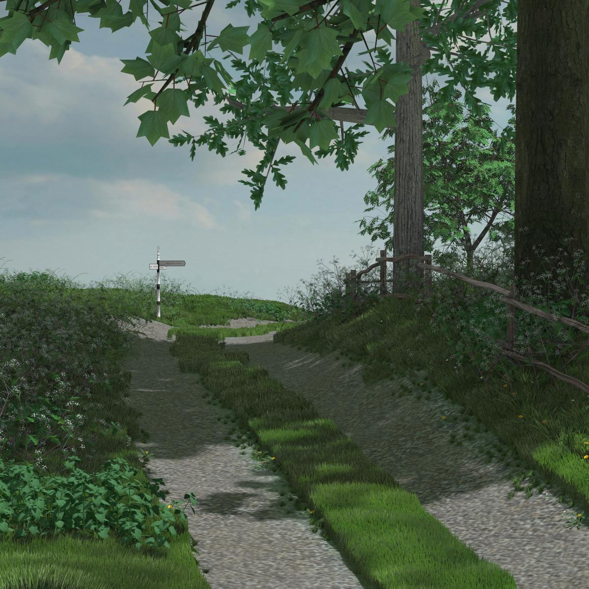
And finally two quick renders from inside the tower, to show that these areas were not neglected. There are lots of interior lights. I found though you need to ctrl+click to add them, otherwise one set replaces the previous.
5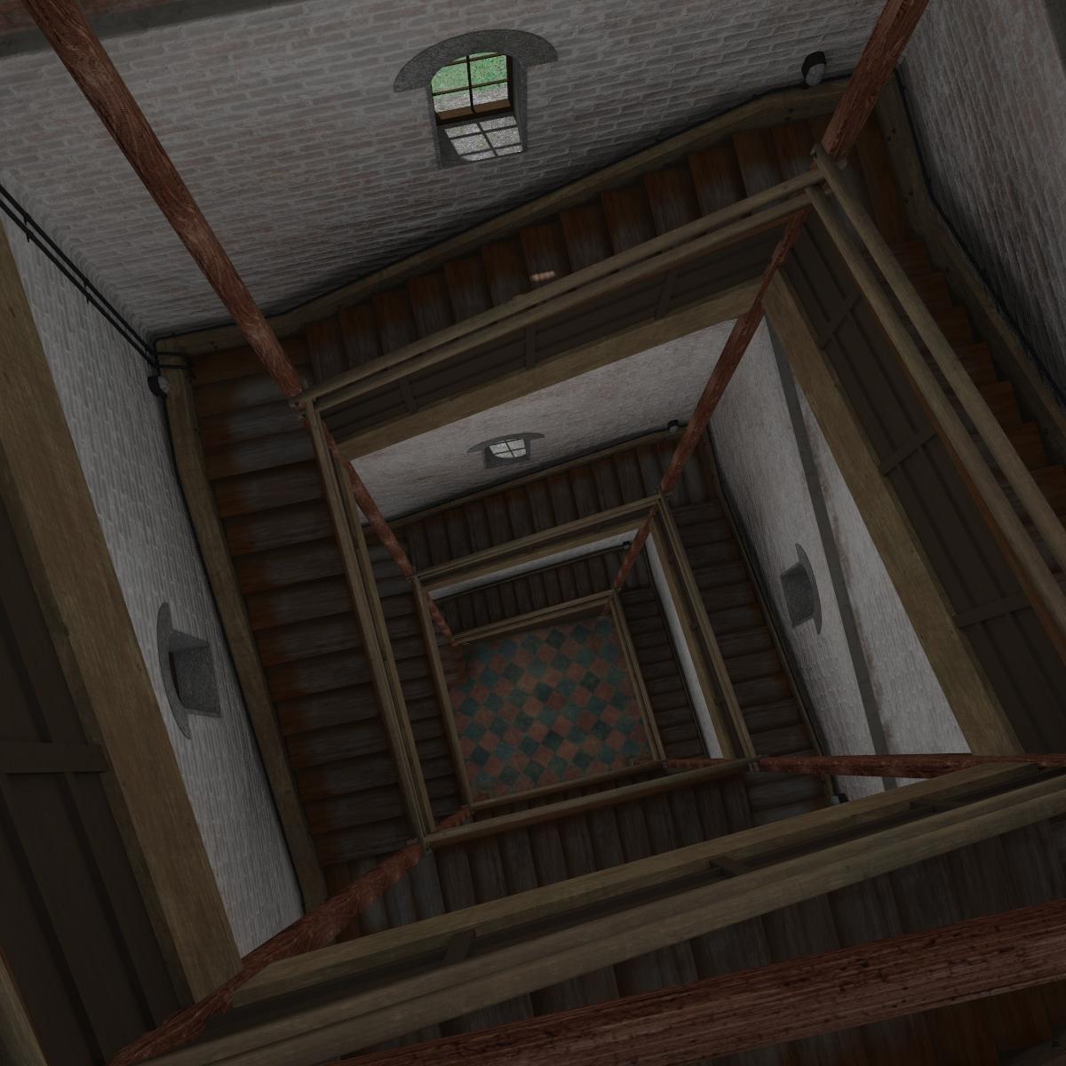
6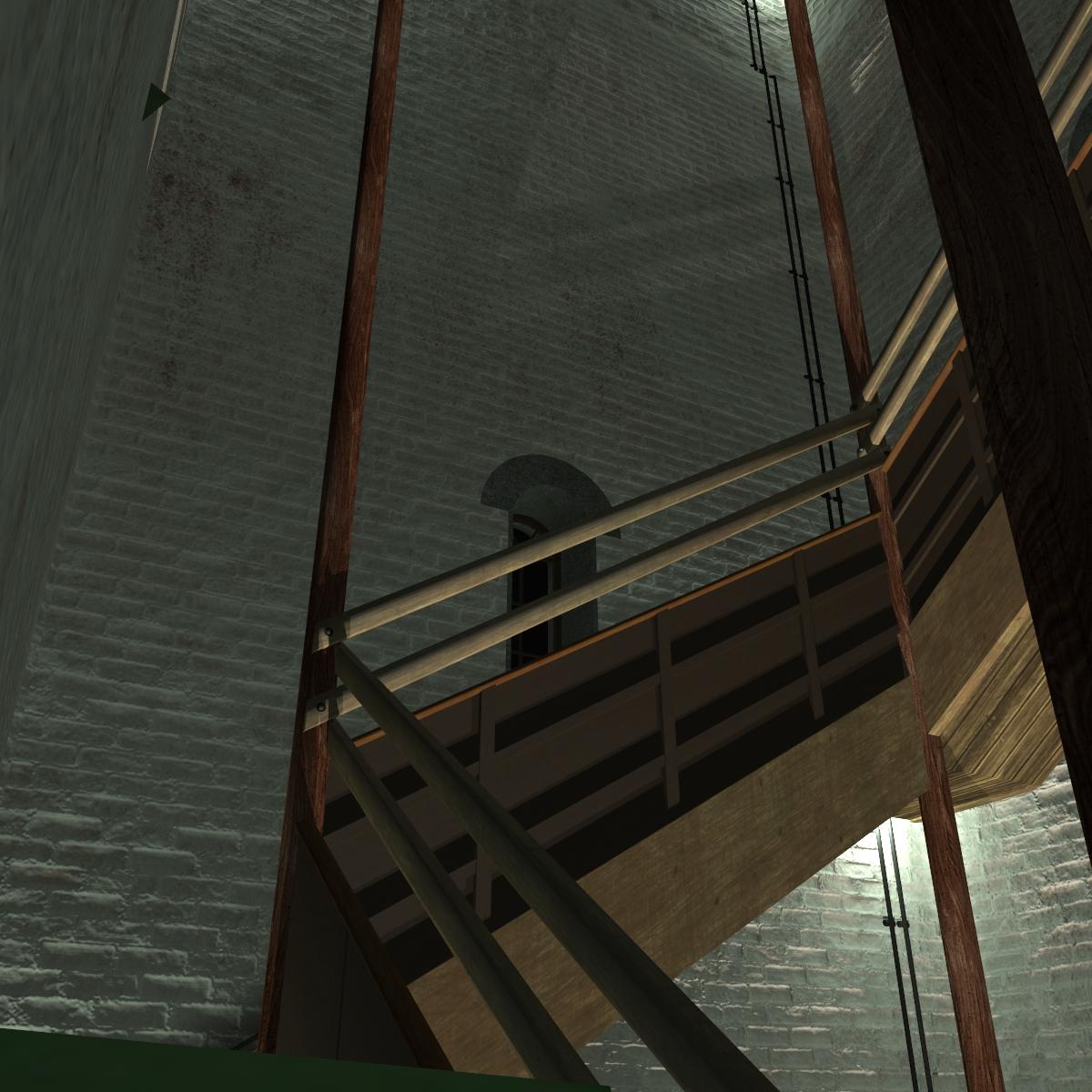
All in all, this is a very beautiful, versatile environment BUT it is resource intensive. The first couple of times I loaded it, not only did it take some time to load but I could not change the camera view at all - totally unresponsive for seconds, then suddenly a big jump. The only view setting that allowed any manipulation was bounding boxes, but then you have no idea what you are looking at. The key is to load the set once, wait for everything to show up, go through and turn off ALL the vegetation except the base trees, then save it as a scene or scene preset. Now you can manipulate the viewport to get the camera angle you want or you can use one of the preset cameras, then set your lights and background. I then do a few test renders, and when happy, I start adding back in vegetation that appears in the scene. It renders fairly fast, it's just the viewport manipulation with all the vegetation that slows down to worse than a crawl. Sometimes after a render you can turn the vegetation back off to do a second scene, but about half the time the program hangs and becomes unresponsive. When that happens, I just closeout the scene, open the saved scene preset I made, and plan out another render.
Rendering a close up your going to get some distortions unless you adjust the focal length on the camera. I've done two sets of renders of V7. I adjust the focal distance on them and then reframed them so that they took the same amount of space before the render. In other words even though her head is smaller in the the 65 mm images before render it took up the same volume of space as the other two. There is only minimal difference between the 110 and 125 but I did both because between those two numbers tend to be a sweet spot for a close up like this.
So are these numbers the focal length or the focal distance? (Assuming distance, length would bring it closer)
EDIT: I changed the focal distance and kept the focal length at 65, didn't see any difference (and clicked back and forth in the graphics program where you first call up an image, so it appears in one box, and there was no movement whatsoever between clicking the different ones. In other words, stacked images where something would shift if anything changed.) When I changed the focal length, that brought her cheek plastered up to the lens it was so close. The first one is what I was using, with the length the 65 and distance 59.13, and you can mouse over the others and see the Focal Distance numbers (aka 110, 125)
The second is 65 and 110, then 65 and 125. They're identical.
Portraits and Focal length - this is a Poser tutorial, but that doesn't change the information about focal length:
http://www.planit3d.com/source/tutorial_files/poser7/3/p7cam1.html
Oooh, thanks- it's a great article! I'll putz some more.
This thread says Novica & Invited Guests but I hope it's ok if I pop in here to thank RGcincy for the post about Hemlock Folly. I too got it during the sales but gave up trying to do anything with it after the first time I loaded the full iray scene and barely could move around in it. I'll have to try the vegetation trick sometime.
Novica, you start with the focal length adjustment and then frame the face for the render.
One of the things I noticed in that article was the tilt at the lower numbers. When I set up mine, I had already adjusted that, moved them back and rotated the character down. It's good to know what is contributing to that. Thanks again!
Gotcha. Thanks for the help!
Isidorn, it's okay to post, not a problem. There were invited guest contributors last year, and the thread was opened up a few months ago for others to post.
I gave this a try, even though I'm a total newbie on portraits. The skin texture is either G2 base or Giselle 6, so a much lighter skin than you used ( I don't have many textures). I applied the iRay optimized G2 map and rendered with iRay. The lights I used are the Classical 1 Portrait lights from Painter's Lights The camera settings were the default Frame Width 36, Focal Length 65, Focal Distance 62.33 and F/stop 22. I only have the first Dial-A-Girl set, not the Tokyo or Budapest editions. Here's my results (G2 Base, Adele, Anja, Jessica, Lorena, Marie):
I don't think the noses look as big with this light, likely from the shadows being softer. I adjusted the lights and render settings to produce a heavier shadow. I think this makes the nose look bigger but it also show more details around the mouth and left jawline. Lots for me to learn about lights and cameras for up close portraits. Here's a comparison on Anja:
Let me know if you want me to try some other conditions (side view, lights, camera position, etc.)
Looks good, seems like the same noses I got from the front basically. Marie has a very large, flat nose. Mine are in sharp light because I'm doing these for print and using fairly small squares in my catalog, so I want darker shadows. Not a bad printer, but not top of the line either. I like that these gals look like everyday people and not Botox Babes with upturned Pixie noses.
What I got from Khory and Kerya though, was to put the focal length at a minimum 90, up to 125. That's where the distortion is (with the default setting of 65, which you and I used.) From the front, it won't be as noticeable as from the side, you'll see the noses shorten up a bit (if I recall from last night when I did my tests.) What balanced it out for me was when I noticed the tilt on any of them, I corrected it and backed the person away a bit. If you've still got that setup, you might want to test a focal length of 90 (then move your figure (using the magnifying glass out in the viewport) to the same location, your focal distance will move but the length will stay at 90) and see what it looks like in comparison.
Note this new Dial A Girl for Genesis 3 includes the other two (Budapest and Tokyo) which are done for Genesis 3! It's in the new promo for today. Hey, happy December!
Well, I'm loving the build your own sale. Be sure you only have three of the featured products in the cart or it won't work. You have to do repetitive orders to keep getting the 60%. I'm scooping up the following:
Genesis 3 Female for Genesis 2 Female(s), Genesis 3 Female Head Resource Kit, Scale Shaders, (some of the Iray ones are light emitters, really cool!) FeralFey's Poker Play (and the tarot cards are really nice, but require the poker set. Not sure if the Tarot cards are in the sale as I already have them), Nuru Hair for Genesis 2 Females, (I liked this one the best because it has such a variety of styles) Ultra Bodysuit for Genesis 2 Females.
Don't forget you have a new code for the PC as it's a new month. I took $6 off using the vendor code one as the order was over $18, and the products dropped down to five and six dollars! If you didn't use your codes from last month, try them. Sometimes they still work.
LOL. I just bought the Genesis 3 Female for Genesis 2 yesterday. It always blows my mind when a sale happens and t is on a deeper discount than before.
I was kind of hoping for some new releases today. It's been a few days now.