Show Us Your Bryce Renders Part 12
This discussion has been closed.
Adding to Cart…

Licensing Agreement | Terms of Service | Privacy Policy | EULA
© 2025 Daz Productions Inc. All Rights Reserved.You currently have no notifications.

Licensing Agreement | Terms of Service | Privacy Policy | EULA
© 2025 Daz Productions Inc. All Rights Reserved.
Comments
Hey Horo, I'm not getting the DTE when I hold down ctrl/shift. I get the picture tab.
I select the Elevation tab, hold down ctrl/shift and click on Picture tab. Is that incorrect?
I played around with this after utilizing Horo's zip. I see that a very uneven shoreline looks more like sand. The material that you use should not have dots in the ambience in material. The material that I used did but disappeared when I changed the color to white. That changed the look of the rest of the mountain. This is very useful and easy to use. Might take some experimenting to get the look for your image right. Thank you Horo.
Thanks for the pdf and texture Horo
Nice attempt, NGartplay looking good
Horo : thank you for the pdf tutorial and the textures.
NGartplay : great result, nicely done.
NGartplay - Thank you. I have done that ctrl/shift by clicking on Pictures with the Elevation tab active for ages. HOWEVER - I just noticed that Ctrl-Picture actually opens the Pictures library (as you noticed) while Shift-Picture opens the DTE. I actually never noticed that the pictures library can be opened from the Terrain Editor. So try by just holding down the Shift key (without the Ctrl one) and click on Pictures.
Very nice test render. The uneven shoreline looks like sand, yes. 1. the size of the terrain and matters (I use it at X and Z 4000, Y depends ...). In your case, try to lower the Shoreline (set Y 6 to Y 5 or 4 to test).
mermaid and adbc - thank you.
EDIT - The PDF has been updated about the TE access to the DTE (Shift) and Pictures library (Ctrl). Thank you NGartplay!
Thank you again Horo! I will try making those changes and using shift/picture.
Experiment using the Shores textures described in the PDF higher up on a terrain (here Size 3, Y -58). The water is a terrain made in the TE from a texture made in the DTE. The sky from an HDRI.
Horo, such a unique landscape. The water looks like a whirlpool. The waves are just the right amount. Nicely done.
NGartplay, great work with Hubert’s file. And the lady in the crypt looks amazing, specifically the second version. The watchtower looks very good under that beautiful sky. The attempt with the shoreline looks good too. A bit dense foam, perhaps.
Mermaid, very nice renders with the lantern. I too like the night-version most, because of the very good lighting.
Horo, Peaceful looking very well made island render. Good work with Hubert’s file too. Whenever I get the time to dabble in Bryce again some more, I should try both your shoreline method and Hubert’s file too. The swirling lake looks very close to erupting or caving in to me, weird, but good.
Hey Hansmar, thanks. Give the shoreline a try.
Horo - you have a nice whirlpool in the lake, very nice effect.
Hansmar - thanks
Horo : amazing whirlpool lake render, great effect with the shore textures.
Thank you NGartplay, Hansmar and mermaid - and adbc, just missed your comment, it came at the same time.
NGartplay:
- A wonderful moody "watchtower" scene. The scale of tower and cannon looks OK for me.
- That's a cool little island with a great shoreline. The mountain's material is fascinating, could be volcanic?
Horo:
- Many thanks for your Tutorial!!
- Looks like a giant creature stirred that volcanic lake. Cool effect!
@ all:
As promised some assorted impressions from my most recent Bryce sessions. I haven't decided yet which workfile I will upload here, suggestions are welcome! ;)
Disclaimer: Beware of possible visual overkill!
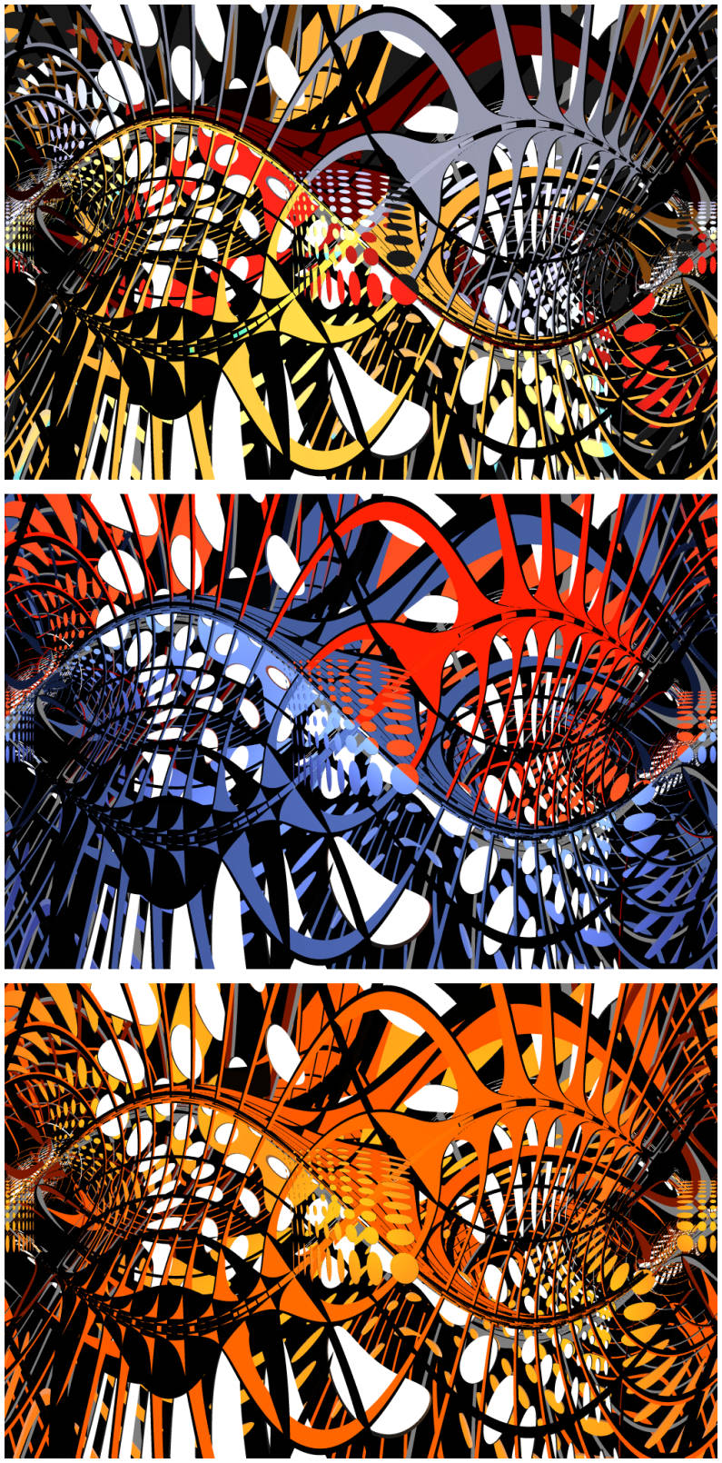
Most scenes got Spotlights with a rainbow-gradient image as their PictGel. In other scenes older Hubism images as PictGel or just a pure light color. All images were rendered as Panorama. -- And since I am engineer and not artist deep in my heart: The sticks were arranged in a double logarithmic grid order. ;)
1) Close to my previously shared workfile in a "flat look".
.jpg)
2) Same set up (varying camera POVs) with a "soft look" by using a colored bitmap (bryced "sticks grid with spheres" image) instead of the B/W image as before, for Terrain and its Texture.
.jpg)
3) Now using real Bryce primitives ("sticks grid with spheres") in the scene instead of bitmap for Terrain and its Texture.
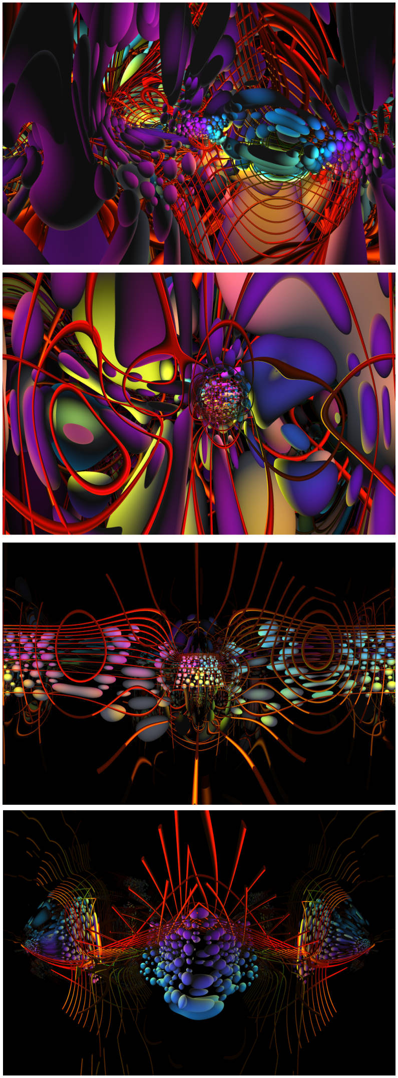
4) Same scene with Bryce primitives, though flat cylinders or cubes instead of the spheres.
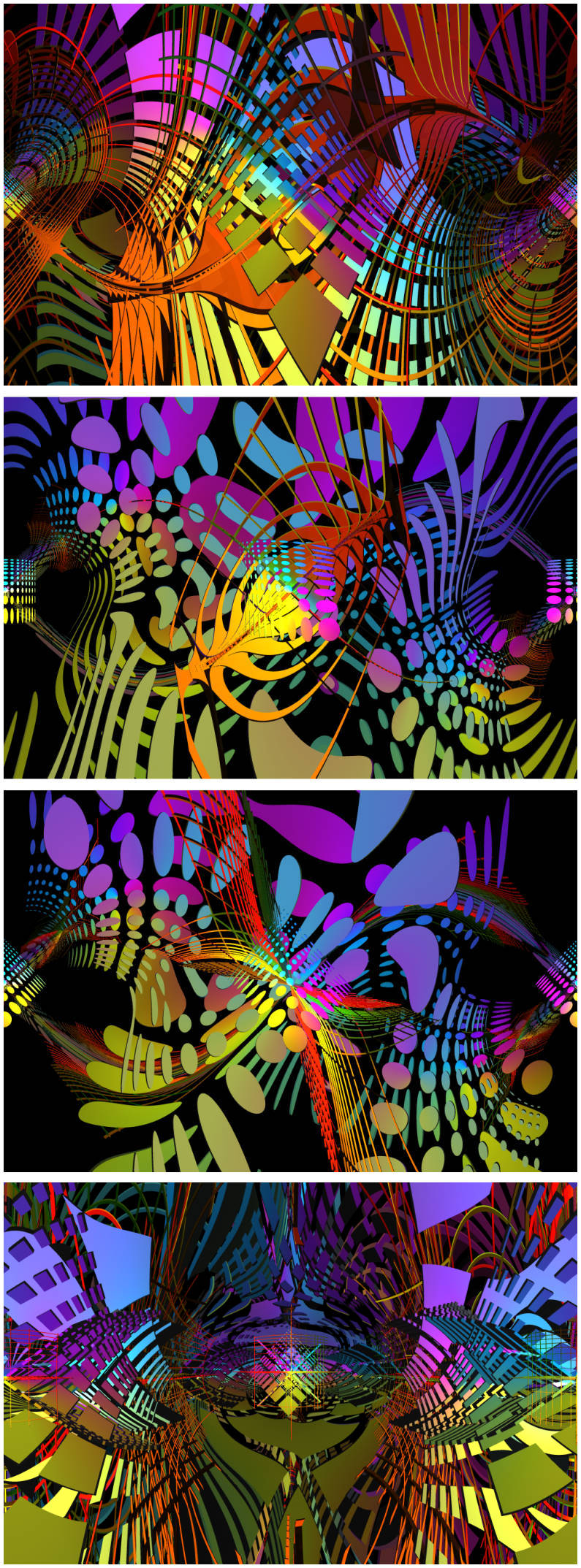
5) Same scene but with different grid position/size/orientation and camera position.
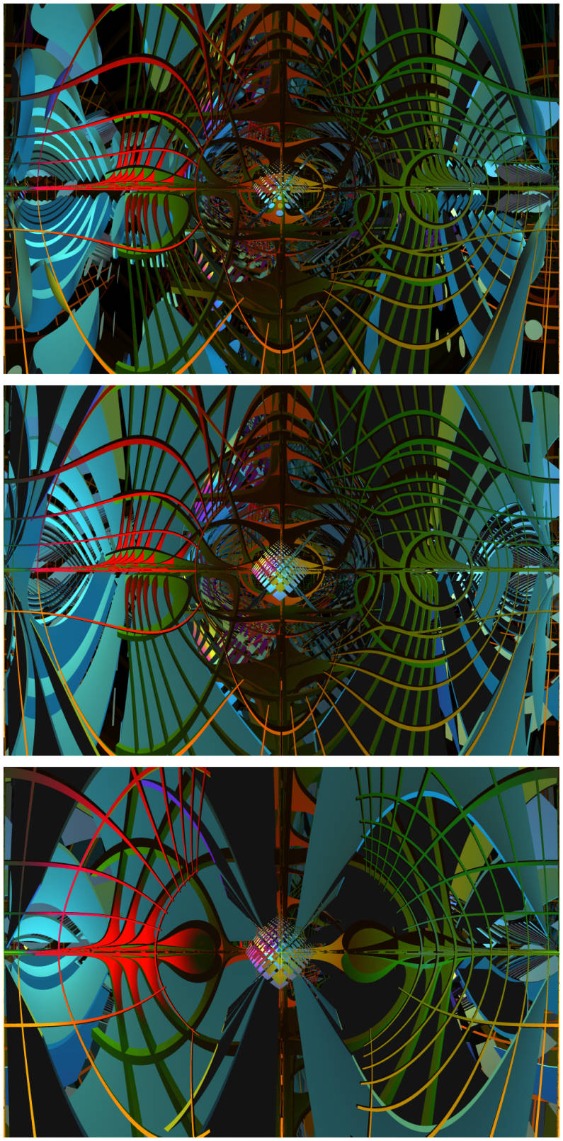
6) Same scene with simple color lights and much different grid position/orientation and camera POVs.
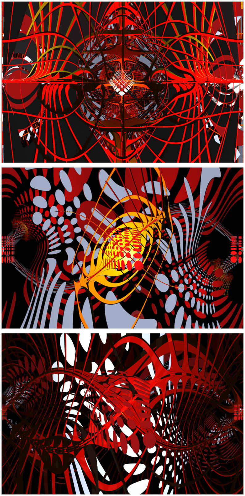
7) Same scene as the last one from #5, again with different colored or PictGel lights.
PS: Did I already mention that I really love Bryce for all this fun? :)
[Edited: Fixed wrong enumeration of #6 and #7]
Thank you hubert. Great abstract, I cannot decide.
Lol, Horo is a politician :) :)
Hubert, what amazing images. Just 'wow.' I love the 2nd as it looks like an outline of a man's head with all his thoughts inside. I also love the diversity of the 3rd one.
The first one very similar to the original. I probably didn't study the 4th as much because I was drawn to the 2 that I mentioned. Well done.
hubert - I love the 3d and 4th of number 3 best. NGartplay - no politician, I'm usually frank

 .
.
Didn't mean to make you choose, just teasing :)
I didn't see 5, 6 and 7 before. Really like the cyan in 5.
Wow a fantastic set of abstracts, Hubert I love them all each set is special; #3 and #4 my fav.
Horo: Thanks!
Ah, I see that you finally made a choice. Otherwise, I would have provided a "I_cannot_decide.br4" file. ;)
Here we go:
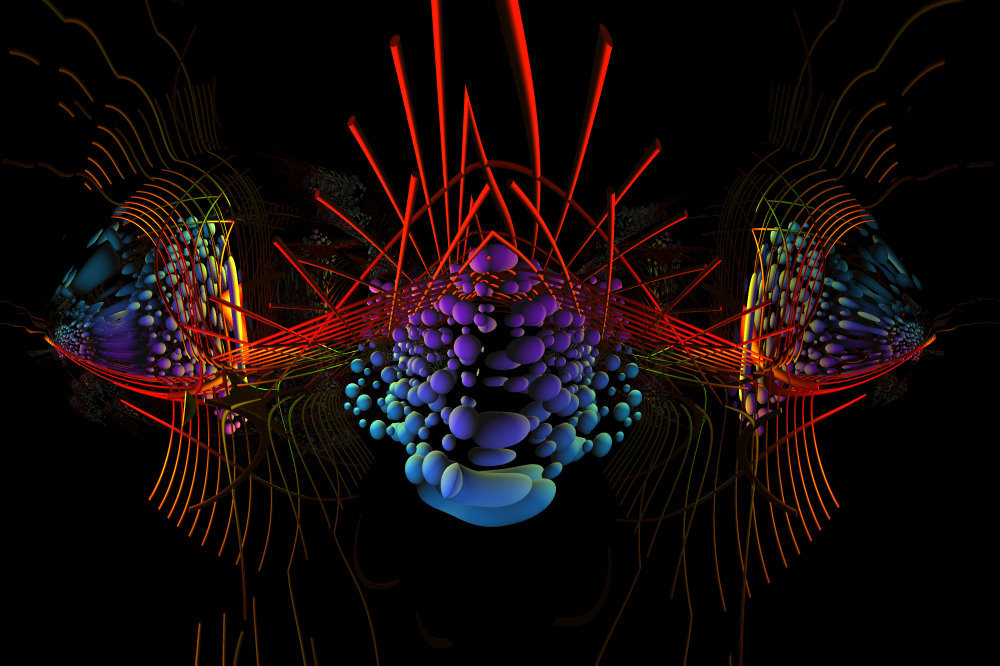
Download:
http://hubert-schaefer.com/hubert/bryce4/Hubism_2023-02-06-1548_sample-achtundzwanzig.zip
Hints:
- It's a HTTP (not HTTPS) download.
- BR4 workfile (33kB as ZIP). Tested also in Bryce7.
- Bryce Primitives instead of a Terrain are used for this scene.
- Both Spotlights use a rainbow-gradient Bitmap as PictGel.
- It's the unaltered original workfile. Provided as is, with possibly confusing "denglish-language" Object- and Group-names. ;)
PS: Glad to read that you are NOT a politician, because I consider these lowlife, just like lawyers. ;)
--------
NGartplay: Many thanks! :)
It's fascinating, that small changes in such a scene can produce quite differently looking (often unpredictable) results. Sometimes, this leads to a totally new look/style. Kudos to Bryce for this incredible versability!
Regarding the (assumed) "head":
Here is an older Hubism which looks imo even more like a human head. (Iirc, I used a Hubism image for a Volumetric Mat then.)
http://hubert-schaefer.com/hubert/bryce4/Hubisms_Ab16-series_2012-05-01_JPG-previews/page/image33.html
[Disclaimer: Regardless of the depicted "hollow head", this image is not autobiographic!]
--------
@ all:
Here is a sample workfile (similar to the #6 series).
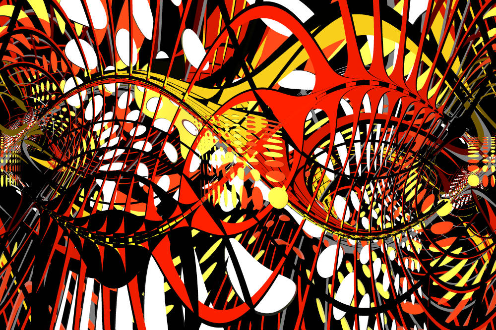
Download:
http://hubert-schaefer.com/hubert/bryce4/Hubism_2023-02-14_sample-with-BryceMat.zip
Hints:
- It's a HTTP (not HTTPS) download.
- BR4 workfile (20kB as ZIP). Tested also in Bryce7.
- I renamed its Object- and Group-names for a more logical handling.
- One Spotlight uses a Bryce Texture. The other one is of pure white color.
Live long and render fast! :)
Hubert - thanks for sharing these files.
Mermaid: Thanks! (Seems as you had posted just while I was still composing my reply and I hadn't noticed this after the page refresh.)
> (quote) "... thanks for sharing these files."
Am always happy to share. Just tell me, if you want a specific workfile to play with. No problem! :)
@ all: Beware of possible addiction to render such stuff. -- I will strictly deny any liability and not take responsibility for this. (Please discuss legal details with one of my 150 lawyers.)
:)
Hubert : Wow amazing abstracts.
Thank you for sharing some workfiles.
hubert - thank you for sharing the files.
Not sure if I shared this before; I used a terrain and materials from Hi-Res set 1 and lighting from Hi-Res set 3
mermaid - I do not remember having this seen before. This is a great hillscape, rock and vegetation material fit very nicely.
Four terrains made in the DTE inspired by the texture Installed Psychedelic 1/3. Two components were used, the frequencies and octaves changed; in the TE the tops and bottoms removed. They are arranged in a corner with a bottom and a top. Everything with the camera within a transparent and reflecting cube. Light and colour from an HDRI.
mermaid, wonderfully done! Love the texture on the hills/mountains. Looks like trees. The sky is pretty too.
Horo, such a complex render. I'm so surprised that these are terrains. Amazing how it turned out.
Hubert, thank you. Wild render. I'll grab the files and see what I can manage. My mind is not as vast as yours so it will probably look like the other one I did, lol.
Hubert, that was a trip through your Hubisms. What fun, thanks.
Had some fun with Hubert's craziness. I used some textures that need better render settings but I'm impatient. I did not save any of the working files. Thank you Hubie.
Thanks Horo and NGartplay
Horo - fantastic abstract, an amazing way to use terrains.
NGartplay - wow I can see you had lots of fun, a beautiful set of examples, I can see a bunches of grapes