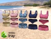
Some Genesis 3 Basics Freebies anyone ?
 Widdershins Studio
Posts: 539
These were rejected unfortunately but I half expected it as it's an early attempt to make textures. Obviously I have a lot to learn. I kind of liked the retro materials but that was not enough to swing it.
So is there anyone who would like these ? If so I can put them up on my site.
Constructive criticism would help me :)


Basics-Promo-A.jpg
1300 x 1000 - 496K


Basics-Promo-B.jpg
1300 x 1000 - 464K


Basic-Promo-Main.jpg
1000 x 1300 - 453K
Post edited by Widdershins Studio on


Comments
I think these are extremely good, and almost anyone would be glad to have them.
Sorry, I can;t help with the crit, but I'm sure some others will chip in.
Cool retro look. I'm surprised there were no takers.
I think they've very pretty. One thing you can watch out for is scale of patterns. The tops are slightly less dense then the bottoms. If they're being cut from the same fabric, they would be the same. Also it seems that the trims do not look even throughout. Keep at it. There is a saying that "no does not mean no, it can also mean not yet." :)
I would use these in a heart beat
I can't give any constructive criticism though since I am very new. This is something I really want to learn to do myself as well. But first, I need to finish learnign how Daz works lol.
Add me to the list of those who would like these. Thank you, Jim
Yes they look nice and I like them. Would like to have them for sure.
Yep, I'd like these too. I really need more G3F clothing and these look great.
Those are excellent observations, and just the kind of comments than can help improve a product.
I agree with Cris Palomino. I have noticed the past couple years that when texturing two or more pieces from the same set, that I have to adjust the size of the textures to make them match, so definitely something to watch out for while you learn. That said, I like your textures.
Thanks for all the positive comments and advice :)
Yes I see what Cris means about the scale of the textures, thanks for pointing that out as I had not noticed - must be a UV thing.
I'll keep an eye on trims for future work too.
I'll bundle these up over the next couple of days hopefully and will drop a link in here for those that would like them.
Thanks again :)
Not that bad at all, mrmorph. I've seen stuff that didn't even cover your level of quality on a well known Poser store expecting some hard cash they really couldn't ask for. Next time. (You could even try and add some stiletto-high-heel-footwear to your product and it will most likely waved through without second thought... Yeah, I know, a little bit sarcastic, but not towards you, more towards those who decide what's been put on the shelves).
+1
This is actually a hard thing to texture for the Daz store, it seems easy but it's not.
Basics: like Cris mentioned, the scale has to be spot on when you have the same texture on multiple pieces, if I had made this set of clothes I would have put all the pieces on the same UV so I could make sure the scale was the same but that takes an extra level of planning when creating stuff that most people don't do. Rather than shrinking my pattern I change the map size I use from item to item, so if you made the top 3000x3000 the panties would probably be 2500x2500. (just a guess) The benefit of doing it that way is you don't have to worry about your textures being the wrong size and any extra details you add like stitching or seam shadowing can use the same brush size, etc. Just makes it a lot easier to keep track of. I have a folder full of grey and white checks just for the purpose of figuring out what sizes to make my maps.
Details: This is what makes this outfit hard, it's really basic and in real life there wouldn't be any more details than what you did.. but that doesn't fly for Daz, you have to add more. It's really a trick to figure out what's realistic and what's just adding stuff for the sake of adding stuff. You can add a slight shadow at the seamlines, add some stitching on the side(s) of them, you can add a line of stiching on either edge of the trim, it could be decorative stitching if you want - cross hatches, etc (there are some great stitching brushes over at RDNA.) Lastly, you could break up the main part, maybe just two colors or patterns on top and bottom or a stripe of something differnet across the front (if you put a solid colored band across the bust line it would camoflauge the worst area of texture stretching,)
That's the basics. It's a really good start. Your choice of colors and patterns is lovely.
Out of curiosity, mrmorph, did you get any feedback from DAZ when this was rejected? Or was it just a form response?
Fisty,
Many thanks for sharing your advice and experience. Scaling the UV map is something I can try for future work, I didn't know that would work.
As for the details, I did try making some seams but was not happy with them so in the end I left them out. I'll practice some more because I can see them being useful for close up work. The seams I made for these mainly blended into the fabrics though, so I didn't think anyone would miss them. Also thanks for the tip for finding brushes at RDNA, I have an account there, so will take a look.
I'm glad you and others liked the fabrics I chose, it's a shame Daz didn't ! ;)
I got the sarcasm with a wry smile :) Yes most of the outfits for G3F are like that at the moment, I hope they balance it out over the coming months. There's a few nice outfits though, like the Eclipse Outfit and the Red Talon 'Armour' - okay not realistic armour, but I think it looks nice. Those two are probably the one's I will try next.
Yes I got some feedback, they said they were not fond of them, that the basics textures don't sell well and they weren't fond of the fabrics...
Beauty is in the eye of the beholder.
Advice, is a funny thing, alot of people ask for it, but very few actually pay heed to it.
DAZ has a review committe. That's there job, at least a few time a week, and perhaps daily, they look at new product submissions and promos and make decisions if it will do well in the store. (even established PAs who have 100s of products in the store go through this process with every product). I'm repeating this because it matters. Every product that DAZ sells goes through that review committee process. If they have given you feedback, pay attention to it if you want to eventually develop your skills to become a PA. They know what sells. The question is will you pay attention to the advice they offered and learn from the feedback.
Yes I pay attention to advice :) It was just a bit disappointing. I'm glad some people liked them in the end.
I've just posted the textures on my blog so if anyone wants them feel free.
If someone could let me know that I set up all the files and folders correctly that would be helpful.
Daz G3 Basics Texture Set Freebie
Cheers :)
Thank You. Will try to use it :)
Easiest way to do them is to make a copy of the template, blur it very slightly (0.5 gausion blur usually is good) so you can get a clean selection edge with the magic wand tool. Get your selction of the outside of the polygons. Invert selection, make a new layer, fill your selection with any color flood (I usually use something bright and obnoxious so I can easily see in the little layer list what it is.) Open the layer styles, turn fill down to 0, set drop shadow and inner shadow the same, no offest but size and the other setting I'm blanking on the name of at the moment. Start at like 0,4,12 on those three spots if you're using photoshop. Turn the strength up to 100% for both. Save that style and then in the layer tab adjust the strength of it until it's just barely noticable on the texture map, you'll need it darker on darker colors, really light on whites, like 10-15% is usually enough. If your outfit doesn't have the seam lines modeled in with depth when you make your bump map also add that shadow but at a higher strength, close to 100% so it makes that ridge for you.
Initeresting. I love them and have just gone and downloaded them to give them a go
Hello Mrmorph, I don't know who rejected them ,but they are fabulous to me. I don't have anything bad to say about them. They are beauts.:) And I only speak true 99 percent of the time so all is good in perspective.
Hello again , so are you given those away? If so I humbly would accept your gift with much gratefulness. :):):):)
You're welcome :)
Thanks again Fisty, I'll give that a go :)
Glad you like them, post an image here if you like, it would be great to see how you use them :)
Really pleased to read that :) And yes they are freebies, the license allows commercial use too (follow the link on my page for details), so basically you can do what you want with them. :)
I just checked out your site and all I can say I hope when I am done all my lessons for a refresher that I can be half as good as you are!!!! You work is very detailed and beautiful!!! and I love those textures and downloaded them for myself!!!
Thanks for the kind words, glad you like my stuff
Nice textures nrmorph. Thanks very much.
Not easy doing textures, that's the one thing I don't like much.
Havent had a chance to use these yet but I am hoping soon. Too much overtime last week to do much. I still think they were crazy for turning these down.
Thanks Wilmap :)
No worries Sonja, I've not had much time myself atm :)
I've been doing stuff related to graphics and visual arts since the 80's and I think this stuff is way cool.