Knittingmommy's Laboratory

1646567697080

Comments

  • algovincianalgovincian Posts: 2,618
    dracorn said:
    Oh yeah, that looks good. I like the fact that he is off center as well.

    @dracorn  Yeah, I've been trying to keep in mind the Rule of Thirds. I don't always use it well, though.

    So, here's another Test Image of @DarwinsMishap's tattoos. These are on George. I just couldn't resist.  :)

    George! He looks awesome, KM. Been meaning to pick up his hair/beard set - thanks for reminding me!

    - Greg

  • dracorndracorn Posts: 2,345

    George is always going to make me smile.  Great image, great pose and lighting.  

    Interesting how the leg tattoo looks different between George and the young man.  

    Is there a way to adjust the opacity on the tattoos?  They seem a little dark to me, more like paint than ink imbedded in skin.

  • You can, if you edit them in LIE- the leg and lower arm tattoos are meant to be extreme as they are blackout tattoos.  If you want to lessen the others, go into the diffuse layer, then the LIE selection and go to the opacity to lower it to about 80 or so and save it. It will automatically change the name so you won't get the error (it doesn't like same naming conventions). You can do that in the translucency setting as well.


  • LianaLiana Posts: 1,035

    I just read in the Carrara forum that we have lost a forum member right before Christmas. wgdjohn passed away unexpectedly after complications from his fall last year. I know I will miss seeing him in my thread. He was a frequent visitor to here with lots of helpful tips. He was also a supporter of the It's Raining Men contest. He will be missed.

    OH no.. He seemed like such a nice guy and very helpful. How sad. *sigh*

  • LianaLiana Posts: 1,035

    Oh Knittingmommy... :)  Tatoo guys. lol Nice!

  • LinwellyLinwelly Posts: 5,948

    Okay. A little bit of adjustment in Gimp and this is more like what I was hoping to see with these pants when I started. So, not bad, much closer to what I was trying to get to when I started. I also fixed that little bit of light down in the corn. I did not like having that there. There's not much of a change but I think it really helps the pants.

    Crazy nice work here!

    George with the tats is funny as well, poor George always has to deal with the jokes... ;)

  • Thanks, everyone! I was off enjoying the South Florida Fair today. The weather was perfect. I got a little bit of sun but not too much. The temps were in the high 60s so great walking weather. Let's see if I can respond to everyone.  :)


    dracorn said:
    Oh yeah, that looks good. I like the fact that he is off center as well.

    @dracorn  Yeah, I've been trying to keep in mind the Rule of Thirds. I don't always use it well, though.

    So, here's another Test Image of @DarwinsMishap's tattoos. These are on George. I just couldn't resist.  :)

    George! He looks awesome, KM. Been meaning to pick up his hair/beard set - thanks for reminding me!

    - Greg

    Thanks. Yep, always happy to help others spend money. Lol. I really like his hair/beard set. The body hair comes all as one item but there are sliders to turn parts off which is nice. I need to see if I can fiddle with that and make a custom mask or something for things like this tank top. I'm sure there has to be a way to do it. I ended up just turning off the chest hair because I couldn't do just a little bit of hair at the top of his chest. I'll need to work on that because I want to do another scene with George in this outfit and I want some of that chest hair poking out there where the shirt's neckline is.


    dracorn said:

    George is always going to make me smile.  Great image, great pose and lighting.  

    Interesting how the leg tattoo looks different between George and the young man.  

    Is there a way to adjust the opacity on the tattoos?  They seem a little dark to me, more like paint than ink imbedded in skin.

    I love George! He's a great character. Makes me smile, too. I really like how he turned out, too. The lighting is one I bought a while ago but hadn't played with yet. It's @Dreamlight's Studio Light PRO Iray HDRI. I picked it up when it first came out. It's not exactly what I thought it was and yet it was. Turns out to be a really great product and I'm enjoying playing around with it and seeing what kind of lighting setups the HDRIs are mimicing. I ended up using different lighting presets from it in each of the renders for DM's tattoo tests.


    You can, if you edit them in LIE- the leg and lower arm tattoos are meant to be extreme as they are blackout tattoos.  If you want to lessen the others, go into the diffuse layer, then the LIE selection and go to the opacity to lower it to about 80 or so and save it. It will automatically change the name so you won't get the error (it doesn't like same naming conventions). You can do that in the translucency setting as well.

    Ah, cool! So, now I've got to try that and see it they look. Thanks, @DarwinsMishap. When I first saw @dracorn's question this morning, I wasn't sure what the answer was. I did figure the answer might be in LIE somewhere. Since you answered, I won't have to try and figure that out now. I can just go there and play around. :)


    Liana said:

    I just read in the Carrara forum that we have lost a forum member right before Christmas. wgdjohn passed away unexpectedly after complications from his fall last year. I know I will miss seeing him in my thread. He was a frequent visitor to here with lots of helpful tips. He was also a supporter of the It's Raining Men contest. He will be missed.

    OH no.. He seemed like such a nice guy and very helpful. How sad. *sigh*

    Yes, it was definitely a blow to read that John had passed. He was always helpful and always cheerful even during all of the goings on when he fell last year and had to start doing PT. I'm going to miss him.


    Liana said:

    Oh Knittingmommy... :)  Tatoo guys. lol Nice!

    Thanks!  Yep, love a good tatooed guy. My husband has none and doesn't plan to get any so it's up to vendors like DM to help me get my tatoo fix. So far, DM's doing a bang up job of helping me out.  Lol. 


    Linwelly said:

    Okay. A little bit of adjustment in Gimp and this is more like what I was hoping to see with these pants when I started. So, not bad, much closer to what I was trying to get to when I started. I also fixed that little bit of light down in the corn. I did not like having that there. There's not much of a change but I think it really helps the pants.

    Crazy nice work here!

    George with the tats is funny as well, poor George always has to deal with the jokes... ;)

    Thank you. I was really impressed with myself when that popped up in workspace and I fiddled with that to get the lighting just right. Then, that little bit of post work to fix those pants. I think I might have to put that in my gallery if @DarwinsMishap doesn't mind. 

    As for poor George, I think he can handle the jokes. He's such a good sport. I love figuring out what to do with him next.  :)

  • dracorndracorn Posts: 2,345

    You can, if you edit them in LIE- the leg and lower arm tattoos are meant to be extreme as they are blackout tattoos.  If you want to lessen the others, go into the diffuse layer, then the LIE selection and go to the opacity to lower it to about 80 or so and save it. It will automatically change the name so you won't get the error (it doesn't like same naming conventions). You can do that in the translucency setting as well.


    Thanks Darwin!

  • Welcome!  When this set comes out (if it's accepted) I will put in a brief explanation on the how to as well as hints as to which set to pick for certain charcters in the commerical thread as well.

  • L'AdairL'Adair Posts: 9,479

    George! He looks awesome, KM. Been meaning to pick up his hair/beard set - thanks for reminding me!

    - Greg

    Thanks. Yep, always happy to help others spend money. Lol. I really like his hair/beard set. The body hair comes all as one item but there are sliders to turn parts off which is nice. I need to see if I can fiddle with that and make a custom mask or something for things like this tank top. I'm sure there has to be a way to do it. I ended up just turning off the chest hair because I couldn't do just a little bit of hair at the top of his chest. I'll need to work on that because I want to do another scene with George in this outfit and I want some of that chest hair poking out there where the shirt's neckline is.

    I've done things like this with the Geometry Editor Tool. Once you have the hairs selected that you want to hide, you can create a new surface from selected, and then set that surface to 0 opacity. I'll be happy to help out when your ready to tackle such a project.

  • FirstBastionFirstBastion Posts: 7,764
    dracorn said:
    Oh yeah, that looks good. I like the fact that he is off center as well.

    @dracorn  Yeah, I've been trying to keep in mind the Rule of Thirds. I don't always use it well, though.

    So, here's another Test Image of @DarwinsMishap's tattoos. These are on George. I just couldn't resist.  :)

    "I'm not sure George but have you been working out?   you're looking younger! "  laugh

  • L'Adair said:

    George! He looks awesome, KM. Been meaning to pick up his hair/beard set - thanks for reminding me!

    - Greg

    Thanks. Yep, always happy to help others spend money. Lol. I really like his hair/beard set. The body hair comes all as one item but there are sliders to turn parts off which is nice. I need to see if I can fiddle with that and make a custom mask or something for things like this tank top. I'm sure there has to be a way to do it. I ended up just turning off the chest hair because I couldn't do just a little bit of hair at the top of his chest. I'll need to work on that because I want to do another scene with George in this outfit and I want some of that chest hair poking out there where the shirt's neckline is.

    I've done things like this with the Geometry Editor Tool. Once you have the hairs selected that you want to hide, you can create a new surface from selected, and then set that surface to 0 opacity. I'll be happy to help out when your ready to tackle such a project.

    Thanks, L'Adair! I'll probably take you up on that when I'm ready. I haven't done much with the Geometry Editor Tool and every time I have, it hasn't ended well. Lol.

    @FirstBastion Lol. He is looking a little buff.  ;)


    Okay. A little bit of adjustment in Gimp and this is more like what I was hoping to see with these pants when I started. So, not bad, much closer to what I was trying to get to when I started. I also fixed that little bit of light down in the corn. I did not like having that there. There's not much of a change but I think it really helps the pants.


    Gallery Link

    Edit: added gallery link

    So, I finally put the post worked version of this in my gallery last night. I've updated the post with the gallery link. Image my surprise when it already had 8 likes this morning when I woke up. That was a nice surprise. 

  • KnittingmommyKnittingmommy Posts: 8,191
    edited January 2018

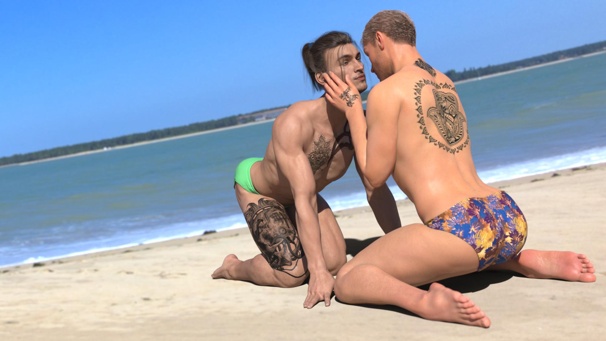
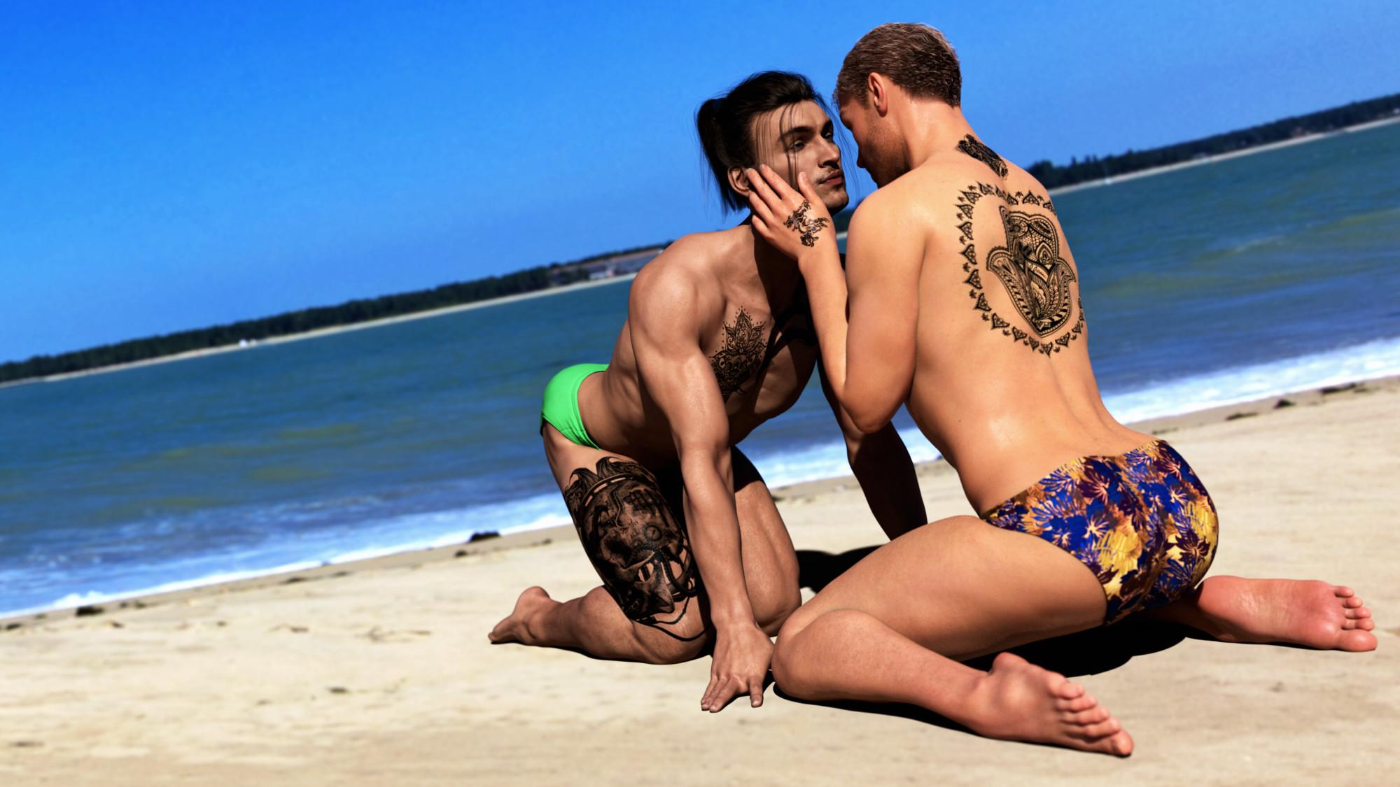
    I wanted to try and outdoor scene with @DarwinsMishap's tattoos to see how they do with an HDRI. The only lighting is the from the UltraHD Iray HDRI With DOF - Pines Beach by Bob Cawallah and Cake One. It's a great set. The tattoos look great. I wish I could say the same for my settings in the tone mapping. Everything looks a little more washed out than I had hoped for. I don't know why it always looks good before I start post work and then looks so washed out when I compare the two. I'll have to play with my tone mapping settings more and see if I can get closer to what I wanted without needing the post work. For post work, I had at them with the NIK filters. I did some color correction and played with the tone mapping in there. I think it's a little richer in color now and not quite as washed out looking. I wanted to use both G3M and G8M models. So, the one in the green trunks is Gianni 7 and the one in the Tropical trunks is Micheal 8. I'm really not crazy about Michael 8's skin. Every single time I've rendered him, I hate it and usually end up using someone else's skin. Thanks to the NIK filters, it isn't quite as bad in the final version as the straight render.

    Original Render:
    With Post Work:
    CoupleTattooTest.jpg
    2000 x 1125 - 322K
    CoupleTattooTestwithPost.jpg
    2000 x 1125 - 386K
    Post edited by Knittingmommy on
  • I kind of had an idea for an image and it kind of morphed into something I wasn't planning. I tried a couple of new techniques, too, and mixed them with some old ones. I really like how it turned out.

    Boopsie and the Burning City

    Gallery Link

  • L'AdairL'Adair Posts: 9,479

    Just sent you a PM, @Knittingmommy...

  • I wanted to try and outdoor scene with @DarwinsMishap's tattoos to see how they do with an HDRI. The only lighting is the from the UltraHD Iray HDRI With DOF - Pines Beach by Bob Cawallah and Cake One. It's a great set. The tattoos look great. I wish I could say the same for my settings in the tone mapping. Everything looks a little more washed out than I had hoped for. I don't know why it always looks good before I start post work and then looks so washed out when I compare the two. I'll have to play with my tone mapping settings more and see if I can get closer to what I wanted without needing the post work. For post work, I had at them with the NIK filters. I did some color correction and played with the tone mapping in there. I think it's a little richer in color now and not quite as washed out looking. I wanted to use both G3M and G8M models. So, the one in the green trunks is Gianni 7 and the one in the Tropical trunks is Micheal 8. I'm really not crazy about Michael 8's skin. Every single time I've rendered him, I hate it and usually end up using someone else's skin. Thanks to the NIK filters, it isn't quite as bad in the final version as the straight render.

    Original Render:

    With Post Work:

    Really like seeing the difference of the render and post worked versions- this is really well done.

  • IceDragonArtIceDragonArt Posts: 12,548

    I saw the buring city one in your gallery, I really like that one a lot. 

    And you can definitely see a big improvement from the first to the second on the tattooed boys.

  • I wanted to try and outdoor scene with @DarwinsMishap's tattoos to see how they do with an HDRI. The only lighting is the from the UltraHD Iray HDRI With DOF - Pines Beach by Bob Cawallah and Cake One. It's a great set. The tattoos look great. I wish I could say the same for my settings in the tone mapping. Everything looks a little more washed out than I had hoped for. I don't know why it always looks good before I start post work and then looks so washed out when I compare the two. I'll have to play with my tone mapping settings more and see if I can get closer to what I wanted without needing the post work. For post work, I had at them with the NIK filters. I did some color correction and played with the tone mapping in there. I think it's a little richer in color now and not quite as washed out looking. I wanted to use both G3M and G8M models. So, the one in the green trunks is Gianni 7 and the one in the Tropical trunks is Micheal 8. I'm really not crazy about Michael 8's skin. Every single time I've rendered him, I hate it and usually end up using someone else's skin. Thanks to the NIK filters, it isn't quite as bad in the final version as the straight render.

    Original Render:

    With Post Work:

    Really like seeing the difference of the render and post worked versions- this is really well done.

    Thanks, @DarwinsMishap! I really like seeing what I can do with post work the more I get into it. There is still lots to learn. :)


    I saw the buring city one in your gallery, I really like that one a lot. 

    And you can definitely see a big improvement from the first to the second on the tattooed boys.

    Thank you, @IceDragonArt. I really like playing around with the NPR stuff and I'm very happy with how that one turned out. As for the boys, it's amazing what a little bit of tonal adjustments can do to an image.  :)

  • IceDragonArtIceDragonArt Posts: 12,548

    Yes it is and I am excited to see you getting into postwork a bit more.  Can't wait to see you evolve in that area.  ( I know, you need at least 3 clones to learn everything you want to learn and do lol)

  • Yes it is and I am excited to see you getting into postwork a bit more.  Can't wait to see you evolve in that area.  ( I know, you need at least 3 clones to learn everything you want to learn and do lol)

    Lol! Yeah, I could stand to have some clones around here that's for sure! :)

  • LinwellyLinwelly Posts: 5,948

    Those two guys make me laugh, the poses are quite unusual, but well done, the postwork really makes it pop :D

  • Thanks, @Linwelly! The poses are actually from Z Lover's Delight - Poses for Genesis 3 Male and Female. I modified one of the female poses slightly and transferred it to G8M.

    I've been so busy that my thread managed to slip off halfway down page 2 of the Art Studio threads. I haven't been rendering much as I've been writing more. At least, not rendering things I want to share. I still render out quick scenes from my stories to help me write them and figure out how logistics. Having a visual really helps me write. 

    I did volunteer to test a potential new product here at Daz. It's still in the works so hasn't been submitted. Silent Winter is making this really cool Kung Fu School and it looks great. Here is my first real render that isn't just a test. No postwork. Sun/Sky is the only lighting used. Of course, I played with the tone mapping. I think it turned out pretty good. Check out his thread in the Commons.

    I also think I'm finally getting a handle on using dForce. The clothing in the render are all older pieces for G2M. (Mec4D Shaolin Monk Uniform for Genesis 2 Males, Kung Fu HD for Genesis 2 Males) I had to add a weight map to block out draping to some parts. I finally figured out how to use the weight node tool. Both outfits work reasonably well once you figure out which pieces shouldn't be draped. No explosions which is always a good thing.

  • LianaLiana Posts: 1,035

    That looks pretty interesting even the lighting I think would be atypical of real world.  :)I have not even tried dforce. I am like you and have not really render much too busy with some other stuff, mostly modeling and getting the hang of that.

  • IceDragonArtIceDragonArt Posts: 12,548

    That looks like a really nice set.  Hope Daz picks it up. 

    I am becoming more and more fond of Dforce the more I use it and understand (very little right now lol) how it works.  I also got the two new utilities for Dforcing hair and the cloth presets.  Havne't had a chance to try the hair but the item I used the Cloth script on worked fabulously.

  • LinwellyLinwelly Posts: 5,948

    So you got in for the school test, cool. I was thinking of asking in but I'm ratehr busy so i wouldn't have had the time. Seems like its really a nice work. And your render has quite the fitting personnel :D

  • KnittingmommyKnittingmommy Posts: 8,191
    edited February 2018

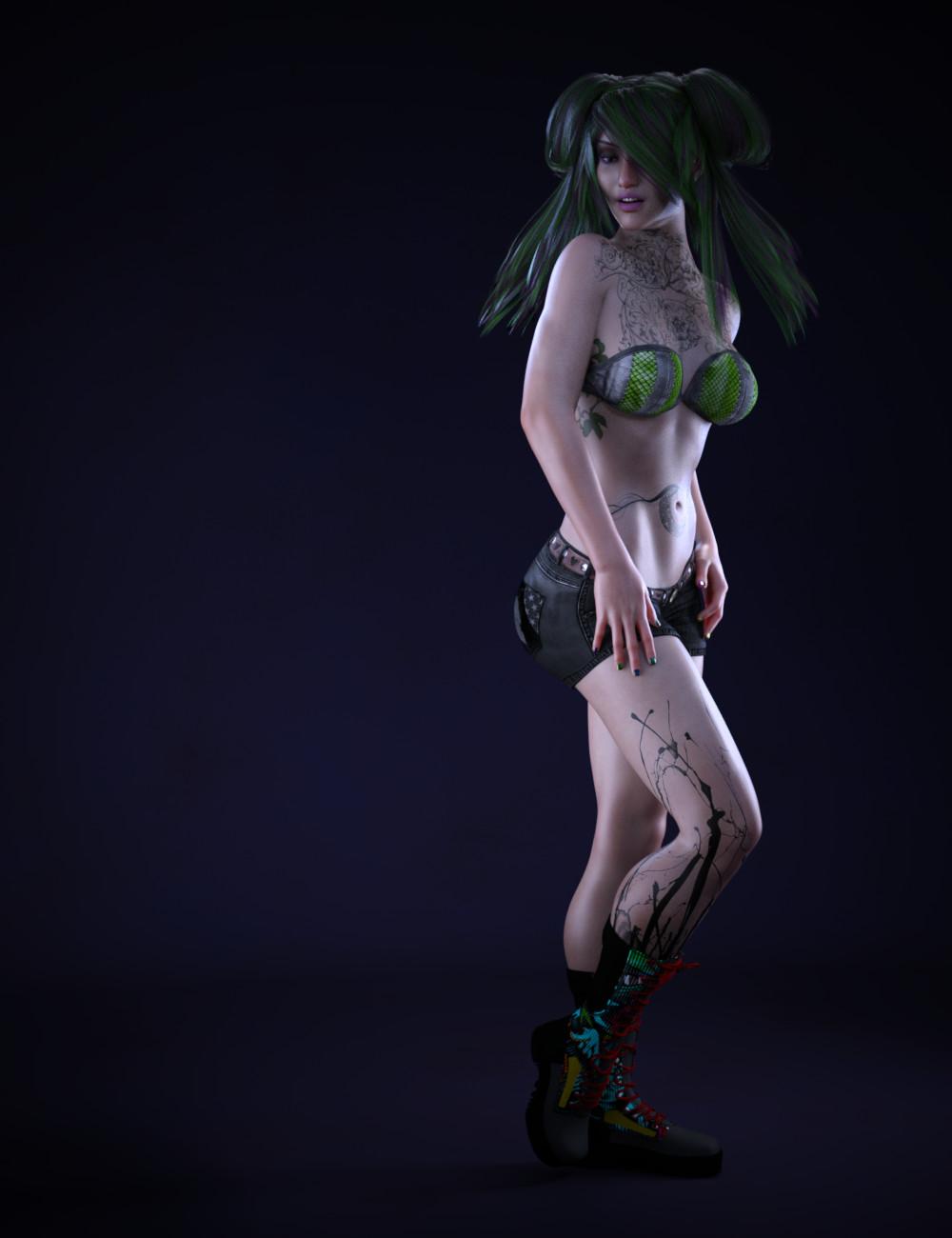
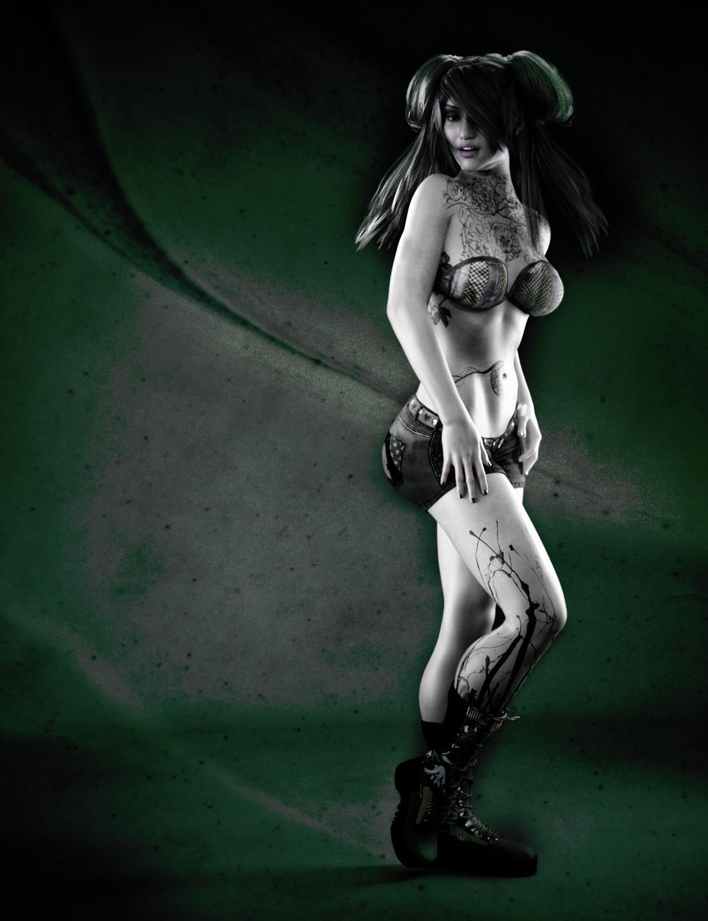
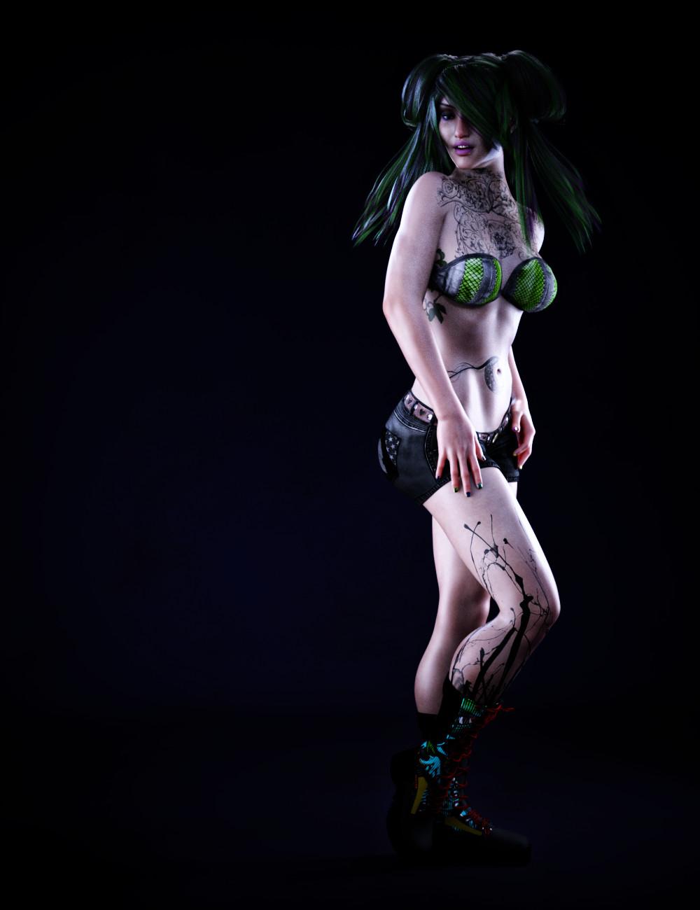
    Hi everyone. I've been a busy little bee so I haven't been online lately. I was lucky enough to be able to test @DarwinsMishap's newest girl. She's loads of fun and has some really cool tattoos. I figured it was about time I posted an artistic render of her. So, I'm posting both the raw render and what I ended up doing with her in Gimp. I'm also posting the version that just has some slight color correction, too. I've been trying out a couple of new techniques on her. I like how it turned out. I still have lots to do with two products to test so I'll be back when I have more stuff to show. 

    Raw render:
    Post worked version:
    Raw render with color correction:
    Athana05.jpg
    1000 x 1300 - 100K
    Athana05withPost.jpg
    1000 x 1300 - 236K
    Athana05withColorCorrection.jpg
    1000 x 1300 - 108K
    Post edited by Knittingmommy on
  • IceDragonArtIceDragonArt Posts: 12,548

    She looks fantastic!  Love the middle render in particular.

  • LianaLiana Posts: 1,035

    Cool renders! She looks great. :)

  • Thanks, @Liana and @IceDragonArt.  I stepped out of my comfort zone a little bit but I liked the effects. Working on another with some of the same postwork techniques but with a little different outcome. Looks good so far. :) I should be able to post it by tomorrow.

  • SaphirewildSaphirewild Posts: 6,668

    Hi everyone. I've been a busy little bee so I haven't been online lately. I was lucky enough to be able to test @DarwinsMishap's newest girl. She's loads of fun and has some really cool tattoos. I figured it was about time I posted an artistic render of her. So, I'm posting both the raw render and what I ended up doing with her in Gimp. I'm also posting the version that just has some slight color correction, too. I've been trying out a couple of new techniques on her. I like how it turned out. I still have lots to do with two products to test so I'll be back when I have more stuff to show. 

    Raw render:

    Post worked version:

    Raw render with color correction:

    Each one of these looks amazing KM!!

    I am still having fun with Darwins Gigi I got for X-Mas gift!!!

Sign In or Register to comment.