My WIPs/renders while caffeinated
 mtl1
Posts: 1,507
in Art Studio
I figure that making a WIP/render thread in here would be a way for me to actually make art instead of focusing on the technicals...
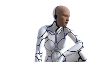
Here's a recent WIP from today -- experimenting with a long-awaited wishlist item. Getting it to work in iray was a pain though, since the 'highlights' in the 3Delight ambient channel didn't convert over to the emissive channel. The eyes (irises in particular) don't render properly, so I'm still tweaking things as I go along.


robot.png
1280 x 720 - 420K


Comments
Oh, and an older WIP/Render: I was experimenting when iray first came out, but never finished it because I somehow misplaced the duf file on my HDD. Still need to add some DOF, a background outside the windows, as well as subD-ing the clothing.
Hmmm... some adjustments.
So, how did you get the robot to work? I've tried something similar using that firey Daz horse and still haven't managed to get it looking good in Iray. I like the bottom image. The skin texture looks a little more realistic. I think the lighting looks a little better. Interesting composition. Are the shadows from a gobo type thing or from light actually shining through a window?
Thanks for your kind words :)
The lighting is from the Bachelor Lair set -- sunrise present I believe -- but I turned off UberEnvironment. The set actually has a door/window, which created a convenient shadow.
As for the robot, RoboGenII doesn't work with iray *at all* out of the box, so I had to do the following:
I should probably look into opacity maps to improve the emissives as well as the glossy/spec settings.
Thanks for the tips. I'll give that a try. I think that horse would look awesome in Iray if I can just work out the logistics. I think I tried doing that robot in Iray recently, too, but didn't have much luck. I'll try digging it out again, too, while I'm at it.
Love the satin look of the robot. Its really gorgeous
Thank you! To be fair though, I didn't adjust the material properties except for the displacement map intensity :) I have to say it converted pretty well from the original 3Delight settings.
I haven't posted anything for a while, but that's because I've been troubleshooting the robot render for the past while.
Currently, giving the entire robot the original ambient maps results in less than favorable results, namely the emission colors looking very flat. Not only that, but the emission maps don't work well for the neck and ears as they use the edges of the ambient map -- which is white! I'm toying with the idea of an opacity map, which *should* ensure even light emission, but we'll see.
As well, if you look closely at the ear, the base G2F map for the face don't work well with the rest of the robot figure. That is because the grooves on the original figure don't follow the UV seams -- which means I'll have to manually edit the texture map...
I'm procrastinating on my other projects by... starting a new project. Good thing this didn't take too long to do.
Another quick one: this time I'm playing with dynamic cloth.
A render of one of my (former) favorite passtimes: Tango! I had to do some post-processing because the colors didn't turn out the way I wanted.
Aside from that, there are a few more things that need to be done, namely:
Comments/thoughts?
Another one... not sure where I'm going with this one yet. Horror? Vampires? Something creepy like a certain comic supervillan?
I didnt kow there was make up required for the tango... Is that considered part of the costume? I know many forms of theater do require some form of over the top make up though.
Well, a lot tango dancers I've danced with tended to be very well dress and made-up, hence the makeup comment. I suppose it varies region to region, and type to type. I used to do International Ballroom, and that was definitely a lot different than the Argentine Tango scene for the couple of years I did it...
Oh, and a neat bit of trivia: a lot of the poses in DM's Tango set seem to be Argentine Tango poses :)
I posted a new render on my DA page. Couldn't post it here because of the rules and such...
Having said that, I'm working on a new 'landscapey' render using the Dream Pool freebie by Bricabrake: http://www.sharecg.com/v/79315/browse/21/DAZ-Studio/Dream-pool
I'm still tweaking a few things, namely the bump maps as well as the skydome position.
Another WIP, this time accidentally when I was playing with dynamic cloth. I was actually going for another camera angle when I repositioned the viewport and magically got a *much* more aesthetically pleasing composition.
The problem is that the hair isn't working quite well -- End of Summer Hair -- for all camera angles so I'll have to change it up at some point.
It is an interesting angle with that hint of bra showing. You might be able to use d-formers or something like Fit Control to help with hair clipping into the shirt if you could move that collar just a little. Did you try changing the what the hair collides with in the parameters? Usually, the default is the character, but in cases like this trying to put the shirt as the colliding figure might work. Also, try upping the collision number. I've had a couple of instances where upping that collision to say 6 works very well. I think the default on most hairs seems to be around 2. I even had collision on one hair up to 8 and it did a nice job of bunching the hair up which gave it a much needed messy look which was needed in the image I was doing at the time.
Thanks! I do a lot of photography, so I'm not sure if it's reflected in my render angles or not...
Believe it or not, but that shirt is actually a prop at the moment. That's the Dynamic Dress Shirt for M4, which I had to export and re-import as an OBJ so I can get subD and smoothing modifiers for it -- the existing shirt had a relatively low poly count and I couldn't implement either subD or smoothing without DS crashing.. I'm not sure if the shirt will reset if I converted it to a figure and fit it to G2F, but it's worth a try. :)
Aside from that, I think I only have... 5 (?) collision iterations on it, so perhaps I'll try more :) Thank you for your kind words!
Doing this render made me realize how few sci-fi clothes I had in my collection... Had to downsample it because my original render is 15+ MB.
I did another render, this time a fantasy scene. I think I messed up the camera angles, but I'll tweak them more in the future... happy with how this turned out and it took me less than an hour to plop down!
It's also in my Gallery and DA page now :)
I don't know if you messed up. I kind of like the angle. I love how the skin of the beast turned out! It looks fantastic. Since the girl is outside the DOF box she's slightly blurred and that seems to bring a little more emphasis on the beastie. I think it looks incredible. Nice job.
Thank you :) The beastie is Bolladon -- a bit of an older figure -- and I reduced the glossiness on the skin as Iray tends to make things a little too glossy for some reason... I retained the gloss on the bone since, well, bone is kinda glossy, right?
Yeah, I have him, but I haven't tried him out in Iray yet. I really like the effect you got with the bones being glossier than the rest. I'm starting to dig out a lot of my older content and trying it out in Iray. I may have to try him out, too. And, while I don't know if bone is that glossy, I really like how it turned out.
Really like the dof in that one it definitely highlights the beasty while implying that she is too close still.
Thanks :)
As I've posted in the Iray render thread, I've been testing some wet skin/soap shader settings... Here's what I have so far!
Any critiques are greatly appreciated :)
I'm not exactly sure which of these I should use... critiques?
Nearly a month since my last post... Hmm.
fake edit: I just noticed the pokethrough in the dress and her leg. Ooops. I'll fix it in a future revision :)
A quick one... our heroine about to fight unknown alien attackers.
#3 I liked the most
the DOF of #1 & 2 seemed out of place, there was nothing in the back ground for it,
depending what was in the background, saying you added something, like if it was a fish or whale, #1, if it was a ship going away #2, I think if one added birds it's a tossup between all 3
I'm bad at critiques, so maybe I should stayed in the shadows
Your critiques are good :) I actually came to the same conclusion a few days ago when I revisited some of my renders...