Game On 4 - The Sky
 NGartplay
Posts: 3,166
I hope you all aren't getting tired of me. I'm hoping that more people will join in if I can just get the right game on.
This one is inspired by Hansmar and his comment about the sky changing the look of an image.
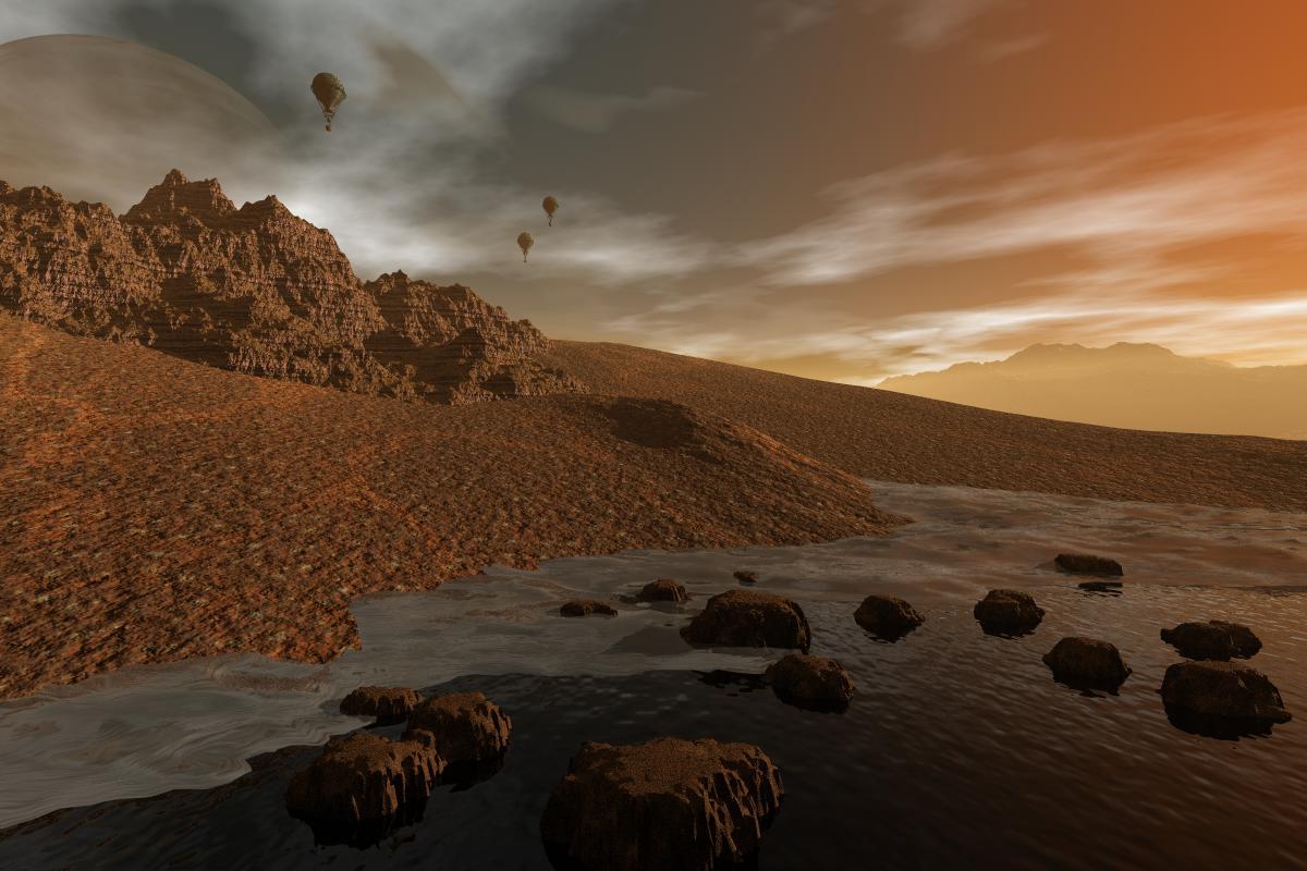
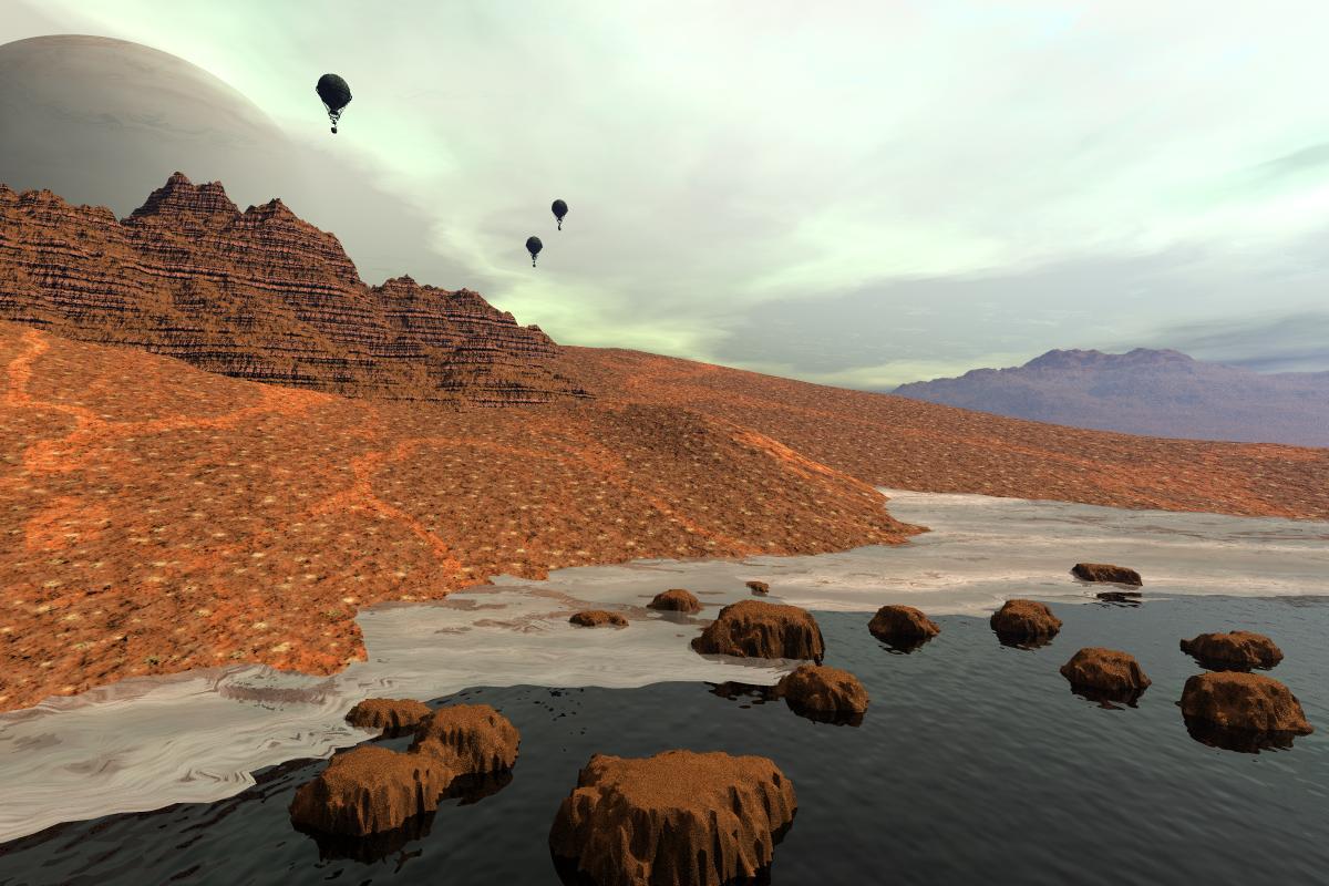
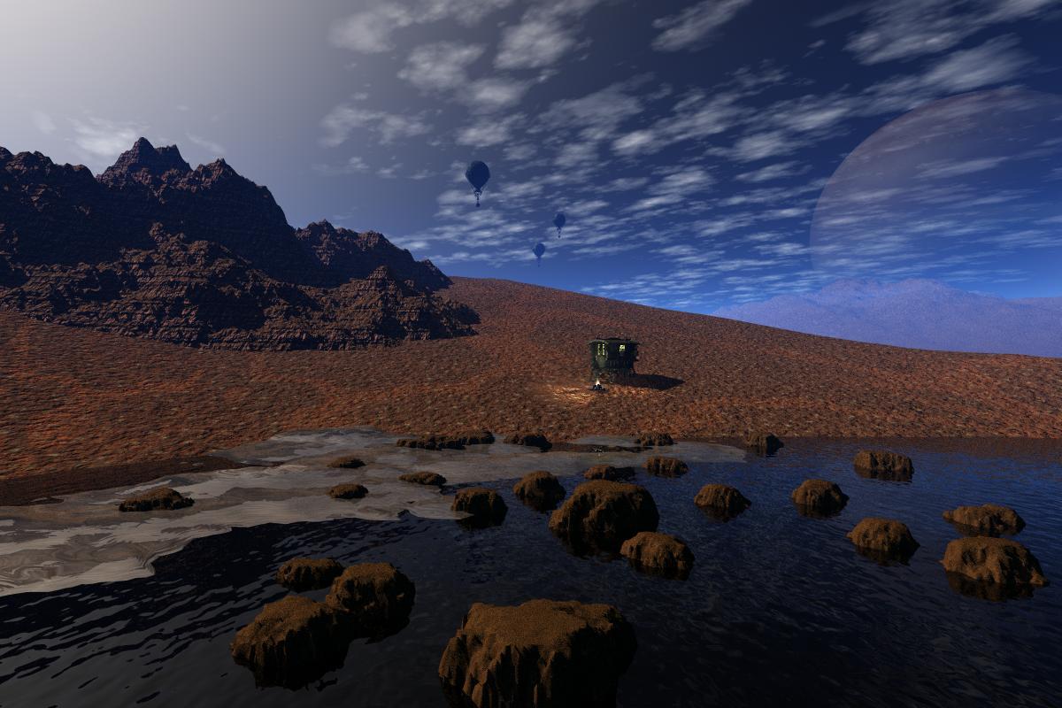
I'm taking my landscape from a previous post and making changes to it with the sky.
The challenge is to take an existing picture (can be anything or you can make a new one) and change objects around, if you wish, but you must change the sky. Night to day, dark to light, sun in a different position, add an HDRI, add clouds...whatever suits you.
I'm taking the image from another post and have changed the sky twice. I moved a few things and got two different looks.


landscape-try-1.jpg
1200 x 800 - 122K


landscape-try-2.jpg
1200 x 800 - 130K


landscape-try-3.jpg
1200 x 800 - 114K
Post edited by NGartplay on


Comments
NGartplay - thanks for another artplay . Changing the Sky/Atmosphere does give a different feel to the image. There are many Brycers out there and many more lurkers but very few participate in the forum and only a hand full of us are still regulars. It's a pity our Gallery links don't show to non-Daz members. I admire your effort to keep encouraging members to participate.
Many times in the past I did renders with different lighting/atmosphere, like my recent day and night lantern scene, I will find some and post here or make new ones for this thread.
NGartplay - ah yes, yes, a scene can become so completely different when changing sky and lighting. In fact, I always spend a lot of time once a scene is set up to play with the sky and light settings.
NGartplay: I am shocked! One can render.... landscapes with Bryce??
Teasing aside: I like the moody variations from the different skies, whereas I like the 2nd one most.
NGartplay : yes, the sky makes the difference. You certainly did a good job.
Thank you everyone.
Mermaid, can't wait to see. You could also post your day and night lantern scene here too. We've seen it in another post but it's the perfect example to show off in this post as well.
Hubert, yes, amazingly, Bryce is a multi-tasking application. One just has to ferret out the joys that it can create.
OK, here we go.
Day and Night, Exactly the same scene: LoneCoveSun 1497 + LoneCoveMoon 1498
Different Sky and Material: Lake in Hills 1594 + Sandstorm Ahead 1593
Different Sky and Material: Upper Valley 1618 + dCMEs = Dramatic Coronal Mass Ejections 1617
Wow Horo, dramatic differences. They look like completely different images. There isn't one that I find fault with. Exceptional examples.
I second the Wow, Horo, very photo realistic scenes and examples for this thread showing the different effects.
Horo: These differences are simply amazing! As are your landscapes in general.
I myself never have luck with landscapes. Especially not if Woody is involved, as one can see here. (An old Bryce4 scene from 2005, only rendered in larger size now. No postwork besides of slightly adjusting the contrast and adding a frame.)
:)
Horo : fantastic set of landscapes, completely different each of them, fotorealistic, just great ....
hubert : wonderful surreal image.
Hubert, I expected Woody to have no shadow but his shadow proves that he's real and not a figment of my imagination. THEN, I look again and the shadows don't match the shapes. That is amazing since there's no postwork. Excellent eye teaser.
Thank you NGartplay, mermaid, hubert and adbc.
Hubert - amazing render, especially the shadows, Is the white shape in the sky the cause of the irregular shadows.
Here are my lantern day and night scenes
A day and night scene of Dave's beautiful temple model
mermaid - I remember the lantern renders, they show very nicely how a scene changes with different lighting. The one with Dave's temple I haven't seen before or don't remember. Also a very nice demonstration of how a scene changes under different light. I have a render with that beautiful temple (made it 6 years ago) when the sun sets, but not a day one (except a clay render). Got to unearth the scene ...
Mermaid, thank you for bringing the lanterns over here. Perfect example of changing atmosphere. I love the lighting on the 'plants' in the night scene.
Your temple images are as different as can be. The first looks like a serene and calm day. The second looks like it's on another planet. Eerie almost.
NGartplay, Horo: Thanks!
Mermaid:
> (quote) "Hubert - amazing render, especially the shadows, Is the white shape in the sky the cause of the irregular shadows."
Yep, it's a "Square Sun". It was much fun then to create this scene, especially to confuse poor Woody. ;)
- I too remember your lantern images. The different lighting makes a big difference.
- I haven't seen your temple images before. Great different moods, whereas I prefer the first (less eerie) one.
Thanks Horo, NGartplay and Hubert for your comments.
Dave's temple render is from 2017, I'm not sure if I posted it here at that time, as most of you know, I only post less then 10% of my Bryce renders here, the rest I upload to my Pinterest Boards.
mermaid : great examples, changing the lighting and skies makes very different scenes. Very well done.
mermaid, you should put a link to your Pinterest in your signature. I've been there before but I have forgotten the link.
Inspired by mermaid, I remembered a sunset render of Dave Savage's Desert Temple I made over 6 years ago, unearthed it and put it into the sunlight.
Evening and day - exactly the same scene: Sunset over Desert Temple 948 + Daylight over Desert Temple 1779.
Horo, your day and night temple renders are so different from mermaids. So interesting how both days are completely different and both nights are different. Thank you for sharing. I wonder if I have this model. Would be fun to try a day and night of my own.
Adbc - thanks
NGartplay- thanks, the link is in my signature - My Bryce Boards
Horo - beautiful day and night scenes of Dave's temple
Another example from me two different skies, not day and night, the model is Ancient Ruins from Sketchfab, one of these was an entry in the 49th Challenge
NGartplay - thank you.
mermaid - thank you. I remember your dark variant, the bright one looks very nice.
Horo : superb day and evening temple scenes.
mermaid : I too remember your darker scene, the modified bright version looks awesome.
Thanks Horo and adbc
WOW - what`s happened here?
Beautiful theme, and wonderful Artworks from all of you. I´m really excited...
Thank you adbc and Yellow Pen.
mermaid, the first looks like right after the destruction and the second is 10 years later. Both look so well done.
Yellow Pen, please submit an example. Take an existing image and change out the sky. Would love to see what you do.