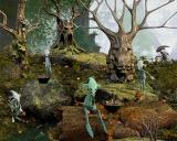
Spit finally decides to offer a thread of some of her renders.
 Spit
Posts: 2,342
This is the type of render I enjoy doing the most. Though this one is new, I may pop an older one in here and there as time goes by.
Currently my favorite grounds to use for this type of pic are any by eArkham. He has a few packages here at DAZ. Muelsfell Hagswood and Muelsfell Vile Mushrooms for two. I don't remember which one I used here.
The trees are by Poisen at Rendo, the basket of mushrooms from Faveral's Medieval Market, and the creature is Loik from the magical Nursoda at Rendo.
3Delight render...enjoy or scoff or ignore..whatever.


ShroomHarvest.jpg
1200 x 960 - 304K
Post edited by Spit on


Comments
That definitely rates an "enjoy!" I love the fogged background and the one on the crest of the hill, sideview- it really shows off the head shape. The trees and critters go superbly together. Welcome to the Art Studio (about time, Spit!!!!)
Only problem with it...I WANT MORE!
Looks like it's only a chapter in that story...where's the rest?
Novica: Thanks! The one on the crest was hard to make noticeable. I changed HDRs and Skyboxes several times before I settled on a background pic where I got the contrast I wanted.
mjc1016: Thanks too! The rest? Heh. Well, I just think of it as a slice of life. A strange life, but, well.
It all combines together well.
Love it...my sort of render Spit! I have some of Poisen's trees but would love to own them all one day...
That is not the teddy bear's picnic
not sure if safer to go down to the woods that day or not though
Love the image, Spit. I, too, am a big fan of Nursoda, and Loik finds his impish way into a lot of my images, Telka as well.
@JaquarElla, I think you're safe. Those woods are "Just a jump to the left..."
Thanks for the comments, everyone. LOL, Ella. These Loiks are afraid of strangers and will hide behind those trees if you walk by. Just don't try to steal a basket because it's the trees that'll get you.
I wasn't planning to put up another today, but just for Etrigan here's a Telka. Urban Future I call it, but it's not desperate and apocalyptic. Nursoda's Mo and Merpal also make an appearance. Postwork on this one used a PS action from one of Adam's sets--unfortunately no longer available. Doesn't really suggest much of a story though. But I like happy scenes.
Another one I like...Telka is one of my favourites from Nursoda.
Thanks, Pendraia
Now how about some joy.
Lovely renders, Spit =) It's a joy to see Telka and Koit, they're adorable =)
I adore the image you did 11 December - I really like that toon effect. I love the posing and interaction of the Nursoda characters.
Great images!
Thank you Kettu and Panda! I hope everyone had a great holiday--sorry I haven't been around the forums for a couple of weeks.
And before we yell Happy New Year, here's a 'shot' of a few days after the madness of presents and eggnog and cleanup. All is quiet, exhausted really.
I like all the little pets in the scene, very sweet, their posing and placement is great!
Very nice images. They remind me of a game called Ryzom. Have you ever played it? If not, you might want to check it out. ;)
Thanks. Yes, too bad it's not available but I actually use something in Filter Forge more. It's called Old Book Illustrator. I love it to pieces though I don't show those images much because the file size gets too large.
Thanks...two Noodles and a little dog (very very old) that was available years ago at Poser Pros I think. Don't know if it ever showed up anywhere else. I ran across it in one of my older runtimes the other day and realized I'd never used it.
Thanks, Gedd. Never heard of Ryzom. I'll check it out.
Wow, Ryzom's world is a planet that's a tree. Love the concept.
Your work is just fantastic, whimsical beautifully realized, creative and unique.
Agreed! I'm wondering how I missed your thread back in December. The style of the image with Nursoda's Mo and Merpal works well. Their stuff has so much character - I wishlisted a bunch when I created an account, but never really started buying over there. I think now is a good time to switch gears and start.
Thanks for sharing your work, Spit. Please post more!
- Greg
Thank you so very much Candesce and Greg. You know, you sit at home and quietly do stuff and have no idea how it would be received. I'll be putting up more...just waiting for power to go out from storm. When it all settles down I'll be back. bwa-ha.
Why did you turn the sign around? It's not for keeping me out, it's for keeping you in.
Very finished/polished looking image, Spit. The tunneling effect fading into brightness not only provides a nice depth queue, but it also frames the characters against an un-complicating background nicely. Excellent composition with a great storybook feel to it!
- Greg
Laid Back. First Bastion's Last Chance Gas Station and Predatron's Lo-Res guy.
He, I love the one with the go back sign, it tellen the story very good. Love the colours as well
Fun thread, nice renders :) Keep it up!
Your renders are truely amazing Spit this last one is too funny I am waiting for the cute dog to start doing tricks for the guys!!!
Thanks. Actually that's a background. I added more foliage and flowers, flipped, and changed colors somewhat. I believe this one is by Adamantine Graphics over at Rendo. I use backgrounds a lot and love to add extra foliage and stuff. It can get tricky though and I usually try out several before I decide.
Re Backgrounds....
--Your taste and type of image you do dictates what parameters would be useful and what problems you might run into or ignore when using a background image.
--you have to match the light. Many are fairly neutral and don't really cause problems for what I do. Some have a moon facing you and those can be hard to work with but backlighting is always appealing.
--Color is very important so I prefer backgrounds that have coherent color and try to match the tone with other added foliage etc.*
--Many backgrounds are designed for promos and those are great for portrait type renders. But if you are doing more of a scene, be careful of backgrounds where the artist has placed objects near the front (bottom) because they dictate scale and leave you little room to work with. Maybe this works for some users but I think some artists are wedded to only offering a 'complete' picture, ie, if composition dictates there should be something in a certain spot, they put something there. I'd rather they allow you to do it yourself.
--Shadows and grounds. If you're lucky you may find backgrounds that are fairly 'open' on the bottom and in 'front' but when you add a full figure standing there you'll usually need a shadow catcher. I used to use pwCatch but it doesn't catch AO so now I use the shadowcatcher included with the HDR Pro sets by Dimension Theory.
-Some images, like the one above, have grass and flowers completely covering the bottom. That makes anyone standing there look pasted on. You can counteract by adding your own foliage in front--but be careful to match the color scheme. Often I go to surfaces and change the diffuse color from white to gently tint the foliage. If I can't get it to work, I toss the grass or whatever and find something else. If there is water in front in place of ground, good luck.
--In certain types of images when you're thinking of composition remember the objects in the image are part of it too. Say the tree on the left has a branch which carries your eye way over to the right, be sure you have something on the right that carries the eye back into the picture. Or place the head of your figure in front of a lighter part of a sky for contrast. Balance your placed objects with the objects in the background.
--*I do post-processing in Photoshop but DAZ has made it a bit more difficult since 4.7 when they changed how backgrounds are handled in Studio (I assume in preparation for the then unannounced coming of iRay.) First in 3Delight if you render with a background you no longer get an alpha channel. You need to do two renders. Background only, and scene only with transparency. I have yet to get it to work right. In iRay same deal except you can no longer actually SEE your background while you're working (as I remember, I rarely touch iRay any more) so some of above is inoperable.
These are just a few things I've thought of and it's really not that bad. If anyone has more ideas and wants to share experiences with using backgrounds please join in.
Here's an image I showed in a thread in the old forum a while back. She's sitting on a rock, bird chewing on her hair. But the rock is part of the background and it's dark. Fake shadow. I didn't have to post-process. I'm not always successful with everything I've mentioned, but I always keep them in mind.
Thank you, very much, for the commentary on backgrounds. I'm still on 4.6 pro, no pressing need to change.
And I do love your "not human" Characters :)
I use a lot of my own screenshots from Everquest2 and other MMOs as background. They work because I like that kind of "realism" over photoreal. They also work because the games have day cycles, so it's a matter of picking the time of day and shadows I want for the background. Works well for me :)
Thank you so much Linwelly, mori_mann, and Saphirewild.
Teofa, thank you too and yer welcome. That's great re your backgrounds...I love shortcuts. And using those your figures really stand out.