Adding to Cart…

Licensing Agreement | Terms of Service | Privacy Policy | EULA
© 2025 Daz Productions Inc. All Rights Reserved.You currently have no notifications.

Licensing Agreement | Terms of Service | Privacy Policy | EULA
© 2025 Daz Productions Inc. All Rights Reserved.
Comments
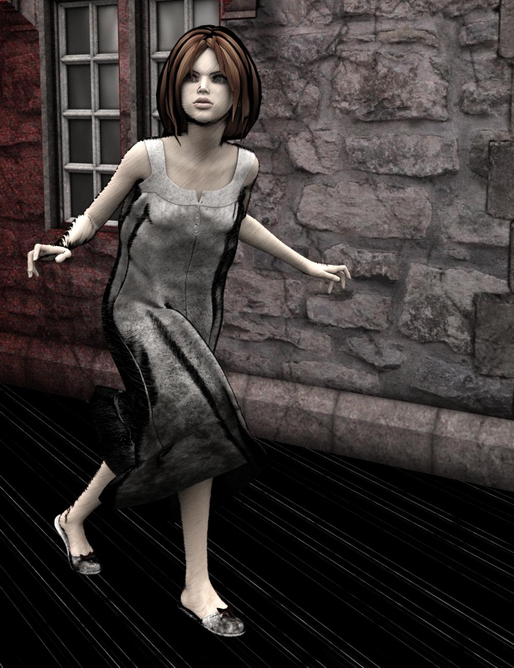
And how your monitor is set up makes a world of difference. At home the knife and the blood are visible, at work it's just one black blob with a few grey hints.
@Nath Really? Huh, that might explain part of it then. On my computer, the blood is very visible. However, I attributed some of that visibility with just how long I had had to play with it to put it where I wanted. I hadn't even thought about the differences in monitors.
It's also a sign that I need to fiddle with my work monitor again
@Nath LOL! Good luck with that! :)
That's a good point about the monitors. But I also just noticed that you have more than one version and I can see the knife and the light as bold as day in one of them. When I commented, I was looking at the one that was much darker.
And you should be proud of the results, @knittingmommy, You do a lot of fantastic images. And you're generous with your knowledge too.
@KevinH Yeah, the first one was brighter. I toned it down on the final version because it looked too bright on my monitor and not quite as creepy as I had intended. I might have gone a little too dark in the final version. Which probably isn't quite so final as I'll be making changes. I'll post again when I'm ready to put it over on the book covers thread for advice. The first one may actually better if I'm looking to turn it into a cover. I just need to do the same type of postwork on the newer version that I did on the older version for that. I used different postwork techniques on the both. I'll play with it and see what I can do. It will have to wait as I'm product testing for the next few days.
@KevinH Thank you. I am proud of what I've been doing. It's a long way from where I started! I like sharing what I've learned. It makes me feel good that I might be helping someone get better at their art. :)
I agree KM sharing helps others. :) Monitors... I wonder if that is why I see seam lines on my cat in my farm scene? Wanders over to my thread to ask the question.
Well, I tried to quickly try out Sketchy - Toon Edge and Art Style Shaders for Iray by @DimensionTheory. I watched the video and then tried it out. It took a little bit of playing with the presets, I'm mostly happy with what I've seen so far. I'm having issues with the hair, though. To be fair, I don't think it's an issue with Sketchy, I think it's an issue with the hair itself. It's was an older hair that doesn't really have texture maps. So, I ended up changing hairs to something else. I don't think my hair choice was the best for a first time try out, but I was using a clown. It isn't like there are a lot of options out there for clown hair and I don't even have the one in the store called Clown Hair.
I should also have started with a much simpler scene. But no, I had to try it out on a scene with complicated lighting and other issues. I never seem to do things the easy way. So, here is my first best effort so far with Sketchy. I'll have to try a few more scenes until I get the hang of it. Right now, though, I'd have to say I'm excited about this product and I am looking forward to playing with it more. :)
Original without postwork:

Sketchy version:

I think that looks pretty cool km :)
Thanks. It's not too bad for a first effort but I think I started too big. I'll have to set up a simple scene and play with it some more. I do kind of like what I finally got out though it isn't quite the look I was going for. :)
I was gone most of the day and when I got back a render for the project I'm testing was done. I couldn't really get into testing mode anymore this evening so I took a break and played with just setting up a really simple scene to try out the Sketchy Shaders again. I think I did much better with them this time around. I like that they render relatively quickly on my computer. I managed to do this picture. I have the straight out of DS version with no postwork. I didn't do much in the postworked version other than play with the contrast a little and some slight brightness adjustment.
Original no postwork:

Postworked version:

Gallery Link
Awhile back I had a scene all set up and set to rendering overnight. I woke up and the power had gone out and my computer shut down so no render after having spent hours setting it up trying to get it just right. Luckily, I had saved the scene before I hit the render button. I got busy with other things and never got around to trying to render it again. I didn't have anything set up to render the other night so I pulled up the scene file for this one and let it render overnight again. I did make a couple of changes but not much. I was trying out all new things I hadn't rendered yet.
Little Pixie and the Fairy

Gallery Link
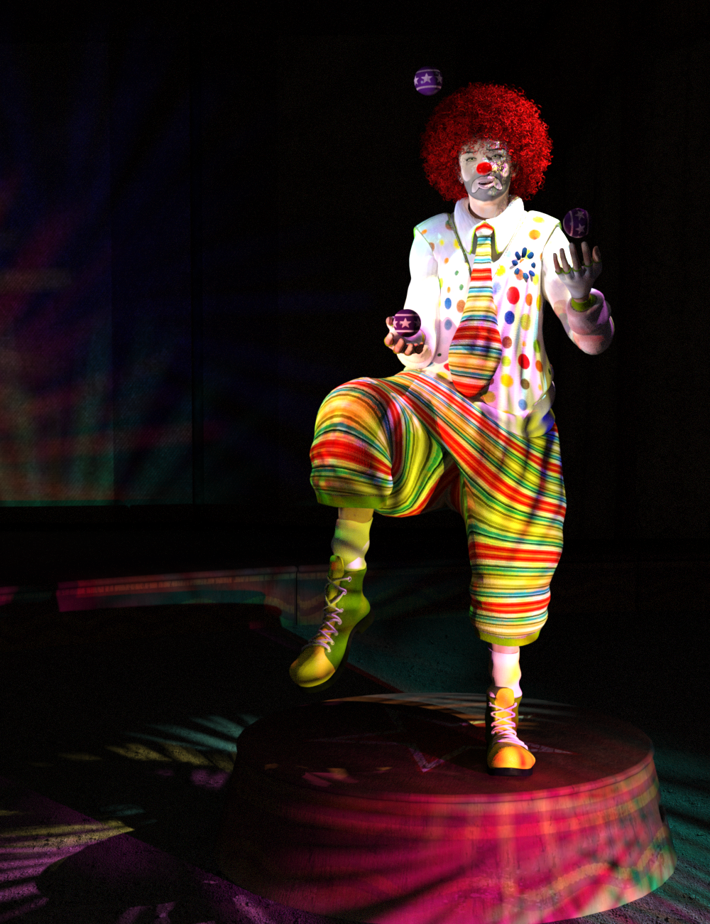
I made some changes to my clown so the background is a little more visible and not quite as dark. I don't think I'll be doing much more with this. I think he's done. I was a little miffed with this one. I spent a lot of time posing him based on some reference photos of jugglers trying to get the balance correct. I wanted to make it as realistic as possible. However, I forgot one small detail. I tend to pose my figures naked as it's easier and I don't accidentally grab the clothing when I'm posing until I get it mostly done. Then I'll add the clothing at the end so that I can adjust how the clothes fit and adjust the pose as needed. I forgot that I was posing a clown and the outfit I was going to use was so large! It hides all of the great posing adjustments I made! Aargh!
I found a few really great juggling photos that I might give a try, though, so the next juggler is not wearing this clown suit!!!! :)
Sad Clown Theo

Gallery Link
Time to go fix dinner. It's meatloaf, mashed potatoes and gravy, carrots and fresh made biscuits at my house tonight. :)
I am coming over right now set out an extra plate! The clown still looks really cool. I have not done much been doing other things. :)
Ah, so noted. Extra plate on the table. Got it! ;)
Thanks for the comment about the clown. Probably not my best work but I had fun doing him. He didn't turn out too badly, I think. He definitely is not a candidate for using the new Sketchy shaders until I learn more about using them, but I like him as he is. :)
Fancy colors in your clown render. Like your lights very much. Very good work. :)
I think the pose, balance, and sense of motion is well composed too. You can see how intently he is staring at the object in the air. It seems photorealistic.
It actually looks kind of like Bill Murry to me. :)
Thanks, guys! Yeah, I spent a lot of time on the pose trying to get it as close to the reference photos as possible. I got so involved with getting the balance perfect I forgot that most of my work wouldn't be seen. :)
I love the lights! Those were from IDG Iray Gel Lights and Gobos by @DestinysGarden and @InaneGlory. I love how they worked with the whole circus theme. :) DG even left a lovely comment on my gallery page for it. She's such a sweetie!
Yeah, I see the resemblance, too!
I've bought so many clown related items but have always skipped over this one. After seeing your fantastic image, Knittingmommy, I think I've changed my mind - great job! He needs a tiny car ;)
- Greg
@Algovincian Thanks, Greg! I would love to find a tiny car! :) Yeah, I can see the resemblance to Bill Murray, too. Sad Clown Theo has a great morph and it wasn't too much trouble transferring him up. He had a slight issue with his body morph but I just needed to figure out which morph was the issue. If you get him and move him up with GenX, let me know and I'll tell you exactly which morphs you need to watch on his upper torso. He has a great face morph under all of the makeup. I love the older M4 guys. There were some really great characters for M4 and V4 and the mats look great in Iray!
Knitting, I don't know just how you manage to do all that stuff... your dasy must have more than the average 24 hours. I ahve a hard time keeping up with all the threads,
anyways I just wanted to tell you that you are doing an awsome job in this thread!
@Linwelly Thanks. I honestly don't know how I do it either. I'm flighty and I'd love to say I just do one thing at a time until it's done but that isn't true. I have very little focus at times. I always want to move on to the next thing that strikes my fancy. Unfortunately, that means I have a few projects in the works that still aren't done. They will get done. I just don't have a timetable for them. I have a list a mile long of graphics related stuff I want to learn how to do. I STILL haven't finished my book although it gets closer to being done every day. I'm actually surprised that I've managed to stick with it as long as I have, both the graphics and the writing, at times. I love it, though, so I keep moving along one project or whim at a time. Eventually, stuff gets done. Not everything successfully, I might add. I still have some major flops. However, I think my successful endeavors are far outweighing those flops these days.
Then, of course, family comes first so there are times when I have to literally stop and take a break to play chauffeur, be a teacher, or just Mom. I suppose, in some ways, having teens now are a blessing because I get more 'me' time to do the things that I want and am interested in trying. Oh, trying to do all of that on about 5 hours sleep on average helps. There are times I just can't go to sleep because I'm working on a render or writing another chapter and 2 am to 4 am seems to be my peak creative time. Makes me wish I drank coffee at times. I could certainly use the caffeine boost! :)
Stay tuned everyone. I do have more tutorials coming. I promise!
Yay tutorials! I'm bookmarking so I remember to check back in.
BTW I'm a "crochet" mommy. :D
@Deathbycanon I'm not sure what I can teach you but, yeah, tutorials! I like making them though they take a lot of work. They are actually getting easier to do the more I do them. I like to crochet. I just don't do as much of it as I do the knitting. Nice to find another fiber person! I learned how to crochet first because that is what my mom knew how to do. I had to teach myself how to knit because I wanted to learn how to do it and knew no one who knew how to do it. I still crochet. In fact, I have a few crochet wips around. I love knitting, though, and I'm a faster knitter than I am a crocheter. I quilt and sew and do a few other fiber related crafts, too. :)
My wife does the knitting for our family......
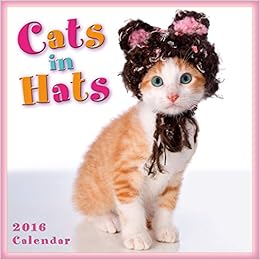
I learned to crochet to make hats for cats lol - I sound like a crazy cat person don't I. It was actually part of my job, this is the 1st thing I ever crocheted,
hahaha No pattern at all can you tell, look at the ears! They are so uneven. All I knew was DC and SC and ST I didn't know how to do decreases so I just winged it. Got the shot though and made the cover so it worked well enough. :D When I got sick I started crocheting more, not a lot to do in the hospital, or the four hour rides to the doctors offices. Lots of time to learn the craft. I made 3 of these last winter http://fav.me/dakn7x9 Planned on keeping one for myself, but all three got nabbed up by family. I try to sew, but a lot of that looks like that 1st hat if you look too close.
@TabascoJack I'm sure you don't mind wearing what she makes either! I know my husband is very proud to wear anything I make him.
@Deathbycanon That hat is adorable on the kitten. :) I've never made a wearable for any of my animals. I have made a few toys, though. I left a comment on your blanket. Love the pattern. It looks like you did a great job. You know I knit a lot. However, I don't have very much of my knit objects because they always seem to get scarfed up by family members. I did keep my socks that I knit which won an honorable mention at the New York State fair when I entered. I was pleasantly surprised because it was the first time I had ever entered anything like that. Everything else usually gets confiscated as soon as they are finished. I do some charity knitting, too, which always goes to a good home.
Listening to music on YouTube in the background and one of my favorite songs just came one. Here's a little taste of summer for those of you who are about to get blasted with snow. Stay safe!
"You will have time for an almost unlimited number of things, as long as you're in no hurry to get them done" (freely translated from a plaque I have hanging on my wall)