Adding to Cart…

Licensing Agreement | Terms of Service | Privacy Policy | EULA
© 2025 Daz Productions Inc. All Rights Reserved.You currently have no notifications.

Licensing Agreement | Terms of Service | Privacy Policy | EULA
© 2025 Daz Productions Inc. All Rights Reserved.
Comments
I'll have to try that. I'm still working out the best way to use some of these tools. I'll try your method when I pull the image up again and see if Gimp reacts the same. It probably does because a lot of the tools in Gimp work almost exactly the same as their counterparts in Photoshop work. Thanks for the tip because, no, I did not do it exactly as you described.
Yeah, exactly what I probably did.
I am sure loving this new charactor Mace I may just have to pick him up soon for my treasure chest of male charactors!!!
Good choice for your book cover so far, now I can not wait to see what charactor pops out next!!!
Well, I did some more test renders with Mace. I can see why this seam might have been missed. It's very faint in most straight on camera angles in the default lighting. The seam seems to become more visible depending on the lighting and the camera angle. Something that is really hard to judge when testing, I would imagine, unless you have a tester that does a ton of camera angles and lighting. And, even then, it might get missed.
I was just lucky or unlucky, depending on how you look at it, enough to have both the right lighting and camera angle to really see that seam. I've submitted a ticket with a couple of large test renders with the area marked so, hopefully, there will be an update soon if this is something that can be fixed.
That being said, Mace is still a great character and, now that I know what to watch out for, I can definitely keep that in mind and/or fix it in post if needed. I have a lot of respect for @GypsyAngel and her creations. Character creation is not an easy thing. I still think she does a great job.
After being a tester of a character or two now, I know how difficult it is to fix some of these seam issues. Lots of swearing going on when you submit a render to a vendor with seams they thought they had fixed. :)
That is a very well done character and I like the dark postwork version. Especially the face is very expressive. I did find the seam rather easy but thats what you get trained for in this hobby, so I don't think its too dominant. Thar armpit skin has already been mentioned I think. That is honestly the one thing that my eyes keep returning to, so some smoothing there would be good.
Thanks, @Linwelly. Yeah, I agree about the armpit. I mostly wanted to try out the skin to see what I was working with. That is not the pose that will be in the final render. I do like how the skin turned out, too. At least now, I know how the skin reacts with the possible lighting that I'll be using for the render. Just have to work on the other characters that are going into the final render and see how well I can mix them all together. Four characters and two, possibly three, different skins. Should be interesting. :)
Just playing around with @Sickleyield's newest HDR, Iray HDRI: Storms, Lightning, and Desert. It's a pretty cool HDR. This is image just uses the HDRI and the rest is all done with postwork. I'm not completely happy with it, but I'm not exactly sure what I'd want to do to improve it, assuming it can be improved. It's 3 am. I might think it's total crap after a good night's sleep. That's me, second guessing myself and it gets worse when I'm up so late. Aargh! I'm off to bed.
PS. Character is the new Pix-Venus500 by @Pixeluna.
Well, I gave in and got the LAMH2Catalyzer. I just had to try it out. Curiously enough, I didn't have any crashing issues even though I expected it from what I had read. Admittedly, for this test, I only had the one raccoon in the scene with HDR lighting and nothing else. The jury is still out as to whether this creates a better fur than what I can do on my own with LAMH so I'll be running some more renders and testing that out to see what the differences are.
Original render:
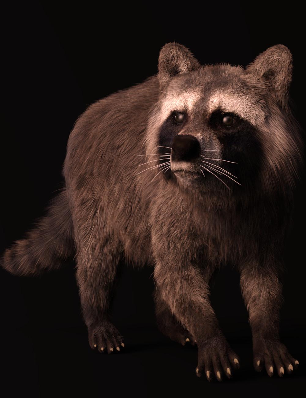
Postworked version:

Looks fantastic, KM! There's a racoon that lives in the roof of a barn behind my house. He uses a tree to bypass a fence and drop down into the area where my recycling/trash barrels are lol. Hard to get mad at him, though - he's too cute:
As far as the realism goes, you may find this post by Alessandro interesting:
https://www.daz3d.com/forums/discussion/comment/2723151/#Comment_2723151
In general, is it faster for you? I had lots of crashes when rendering the wolf, but it was so much faster.
- Greg
@Algovincian Thanks! Oh, he is a cutie! Yeah, hard to get mad at animals that cute when they are just being themselves. BTW, I just saw your wolf over in AM's commercial thread. Nice job! I really liked it. He looked amazing.
Well, considering I only had the raccoon in there, no crashes. I'll be doing a render with a scene soon so I'll let you know if anything crashes with the extra scenery. I'm not sure yet about the speed, but I think it was faster. I'll know for sure after my current render is done. I have the raccoon set up with the LAMH preset which I converted to Iray myself and I'm rendering with an HDR just like the first one. I'll compare times when it's done and post the render for comparison along with the official times from the log.
This is great. Very glad to see such wonderful fur in Iray through LAMH. Thanks for posting.
The fact that it's not my barn makes it even easier to look the other way. The old couple that lives behind me and does own it likes him, too. We've talked about him/her (how do you tell?) and we both kind of think there's probably some little ones stashed away in there. I keep hoping for a sighting, but nothing yet!
Looking forward to hearing about your testing with your coon in an environment. Glad you liked the wolf. It did make me think of those wolf renders you did way back when. FYI, that was simply a backplate blurred by DOF and the wolf lit by sun/sky - nothing else in the scene. I'm a tweaker, so the process of posing, setting up the lighting, and positioning the camera is a lot of render/tweak, render/tweak, rinse/repeat. There was a huge speed increase for me with the Catalyzer, which made it not only possible from a practical standpoint, but much more fun, too.
- Greg
You may wish to grab this before you do any further testing:
https://www.daz3d.com/forums/discussion/comment/2732856/#Comment_2732856
- Greg
That's a great render - the racoon. Very realistic. I got the catalyzer but I have no animals yet, lol. I think I will get the wolf first, it's so cute.
Thanks. The wolf is a great animal to work with and definitely a great idea as a starter animal. I love all of AM's animals and have most of them.
So, I did a little mini test and ran the LAMH raccoon with the fiberhair converted to Iray and rendered him again. Same pose. Same lighting. I'm posting the original LAMH test render and posting the original LAMH2Catalyzer orginial render for compairison purposes. No postwork on either image and the exact same settings on both. The only thing I did was convert the LAMH Fiberhair to Iray in the LAMH version and adjust some of the surface settings to cut down on fireflies.
The differences in fur is downright visible between just the LAMH fiberhair exported to Iray and the Catalyzer. That Catalyzer must do something extra to make the fur look that much more realistic. The difference in times is amazing. While it's disappointing that you can't use the Catalyzer on all LAMH presets yet, the time reduction alone and how good the renders are make it well worth getting even though you can only use them on AM's animals at the moment. I really hope that AM gets it to the point where those of us playing with out own presets can use this, but for now I'm happy with my purchase. I see a lot more animal renders in my future.
LAMH Render Time: Total Rendering Time: 4 hours 34 minutes 37.25 seconds
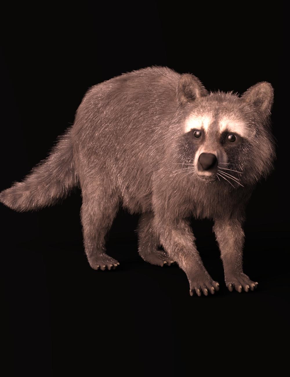
Catalyzer Render Time: Total Rendering Time: 1 hours 43 minutes 3.50 seconds

Now, I just need to see if this works in Linux. Not sure about that as LAMH was having issues with that lately. I'll keep you posted on whether it does or not.
Note: my camera angle is slightly off between the two, but other than that, it's basically the same setup.
That's a big difference in both render time and, perhaps more importantly, how it looks. Catalyze makes the fur thicker and richer, and a it gets rid of those "split ends."
Fantastic testing renders and I love the comparison. I bought it too but I haven't had time to play with it yet so I was really wondering how it compared!
I haven't had time to try it out yet either. I have a lot of his animals as well. I'm hoping this will solve my crash every time I load LAMH problem. Hoping to get a chance to test it out this weekend. Yours looks great!
I agree, the fur does look much better and I love the time difference. I think it was well worth it to get the Catalyzer considering how much I enjoy doing animal renders.
I'm looking forward to seeing what you can do with it. I love your images.
So far, I haven't had any crashes. I haven't updated yet either. I might just wait until I start having problems. Everything is working perfectly on my system so far. I kind of want to wait until the dust settles and all of the updates are finalized since the Catalyzer works fine so far.
You're running an AMD card (non-nVidia, so CPU rendering right off the bat), right? I wonder if this is a clue about some of the crashing . . .
I definitely think that running out of VRAM while rendering critters will cause crashes, but then again DS itself has never dealt with that gracefully, either.
- Greg
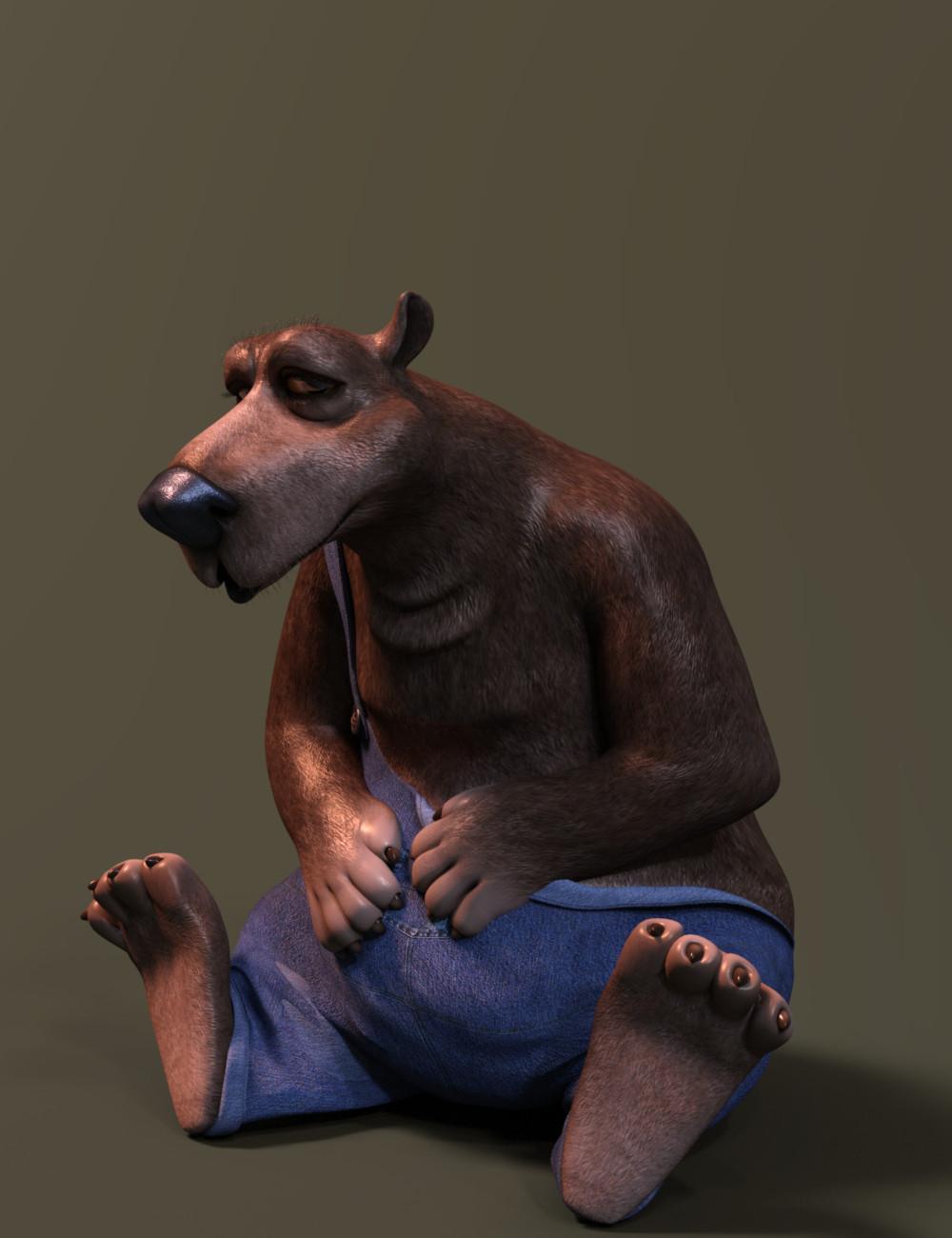
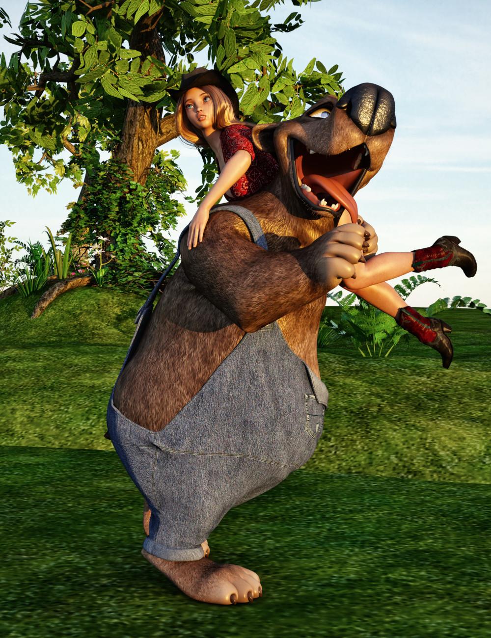
So, I wasn't going to get him, but I just couldn't resist getting Snuggles the Toon Bear from 3D Universe. Most of you know I have this irrisistable urge to collect everything toon. I really wanted to wait until he wasn't new anymore, but I kept seeing all of these great images in the gallery using him and that just about did in any resistance I had. So, I've been playing around with him.
My first test render of Snuggles:
Original:
Postworked:
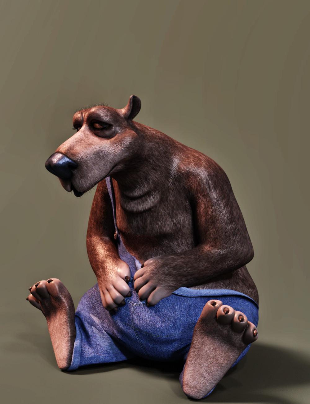
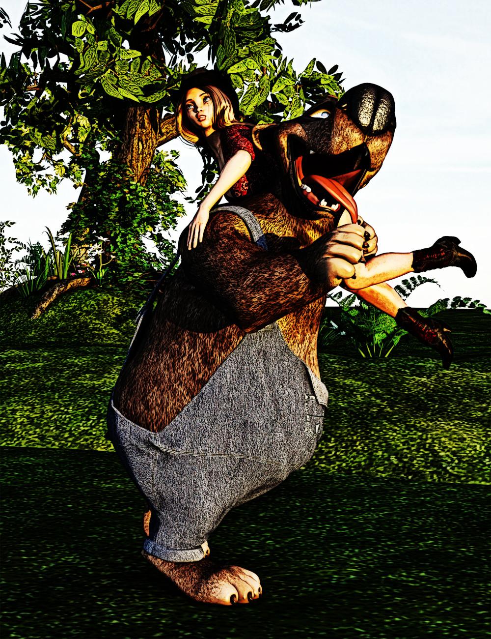
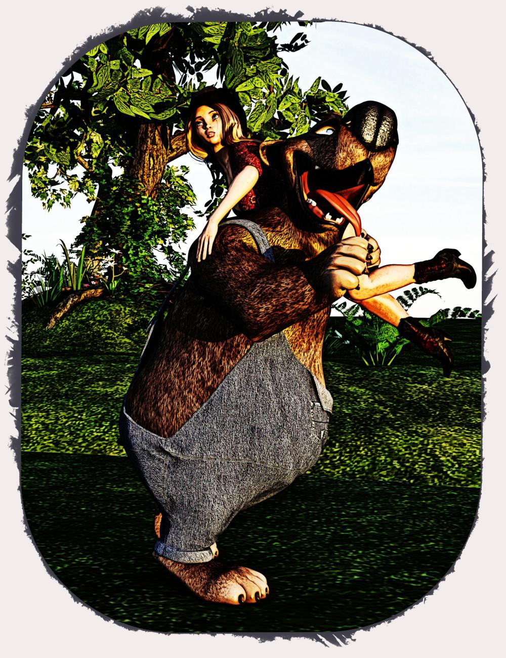
I had a great idea and I played around with it and came up with the next two images. I really like them both. I think the frames really add to the whole image, but I have a connundrum. I'm not sure which frame I like better or whether the original image is better so I'm looking for opinions on which one you guys all think should go in my gallery. I'll let everyone know which one I'm leaning toward after I get some input. I'm just not sure, yet, which one I like better. Each one has some good merits as well as points against. So, tell me what you think.
Original:
After major toon type postwork:
With Frame 1:
Gallery Link
With Frame 2:
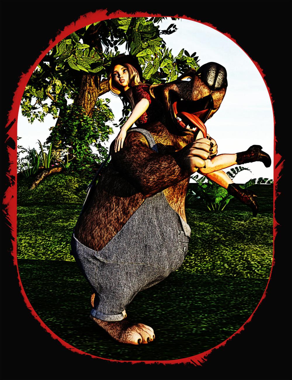
So, what do you guys think? With or without the frame and, if with the frame, which one works better?
edit: added link
edit 2: added Gallery link for the first framed image that I ended up putting in my gallery. Thanks for all of the input everyone! :)
He's adorable! The images that you have toon post-worked would be great in a kids book.
Thanks. Yeah, I think he's adorable, too. I love 3D Universe toons. Yeah, one of these days, I might seriously consider doing a kids book. I've really been enjoying the NPR images that I do.
Nice work on those- I think I like the first framed one.
@DarwinsMishap Thanks. That was the one I liked the best, but I wasn't completely sure of myself. Turns out most everyone else liked that one, too.
I put my Snuggles and Ruby image with the first frame in my gallery. Adding the link now up above with the image.
I just spent most of yesterday and today following a Photoshop tutorial. There was a deal on Shiftart for some tutorials and I wanted to try some of them out. I'm glad I did. I have learned a lot! Part of that learning was figuring out how to do all of the steps in the tutorial for PS and do them in Gimp instead. I did have to look a few things up because, while Gimp has a lot of the same tools, not all of them have the same names or do them in exactly the same way. It was definately a learning experience because I had to find a few tools in Gimp that I didn't even know were there let alone how to find them.
Luckily, it all turned out well. I learned a lot from this tutorial. I was following the Fire Starter tutorial at Shiftart by Gail Edwards. Anyone who wishes to see the image the artist doing the tutorial created can see it here. My resulting image isn't an exact match. The tutorial art used stock images the artist had gathered, most of it paid. I chose to render out each of the parts that I needed inside DS. I was actually able to render almost everything. What couldn't I do? Let's just say, my library is rather deficient in the avian species. I'll have to remedy that soon.
This was as close as I could get to the tutorial. Let me know what you think. If you want to see all of the products I used, you can click on the gallery link. I have all DS products used linked in the gallery. At least, I'm pretty sure I linked them all.
Fire Starter

Gallery Link
Your toon images are so fun! I like the toon postworked one without the frame the best but the first frame comes in a very close second. And, I'm just weird lol.
I have watched several of those tutorials, I think you did a great job on this one, especially since you are using your own resources. I like that its not an exact match to the tutorial but the idea is solid in yours.
This came out excellent! Using DS to render stock is a fantastic approach - great job.
- Greg
@IceDragonArt Thanks for the input. I ended up putting the first framed image in my gallery. It's the one I liked the best. Though the original was a close second. I have really liked my adventures with the toon postwork. I've gotten comments that there are too many colors for a classic toon, but I really like the illustrative effects that I've been getting. They probably won't be popular with most of the folks in the galleries, but I'm okay with that. They just make me happy.
Thanks for the comment about the tutorial pick. I wasn't sure if it would work out or not using my own resources, but I'm pretty happy with the final result. It turned out much better than I thought it would and I learned a ton of new stuff from the tutorial.
@Algovincian Thanks. Well, I'm cheap and I figured, since my ulitmate goal is to be able to do this kind of postwork on my own renders, I might as well start now by using stuff I've rendered to use in these tutorials I'm following. That pose was a bear, though, let me tell you. I still don't have it quite like the model in the original image by the tutorial's artist, but she was using stock of a real person so I was pretty happy to get that close.
Great job, that would be so much more confusing trying to convert it all to Gimp. When I'm at a loss of what to do next art wise, I render random things like tress and plants to build up my "stock" library. Cutting things out of a photo like that is a pain, so it's so much better being able to render pngs.
In the end, you have to be happy with it and that's what really counts. I am running through all the tutorials and when I am over this flu bug, I will sit down and start to actually do them. I would like to do them using my own stuff as well, although I have a pretty large stock collection going anyway lol. But I love DeathbyCannon's point about rendering our own stock images in png format. I am going to have to start doing that!